Imagine your ad as a vibrant billboard in a crowded cityscape – it must grab attention swiftly and leave a lasting impression. To make your ads irresistible, you need more than just basic visuals and text; you need creatives that captivate, engage, and convert.
Welcome to the art of crafting Amazon FBA ads that not only catch the eye but also drive action. This guide will walk you through the creative strategies to transform your ads from mere placeholders into powerful, persuasive tools that turn casual browsers into eager buyers.
From dazzling listing images and compelling headlines to leveraging social proof and seasonal trends, we’ll explore how to refine your ad creatives to achieve outstanding results. Ready to elevate your Amazon FBA ads and see those click-through rates soar?
The Role of Listing Images in Amazon FBA Ads
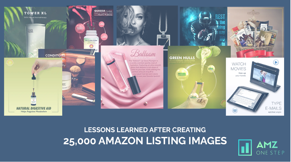
Listing images are often the first element a potential customer notices in your Amazon FBA ads. They serve as the visual hook that grabs attention and invites users to learn more about your product. High-quality listing images can communicate the product’s features, benefits, and usage, making them essential for compelling ad creatives.
Example: If you’re advertising a premium coffee maker, a high-resolution image showcasing the sleek design and key features, such as programmable settings and a built-in grinder, can highlight the product’s value. In contrast, a blurry or poorly lit image may fail to convey these features effectively.
Why High-Quality Listing Images Matter
High-quality listing images can significantly enhance your ad performance by improving click-through rates and conversion rates. They provide clarity and detail that help potential buyers make informed decisions.
Quality listing images also help build trust by presenting your product in the best possible light, reflecting professionalism and attention to detail.
Example: Consider an ad for a luxury watch. A high-quality image that captures the watch’s intricate details, such as its craftsmanship and fine materials, will attract buyers who appreciate luxury and quality. This level of detail is lost in low-resolution or poorly shot listing images.
Characteristics of High-Quality Listing Images
To ensure your listing images stand out, they should possess several key characteristics:
High Resolution
High-resolution listing images are crucial for maintaining clarity and detail. Listing images should be sharp and clear, even when zoomed in, to showcase the product’s quality and features.
Example: For a high-end camera lens, a high-resolution image will allow potential buyers to see fine details like the lens’s build quality and the intricate design of its elements. Low-resolution listing images may appear pixelated or blurry, failing to highlight these aspects.
Proper Lighting
Good lighting is essential for capturing accurate colors and details. Natural lighting or soft studio lighting can minimize shadows and reflections, providing a clear view of the product.
Example: If you’re promoting a set of kitchen utensils, using soft, natural lighting can highlight the utensils’ sleek design and color. Overly harsh lighting or shadows can obscure details and make the product look less appealing.
Accurate Colors
Ensure that the colors in your listing images accurately represent the product. Misleading color representations can lead to customer dissatisfaction and increased returns.
Example: An ad for a range of paint colors should use high-quality listing images that accurately depict each color, ensuring that buyers receive exactly what they expect. Incorrect color representation can result in negative reviews and customer complaints.
Clear Focus
The product should be the main focal point of the image. Avoid cluttered backgrounds and ensure that the product is in sharp focus to draw attention to its features.
Example: For a new smartphone, the image should clearly focus on the device itself, highlighting its screen and design. Background elements should be minimal and not distract from the product.
Consistent Style
Maintain a consistent style across all your ad creatives to build brand recognition and create a cohesive visual experience. This includes using similar backgrounds, lighting, and image formats.
Example: If your brand’s ads feature a clean, modern aesthetic, ensure that all product listing images adhere to this style. This consistency helps reinforce your brand’s identity and makes your ads more recognizable.
Practical Tips for Selecting High-Quality Listing Images
Selecting the right listing images involves more than just choosing high-resolution photos. Here are practical tips to help you make the best choice:
Showcase the Product in Use
Lifestyle images that show the product in use can be more engaging than static product shots. They help potential buyers visualize how the product fits into their lives.
Example: For a new line of outdoor gear, an image of the gear being used on a hiking trail or at a campsite can make the product more relatable and appealing compared to a simple studio shot.
Highlight Key Features
Focus on listing images that highlight the product’s key features and benefits. Close-up shots or detailed listing images can emphasize important aspects and differentiate your product from competitors.
Example: If you’re advertising a high-tech blender, include close-up listing images of its control panel and blade system to showcase its advanced features.
Use Multiple Angles
Provide listing images from multiple angles to give a comprehensive view of the product. This approach allows potential buyers to see the product from all sides and understand its design and functionality better.
Example: For a piece of furniture, such as a sofa, include listing images showing the front, side, and back views, as well as close-ups of the fabric and stitching to give buyers a full understanding of its appearance and quality.
Incorporate Contextual Elements
Contextual elements, such as props or backgrounds that reflect the product’s intended use, can make listing images more engaging and help potential buyers visualize the product in their own lives.
Example: For a set of outdoor cooking tools, include listing images of the tools being used in a backyard BBQ setting. This helps buyers envision how they will use the product in their own outdoor gatherings.
Optimize for Different Ad Formats
Different ad formats, such as sponsored product ads, display ads, and video ads, may require different image formats and resolutions. Ensure that your listing images are optimized for each format to maintain visual quality and effectiveness.
Example: A product image used in a sponsored product ad should be high-resolution and square, while listing images used in a video ad may need to be formatted to fit a widescreen aspect ratio.
Examples of Effective High-Quality Listing images
Luxury Product Example
For a high-end skincare product, a close-up image of the product with a clean, elegant background can emphasize its premium quality. The image should highlight the texture and product packaging details, with soft lighting to enhance the product’s luxurious appeal.
Tech Gadget Example
For a new smartwatch, an image showcasing the watch in use on a wrist with a modern, sleek background can demonstrate its functionality and style. Additional close-up shots of the watch face and band can highlight its features and design.
Fashion Item Example
For a clothing item, such as a dress, use listing images of the dress being worn by a model in a stylish setting. Include close-ups of the fabric and details, as well as listing images of the dress from different angles to provide a comprehensive view.
Designing Compelling Amazon FBA Ad Banners
Amazon FBA ad banners serve as visual advertisements that appear on various sections of the Amazon FBA website, including product detail pages, search results, and other placements. Their primary goal is to attract potential buyers’ attention, convey key product information, and encourage clicks that lead to conversions.
Effective banners should blend seamlessly with the Amazon FBA environment while still standing out enough to capture the user’s eye.
Read More: Why Amazon Video Product Ads Convert Better: The Power of Visual Storytelling
Key Elements of a Compelling Ad Banner
Attention-Grabbing Visuals
The visual aspect of your ad banner is crucial for drawing users in. Use high-quality listing images that are relevant to your product and visually appealing. The imagery should be clear, crisp, and professionally designed to make a strong impression.
Example: For a new line of kitchen appliances, use high-resolution listing images of the appliances in a well-lit kitchen setting. This creates a realistic scenario that helps users envision the product in their own homes.
Clear and Concise Messaging
Your ad banner should convey its message quickly and effectively. Use concise, compelling text to highlight the key benefits or features of your product. Avoid cluttering the banner with excessive text; instead, focus on a single, impactful message.
Example: If you’re promoting a sale on fitness equipment, your banner might feature the text “Get Fit Now – 20% Off All Fitness Gear!” This message is clear and direct, making it easy for users to understand the offer.
Strong Call-to-Action (CTA)
A strong call to action encourages users to take the next step, whether it’s clicking the banner to learn more, making a purchase, or exploring a special offer. Use action-oriented language and ensure that the CTA stands out visually.
Example: For a new smartphone launch, your CTA could be “Shop Now” or “Discover the Latest Features.” Make sure the CTA button is prominently placed and contrasts with the background to attract attention.
Consistent Branding
Your ad banner should align with your brand’s overall look and feel. Use consistent colors, fonts, and design elements that reflect your brand identity. This consistency helps reinforce brand recognition and creates a cohesive experience across different ad placements.
Example: If your brand’s color scheme includes blue and white, use these colors in your ad banner. This not only makes the banner visually appealing but also strengthens brand identity.
Relevant and Engaging Content
Ensure that the content of your ad banner is relevant to the audience you’re targeting. Tailor your message and visuals to match the interests and needs of your potential customers. Engaging content increases the likelihood of attracting clicks and conversions.
Example: If you’re targeting outdoor enthusiasts, an ad banner featuring high-quality listing images of camping gear with a message like “Gear Up for Your Next Adventure” will resonate more with this audience.
Best Practices for Designing Amazon FBA Ad Banners
Optimize for Different Sizes
Amazon FBA ad banners come in various sizes, and it’s essential to design banners that look great across all formats. Ensure that your design is adaptable and maintains its visual appeal and readability in different sizes.
Example: Create multiple versions of your banner for different placements, such as a large rectangle for product detail pages and a smaller banner for search results. Test each version to ensure they perform well in their respective placements.
Use High-Contrast Colors
High-contrast colors help your ad banner stand out against the background and grab attention. Choose color combinations that make your text and CTA buttons easy to read and visually striking.
Example: If your banner has a dark background, use light-colored text and buttons. Conversely, if the background is light, use darker text and buttons for better visibility.
Incorporate Seasonal or Promotional Themes
Align your ad banners with seasonal events or promotions to make them more relevant and timelier. Incorporating holiday themes, special sales, or seasonal trends can increase engagement and drive more clicks.
- Example: For a summer sale, use vibrant colors and imagery related to summer activities, such as beach scenes or outdoor gatherings, along with a promotional message like “Summer Sale – Up to 30% Off!”
Ensure Mobile Compatibility
Many smartphone shoppers browse Amazon on mobile devices, so it’s crucial to ensure your ad banners are mobile-friendly. Design banners that look good on smaller screens and test their performance on various devices.
- Example: Use larger fonts and clear, simple listing images in mobile banners to ensure readability and visual appeal on smartphones and tablets.
Test and Analyze Performance
Regularly test different designs, messages, and CTAs to determine what works best for your audience. Use Amazon’s ad performance metrics to analyze the effectiveness of your banners and make data-driven improvements.
- Example: Run A/B tests with different banner designs and monitor click-through rates, conversion rates, and other key metrics. Use this data to refine your ad creatives and enhance their performance.
Examples of Effective Amazon FBA Ad Banners
Product Launch Banner
For a new product launch, design a banner with a high-resolution image of the product, a bold headline announcing the launch, and a CTA like “Explore Now” or “Pre-Order Today.” Ensure the banner reflects the product’s unique features and appeals to your target audience.
Seasonal Sale Banner
Create a banner for a seasonal sale featuring vibrant, themed visuals and a promotional message such as “Holiday Savings – 25% Off Everything!” Include a CTA button that encourages users to “Shop the Sale” and make the offer clear and enticing.
Brand Awareness Banner
For a brand awareness campaign, design a banner that showcases your brand’s logo, colors, and key messaging. Include a CTA like “Learn More” or “Discover Our Range” to drive traffic to your brand’s Amazon FBA storefront or website.
Incorporating Clear Pricing Information in Ads
Best Practices for Incorporating Pricing Information
Display Pricing Prominently
Ensure that pricing information is easily visible in your ad. Place the price in a prominent location, such as near the center of the ad or in a large, eye-catching font. Avoid burying the price in the fine print or making it difficult to find.
- Example: In a banner ad for a new smartwatch, prominently feature the price in bold text, such as “Only $199!” This clear and direct approach makes it easy for potential customers to see the cost at a glance.
Highlight Discounts and Special Offers
If your ad includes special offers, discounts, or promotions, make sure these are highlighted effectively. Use attention-grabbing visuals or text to draw attention to the savings and create a sense of urgency.
- Example: For a limited-time sale, including text like “Save 20% – Now Only $79.99!” in bright colors or with a contrasting background to emphasize the discount and encourage immediate action.
Use Clear and Simple Language
Avoid jargon or complex pricing terms. Use straightforward language to explain the price and any associated costs. Clear communication helps prevent misunderstandings and ensures that potential customers fully understand what they are paying for.
- Example: Instead of “$49.99 plus taxes,” use “Just $49.99 – No Hidden Fees!” to simplify the pricing message and make it more appealing.
Include Pricing in Context
Provide context for the pricing information by including details about what the price covers. This can help justify the cost and highlight the value of the product.
- Example: If you’re advertising a subscription service, include text like “Only $9.99 per month for unlimited access!” This informs customers about the ongoing cost and the benefits they receive for that price.
Ensure Pricing Consistency
Maintain consistency between your ad pricing and the pricing on your landing page or product page. Inconsistencies can lead to confusion and erode trust, potentially causing customers to abandon their purchase.
- Example: If your ad states a price of $49.99, ensure that this is the same price displayed on the product detail page when customers click through from the ad.
Use Pricing Comparisons Wisely
Incorporate pricing comparisons if they help emphasize the value of your offer. Highlight how your price compares to competitors or list the original price alongside the discounted price to showcase savings.
- Example: For a product previously priced at $79.99 now offered at $59.99, include text like “Was $79.99, Now Only $59.99!” to highlight the discount and value.
Examples of Effective Pricing Information in Ads
Product Launch Ad
For a new product launch, design an ad that prominently features the introductory price. Use engaging visuals and clear text to announce the launch price and any special promotions.
- Example: An ad for a new blender might feature a high-quality image of the product with the text “Launch Special – Just $89.99!” and a note that the price is available for a limited time only.
Seasonal Sale Ad
During a seasonal sale, create an ad that highlights the discounted prices and any relevant seasonal themes. Use vibrant colors and compelling offers to attract attention and drive clicks.
- Example: For a summer sale, design an ad with bright, sunny visuals and text like “Summer Sale – Up to 50% Off! Prices Start at $29.99!” to entice customers with attractive discounts.
Subscription Service Ad
For a subscription-based product or service, clearly communicate the pricing and what’s included in the subscription. Use simple language and engaging visuals to explain the value proposition.
- Example: An ad for a streaming service could feature text like “Unlimited Streaming for Just $9.99 per Month!” with a clear breakdown of what the subscription includes, such as “No Ads, Unlimited Downloads.”
Limited-Time Offer Ad
When running a limited-time offer, create an ad that emphasizes the urgency of the promotion and clearly displays the discounted price. Include a strong call to action to encourage immediate purchases.
- Example: An ad for a limited-time gadget sale might say “Flash Sale – Save 30% Now! Only $139.99 – Limited Time Offer!” with a countdown timer or urgency message to prompt quick action.
Designing Ad Creatives for Remarketing Campaigns
Designing Effective Remarketing Ad Creatives
Personalize Your Ads
Personalization is crucial in remarketing. Use data from previous interactions to tailor your ad creatives to the specific interests and behaviors of your target audience. Highlight products or services they viewed but did not purchase or offer related recommendations.
- Example: If a user visited your site and looked at several types of running shoes, create an ad showcasing those specific shoes with a message like, “Still Interested in These Running Shoes? Grab Them Now with 20% Off!”
Utilize Dynamic Creative Elements
Dynamic ads automatically adjust their content based on user behavior and preferences. Incorporate dynamic elements like product listing images, pricing, and promotions to make your ads more relevant and appealing.
- Example: For an e-commerce store, use dynamic remarketing ads that display the exact product the user viewed, along with real-time pricing and availability, to remind them of their interest and encourage a purchase.
Highlight Special Offers and Discounts
If you’re running a promotion or discount, prominently feature it in your remarketing ads. Special offers can create a sense of urgency and incentivize users to finalize their purchase.
- Example: An ad for a limited-time offer might say, “Exclusive Offer – 25% Off Your Next Purchase! Use Code SAVE25 at Checkout.” This type of message encourages users to return and take advantage of the deal.
Use Familiar Branding
Consistent branding helps reinforce brand recognition and recall. Incorporate your brand’s colors, logo, and visual style in your ad creatives to maintain a cohesive brand experience.
- Example: If your brand uses a specific color scheme and logo, ensure these elements are visible in your remarketing ads. This familiarity helps users recognize your brand and builds trust.
Optimize for Mobile
Many users will encounter your remarketing ads on mobile devices, so it’s crucial to design ads that are optimized for smaller screens. Ensure your ad creatives are mobile-friendly with clear text and easily clickable buttons.
- Example: Design mobile ads with larger text and buttons that are easy to tap, ensuring users have a seamless experience when interacting with your ads on smartphones and tablets.
Utilize High-Quality Visuals
High-quality visuals can significantly impact the effectiveness of your remarketing ads. Use clear, engaging listing images that showcase your products or services in a way that grabs attention and encourages users to take action.
- Example: For a luxury product, use high-resolution listing images that highlight the product’s features and quality. A visually appealing ad can attract users who may be considering a purchase.
Incorporate Social Proof
Including elements of social proof, such as customer reviews, testimonials, or ratings, can enhance credibility and encourage users to trust your brand. Showcasing positive feedback can be particularly persuasive in remarketing ads.
- Example: Feature a testimonial in your ad that highlights a customer’s positive experience with your product, such as “Loved by Thousands – Read Our 5-Star Reviews!”
Test Different Ad Formats
Experiment with various ad formats to see which performs best for your audience. Test formats such as static listing images, video ads, carousels, and interactive ads to determine what resonates most with your target market.
- Example: Run A/B tests comparing video product ads showcasing your product in action versus static image ads with high-quality visuals to see which format drives more conversions.
Track and Analyze Performance
Regularly monitor the performance of your remarketing ads to understand what’s working and what needs improvement. Use analytics tools to track metrics such as click-through rates, conversion rates, and return on ad spend.
- Example: Analyze which ad creatives have the highest engagement and conversion rates. Use this data to refine your ad design and optimize your remarketing strategy.
Examples of Remarketing Ad Creatives
Abandoned Cart Ad
For users who added items to their cart but did not complete the purchase, create an ad that reminds them of their abandoned items and encourages them to finalize their purchase.
- Example: “Your Cart Awaits! Complete Your Purchase Now and Enjoy 15% Off. Shop Your Items Before They’re Gone!”
Product Recommendation Ad
For users who viewed multiple products but didn’t buy, create an ad showcasing related products or complementary items to entice them back to your site.
- Example: “Loved Those Running Shoes? Check Out These Stylish Accessories to Match!”
Seasonal Promotion Ad
For users who interacted with your brand during a specific season or event, design ads that promote seasonal offers or discounts.
- Example: “Spring Sale! Enjoy 20% Off All Items – Shop Now and Refresh Your Wardrobe for the Season!”
Customer Review Ad
Incorporate positive customer reviews into your remarketing ads to build trust and encourage users to return and make a purchase.
- Example: “See Why Our Customers Love Us! ‘Best Purchase Ever’ – Get Yours Today with Free Shipping!”
Using Amazon FBA Ad Reports to Refine Your Creatives
Types of Reports:
- Campaign Performance Report: Provides an overview of how your campaigns are performing, including metrics like spend, clicks, and conversions.
- Search Term Report: This shows which search terms triggered your ads and how they performed, helping you understand user intent and optimize keyword targeting.
- Targeting Report: Details the performance of different targeting strategies, including automatic and manual targeting.
- Placement Report: Reveals how your ads are performing in different placements, such as top of search or product detail pages.
Analyzing Ad Performance Metrics
Evaluate Click-Through Rates (CTR)
Click-Through Rate (CTR) measures how often users click on your ad after seeing it. A high CTR indicates that your ad is compelling and relevant to your audience, while a low CTR may suggest that your creativity needs improvement.
- Example: If you notice a low CTR for an ad, consider adjusting the headline or main image to make it more engaging. Test different variations to see which one resonates better with your audience.
Review Conversion Rates
Conversion Rate measures the percentage of users who take a desired action, such as making a purchase, after clicking on your ad. High conversion rates indicate that your ad creatives are effective at driving sales, while low conversion rates may suggest that there’s a disconnect between the ad and the landing page.
- Example: If your ad has a high CTR but low conversion rates, it might be a sign that the landing page needs to be more aligned with the ad’s message or offer. Ensure that the user experience from ad clicks to purchases is seamless.
Assess Cost-Per-Click (CPC) and Cost-Per-Acquisition (CPA)
Cost-per-click (CPC) is the amount you pay for each click on your ad, while Cost-Per-Acquisition (CPA) is the amount you spend to acquire a customer. A high CPC or CPA can indicate that your ad creatives are not effectively driving value hence low CPC should be the seller’s goal.
- Example: If you’re seeing a high CPC but low conversion rates, consider optimizing your ad creatives to improve relevance and engagement, which can help reduce costs and increase ROI.
Analyze Impressions and Spend
Impressions indicate how often your ad is shown, and spending reflects the total amount you’ve invested in your ads. A high number of impressions with low engagement may suggest that your ad needs to be more appealing or targeted.
- Example: If your ad has high impressions but low clicks, it might be necessary to refine your ad copy or visuals to better capture user interest and encourage clicks.
Read More: How To Use Amazon Video Ads to Boost Your Amazon Sales in 2024
Using Insights to Refine Your Ad Creatives
Optimize Ad Copy and Visuals
Use insights from your reports to make data-driven adjustments to your ad copy and visuals. Focus on elements that have underperformed and test new variations to improve performance.
- Example: If a certain headline or image is not performing well, try experimenting with different headlines or visuals that might better capture your audience’s attention and drive higher engagement.
Adjust Targeting and Keywords
Analyze the Search Term Report and Targeting Report to refine your keyword strategy and targeting options. Focus on high-performing keywords and consider excluding low-performing ones.
- Example: If certain search terms are generating high clicks and conversions, incorporate those terms into your ad copy and targeting strategy to enhance relevance and performance.
Refine Ad Placement
Review the Placement Report to understand where your ads perform best. Adjust your ad placement strategy based on where your ads are getting the most engagement and conversions.
- Example: If your ads perform better at the top of search results compared to product detail pages, consider adjusting your bid strategy to prioritize placements that yield better results.
Test and Iterate
Continuously test different ad creatives based on insights from your reports. A/B testing various ad elements can help you identify what resonates best with your audience and refine your approach over time.
- Example: Run A/B tests with different headlines, listing images, or CTAs to determine which variations lead to higher CTRs and conversion rates. Use these findings to inform future and creative designs.
Monitor Competitive Performance
Use Amazon FBA Ad Reports to benchmark your performance against competitors. Understanding how your ads stack up can provide additional insights into areas for improvement.
- Example: If you notice that competitors are achieving higher engagement with certain types of ads, analyze their strategies and consider incorporating similar elements into your own campaigns.
Examples of Using Ad Reports to Refine Creatives
Low CTR Scenario
If an ad has a low CTR, analyze the ad’s headline and image. For instance, if your ad’s headline reads “Buy Now,” and CTR is low, consider testing a more compelling headline like “Limited-Time Offer: 20% Off – Shop Now!” to increase clicks.
High CPC Scenario
If you’re experiencing high CPC with low conversions, review your ad’s relevance to the landing page. For example, if your ad promotes a discount on a product but the landing page doesn’t highlight the discount, adjust the landing page to align with the ad’s message.
High Impressions, Low Engagement Scenario
If an ad has high impressions but low engagement, consider improving the ad’s visual appeal. For instance, if your ad’s image is generic and not eye-catching, replace it with a high-quality, relevant image that better represents your product.
Incorporating Seasonal Themes in Your Ads
Identifying Relevant Seasonal Themes
Major Holidays
Major holidays like Christmas, Halloween, and Easter offer significant opportunities for themed ads. Tailoring your ads to these holidays can help you capitalize on the increased consumer spending associated with these periods.
- Example: For Christmas, use festive imagery, holiday-themed promotions, and messages like “Celebrate the Season with 20% Off Your Favorite Gifts!”
Seasonal Events
Seasonal events such as back-to-school, summer vacations, or spring cleaning provide a chance to align your ads with relevant consumer needs and behaviors.
- Example: For back-to-school season, create ads highlighting school supplies, apparel, or educational products with messages like “Get Ready for Back-to-School – Shop Our Top Picks Now!”
Weather-Related Themes
Weather patterns and seasonal changes, like summer or winter, can be incorporated into your ads to reflect current conditions and consumer needs.
- Example: For summer, promote products like sunscreen or outdoor gear with ads saying, “Stay Cool This Summer with Our Must-Have Outdoor Essentials!”
Annual Sales Events
Annual sales events like Black Friday, Cyber Monday, and Prime Day are key opportunities for seasonal advertising. Tailor your ads to highlight special deals and offers during these high-traffic periods.
- Example: For Black Friday, create ads showcasing exclusive discounts and limited-time offers with messaging like “Black Friday Blowout – Save Big on All Your Favorites!”
Designing Seasonal Ad Creatives
Use Relevant Imagery
Incorporate visuals that reflect the seasonal theme of your ad. Seasonal imagery can create an immediate connection with the audience and enhance the overall appeal of your ad.
- Example: For a winter-themed ad, use listing images of snowflakes, cozy sweaters, or holiday decorations. For a summer ad, include bright colors, beach scenes, or summer activities.
Tailor Your Messaging
Craft your ad copy to align with the seasonal theme. Use language and messaging that resonate with the current season or event, and emphasize any relevant promotions or offers.
- Example: For a Valentine’s Day ad, use romantic language like “Spread the Love with Our Valentine’s Day Specials – Shop Now and Save!”
Highlight Seasonal Promotions
Feature seasonal promotions, discounts, or offers prominently in your ads. Special deals tied to the season can drive urgency and encourage immediate purchases.
- Example: For a spring sale, your ad could say, “Spring into Savings – Enjoy 30% Off All Spring Styles. Limited Time Only!”
Adjust Ad Formats
Consider using different ad formats to better align with seasonal themes. For example, carousel ads can showcase a range of seasonal products, while video ads can highlight seasonal events or promotions.
- Example: A carousel ad for summer could feature multiple listing images of summer products like swimwear, sunglasses, and beach towels, each with a different promotion.
Incorporate Seasonal Branding
Align your branding with the seasonal theme to create a cohesive and immersive experience. Use seasonal colors, fonts, and designs that complement the theme of your ad.
- Example: For a Halloween-themed ad, use orange and black colors, spooky fonts, and Halloween-related graphics to enhance the seasonal feel.
Examples of Seasonal Ads
Holiday Promotions
During the holiday season, ads can focus on gift-giving and festive celebrations.
- Example: “Holiday Sale Extravaganza – Find the Perfect Gift for Everyone on Your List and Save Up to 50%!”
Summer Sales
Summer-themed ads can promote products relevant to the season, such as outdoor gear or summer apparel.
- Example: “Summer Clearance – Up to 40% Off All Swimwear and Outdoor Essentials. Shop the Sale Today!”
Back-to-School Campaigns
Back-to-school ads can highlight school supplies, backpacks, and educational tools.
- Example: “Back-to-School Sale – Stock Up on Supplies and Save Big! Shop Our Best Deals for Students and Teachers.”
New Year’s Promotions
New Year’s ads can focus on setting goals, new beginnings, and fresh starts.
- Example: “New Year, New You – Start 2024 with a Fresh Look. Enjoy 25% Off Storewide for a Limited Time!”

Hi there! I’m the content marketing and branding specialist for AMZ One Step. I work hard to create engaging and informative content that helps our readers learn more about Amazon selling and how to make the most of their businesses. I love spending time with my family and exploring literary works when I’m not writing or working on projects.

