Did you know that with the right strategies, you can increase the CTR on your Amazon listings? There are several ways to increase traffic including PPC advertising, improving rankings on high-volume keywords, social media, influencer marketing, or paid ads. It’s no secret or a surprise that all of these methods cost you either money or time.
It’s not enough to have a great product or listing; you need people clicking on your listings for them to be noticed by potential buyers. You could have a great product or a great listing, but if nobody is clicking on your listings, you will not get a sale.
Remember, You would never sell to 1000 customers on Amazon if you do not get 1000 clicks.
Read More:- Amazon Product Listing Optimization (2022)
What Impacts Click Through Rate on Amazon?
What makes a shopper click? Why does the shopper stop scrolling? It’s not because they found what you’re trying to sell them, but rather how it is presented to them. To make sure shoppers click on your listing and buy from you instead of someone else who may be cheaper or have better deals than yours – Here are the 5 factors that encourage shoppers to click?
⦁ Main Image
⦁ Price
⦁ Reviews
⦁ Title
⦁ Amazon Badges
Out of these 5 factors, you can only control 2 of them.
The price of a product is determined by the market, and reviews are given according to customers’ experience. Amazon uses its system for displaying badges on amazon products, so they cannot be controlled.
However, the title and main image are the only weapons you have in your arsenal to make it more enticing. To be creative and win more clicks, you have to use the title option wisely. The main image should also grab attention with a captivating photo or design that will keep the audience interested and increase your click-through rate.
Read More:- This Is What You Should Do If Someone Has Stolen Your Listing Images On Amazon (2022)
Why is Amazon main Image so Important?
A study by 3M found that the human brain can process images in just 13 milliseconds. When shoppers are searching and clicking through search results, one thing they notice first is your main image.
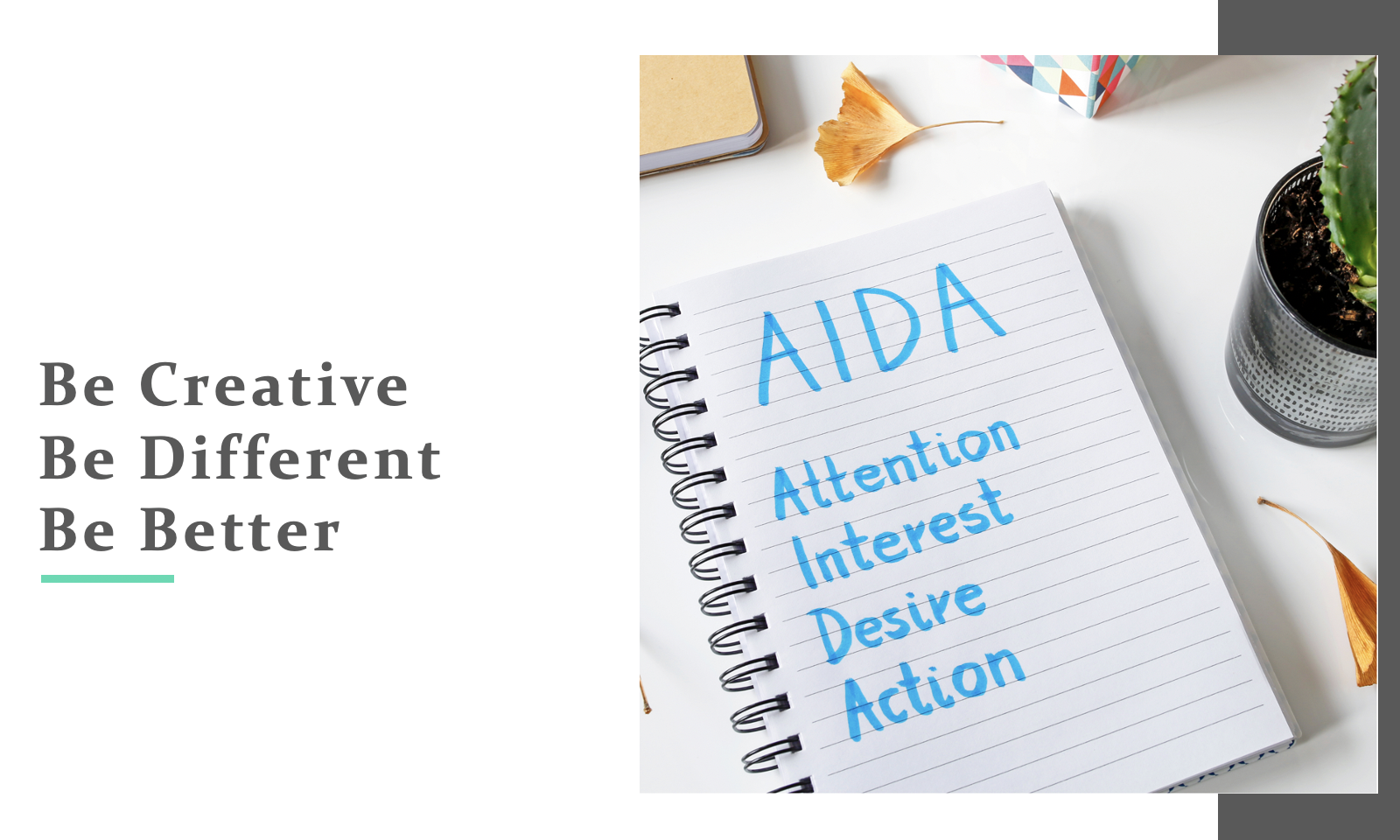
If you’re into marketing, you are likely to know the AIDA process.
AIDA means:
⦁ ATTENTION!
⦁ INTEREST!
⦁ DESIRE!!
⦁ ACTION!!
What should be the goal of your main image?

The main image should be eye-catching and captivating in order to get attention and pique interest!
Number 1 – it should get the attention of the shopper.
Number 2 – it should very clearly explain what your product is.
Number 3 – It should build up interest and curiosity so that the shopper wants to know more about your product.
Number 4 – Shopper clicks on your listing.
Now that the Desire and Action part of AIDA is done, it’s time to take a look at some other parts like product photography, video, and A+ Content. Enough of the introduction, and let’s get started! Before I start, let me tell you the basics of the main image.
Read More:- A Comprehensive Guide to Amazon Listing Optimization 2022
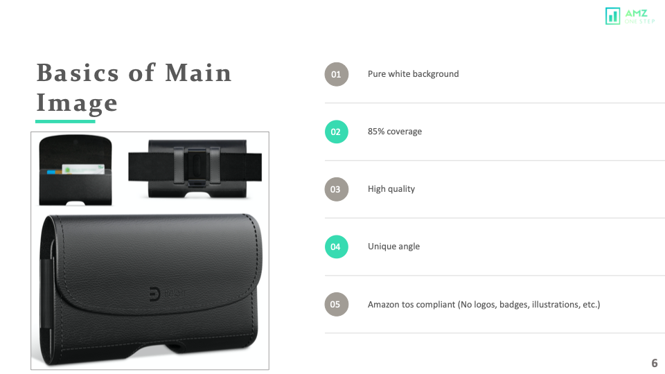
Making your main image stand out from competitors has always been a challenge. Not just for the sellers but also the creative agencies.
But today, we are going deep into the main image strategies, and by implementing these strategies, you will indeed have a competitive edge, and your CTR will skyrocket.
First and foremost, Let’s consider the risk levels of the main image.
Amazon Main Image Risk Factors
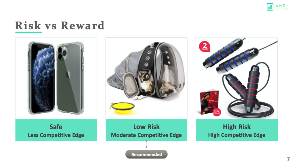 The image on the left is the safest option; It is a pure white background and high-quality image, showing the product in use. And Amazon should not have any problem with it. However, you wouldn’t have any competitive advantage because everyone else will have the same photo style.
Now, the image in the middle is also a great hero shot but we have added a cat in the bag, making it look obvious that this is a cat travel bag. Also, it tells you how big that bag is as compared to the cat.
Finally, the Image on the right has some text and an ebook photo against the TOS. The image in the middle is a much safer option than the image on the right and gives you a competitive edge. We recommend that you stay in this zone where you are safe and also have a competitive advantage.
Images that you see on Amazon that have text or are against amazon ToS, are grandfathered in. Now, Amazon bots catch the text and would not let you upload the image. Therefore, you have to be very careful and creative with your main image.
Read More:- Amazon Split Testing : Stop Guessing What Shoppers Want
LABEL IT STRATEGY!
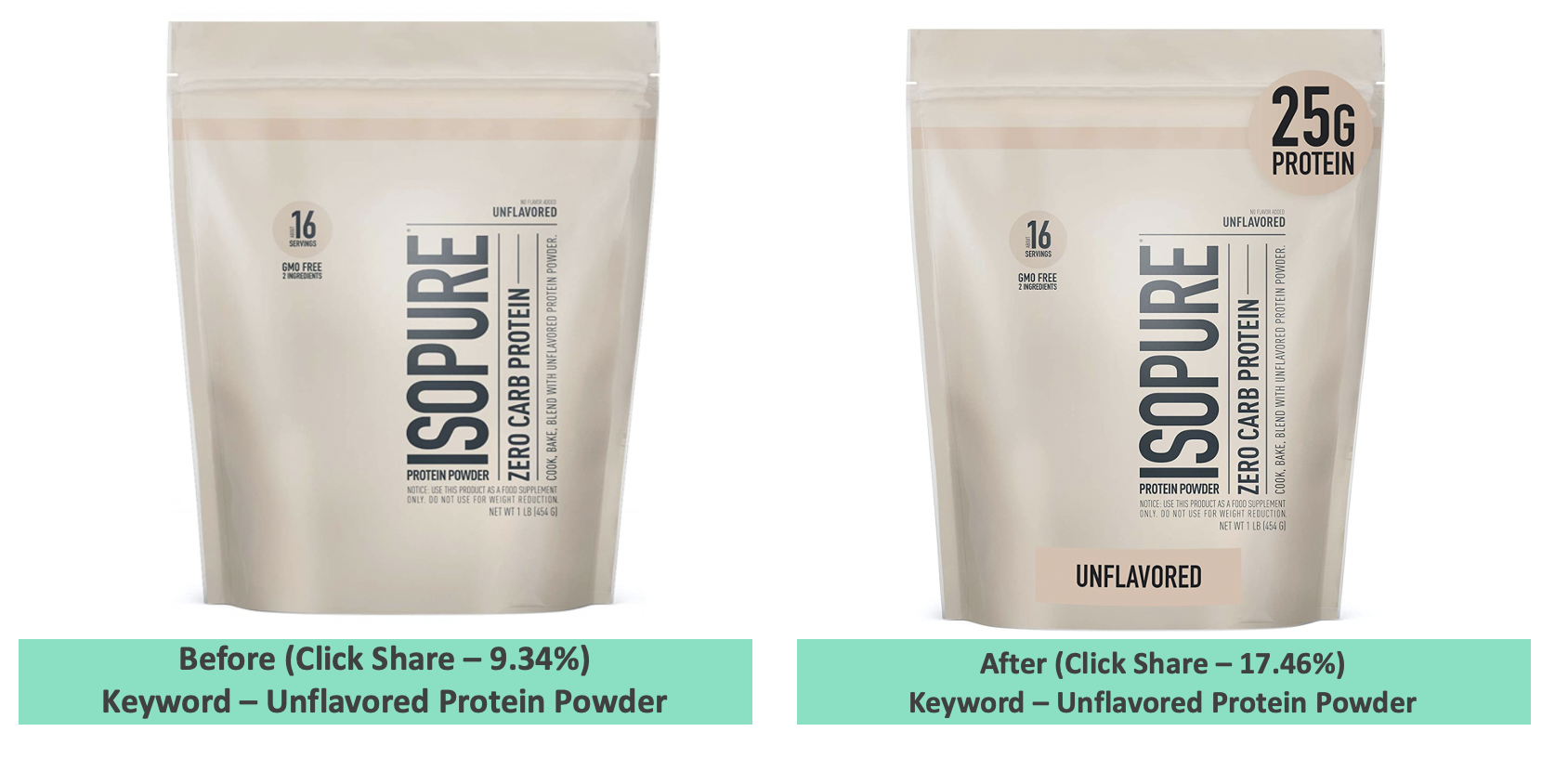
If you look at the image on your left, this is the actual packaging of the brand. Guess what? It wasn’t getting results. What we ended up doing is just adding little labels on the package, 25 grams of protein, and unflavoured because that’s what shoppers want to know about.
Check out the results, the CTR went up from 9.34% to 17.46% on their main keyword. Here is a tip for all those who are starting or launching a new product, try to come up with a packaging design that can contribute to getting more clicks.
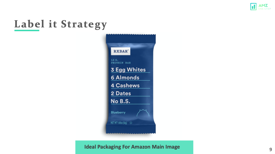
This is the perfect example of great Amazon packaging. However, you might be thinking, my product does not come in packaging or does not have a nice packaging to show. This strategy works for almost all types of products. You just have to be creative.
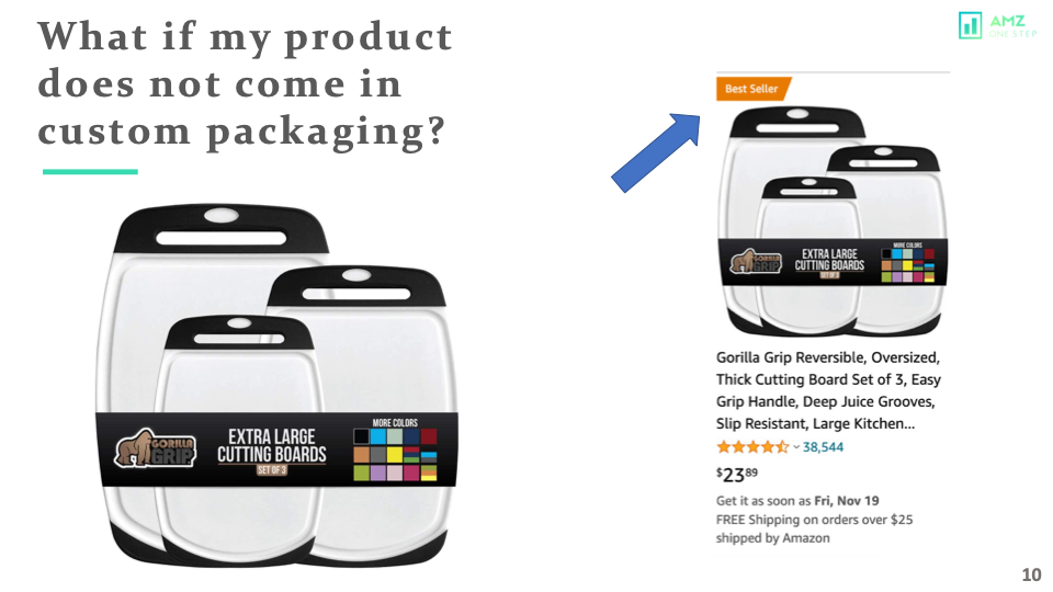
This is a set of three cutting boards and I am sure this doesn’t come like that. The seller has used his clever label placement to make one main image stand out in all its glory. These are the BEST SELLERS!! Let’s keep going because there’s so much more…
Use The Model Strategy!!!
You can’t just provide your product as an explanation of what it is because people might not be interested in hearing about the details. You need to make them see how their lives will change if they buy this, or show off some cool advantages that only come with buying from you! You need more than just your product to capture the attention and interest of potential buyers.
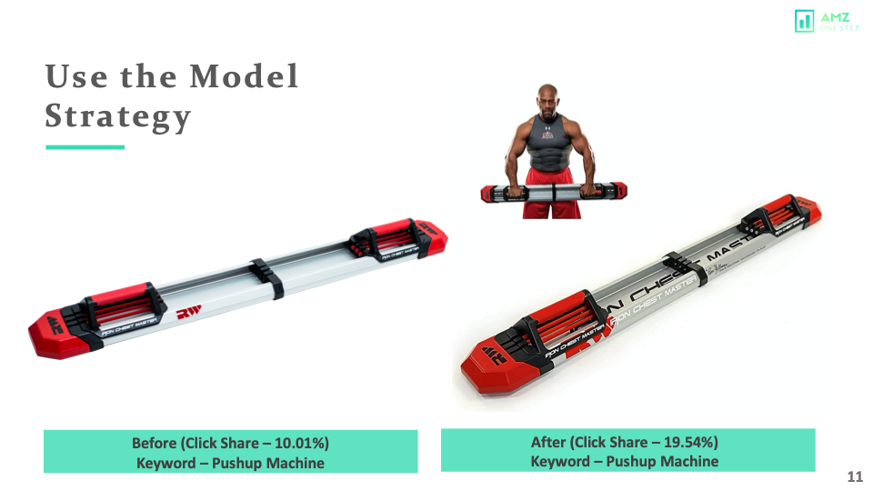
In this case, you can show the model using your product in the pure white background and that can do the trick. Look at this image on your left and how much difference there is when we add a model. CTR went up 10.01% to 19.54% on their main keyword.
What if my product has variations? Is there any strategy to make my main image stand out?
Yes, 100%.
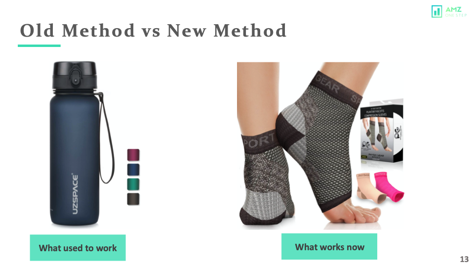
Instead of using color icons, show pictures that illustrate the variation in your product. This is what used to work back then and it’s still a great strategy today!
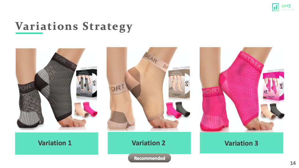
This is how you would design all your variations and it’s already making the main image stand out + showing other colors or variations. Isn’t that awesome?
Kaizen Strategy!
The next strategy is my favorite one. It is called the Kaizen Strategy.
Why?
You may think that you’re doing well with your main image, but there are always ways to improve it. Kaizen strategy means making continuous improvements and updating the content on a regular basis in order not to be left behind by competitors who already know what people want from them.
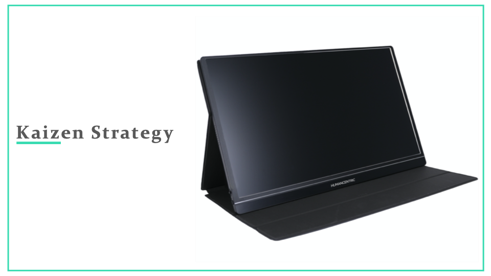
Look at this picture. It’s a masterpiece! The background is pure white and it has all of these cool shadows that make the image pop off your screen. This image has a great background and it follows all of Amazon’s policies.
If we want to make it better, what can we do?
Maybe 3d Render the Image.
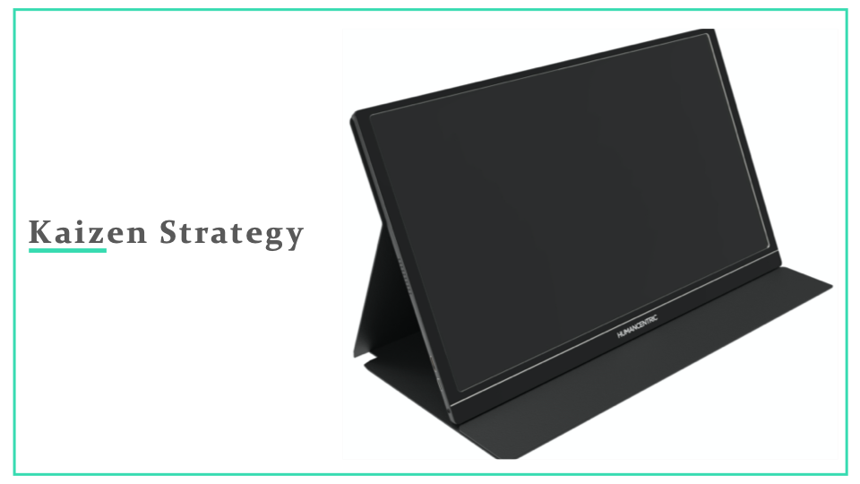
Now that you’ve made the image look so much better, it’s time to brighten up some aspects. 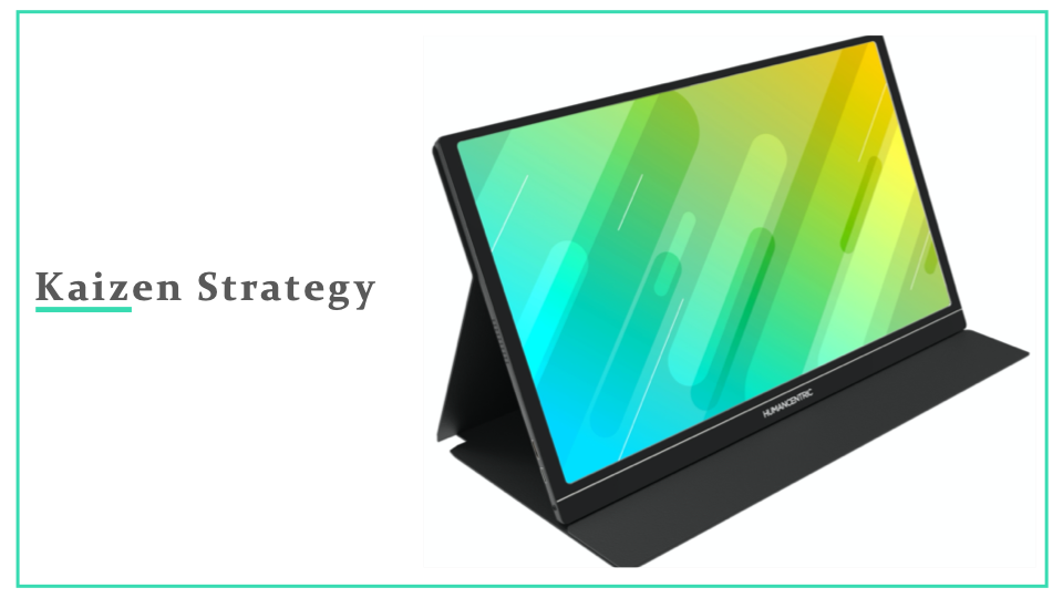
We’ve added a wallpaper that makes the main image stand out and looks 10 times better than its original form. In Kaizen strategy, you always keep working on your main image and how you can optimize to its 100% potential.
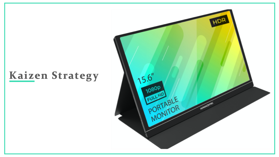
What’s even cooler is that you can use this as an opportunity to add some unique selling points.
“May I show off the improved main image?”
Now, let’s add some unique selling points. Even better right? Now shoppers can take a look at your main image and get additional information that you want to give them in order for their decision on buying from you or not! Pretty cool, don’t you think so too?!
Sky’s the limit!
It’s hard to believe that we can make this any better, but here is our way of further improving the main image.
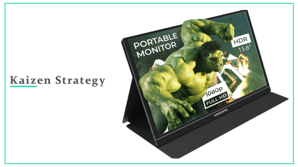
Isn’t that amazing?
How far we have come with this picture. Now, your strategy is always going to be on top of the competition and in first place for success!
In competitive niches, you will notice or might have noticed that once one seller comes out with a great main image, everyone starts copying that idea and the search page looks something like this.
This is why it’s one of the best strategies to use in competitive niches.
Read More:- How to Increase Amazon Conversion Rates: 7 Essential Tips for 2022
Close Up Shots!
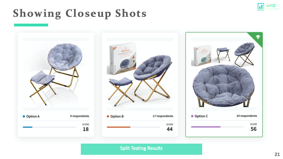
Have a look at these 3 images. We did a poll at our office, and most of the people chose option A or B, but the least amount of people chose option C. When we did a poll on pickfu, the majority of the people chose option C, and the reason was that they were able to see the product more clearly, and that’s why they chose this.
The best way to show off your product is by taking multiple angles on how it can be used. This will make the customer more interested in purchasing because they see all of its benefits! The more angles you show your product on, the better! It’s important to stress how it works for products with multiple functionalities or complex shapes.
Showing More Angles Of The Product!
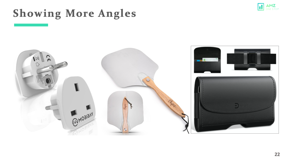
Imagine you are selling these products, do you think one angle of the product will suffice to communicate its features? Of course not, don’t forget about how much other angles can change perceptions. Customers need all the information they can get before making up their minds!
A good way around this is by making sure all aspects get covered – don’t just show off what’s best-looking or most interesting about them! If your product has something like this in store for customers, then it’s time they saw more than just what is on hand!
Well, what if your product has no color or more dimensions and looks boring. What can you do?
Do not worry, I have a solution for this.
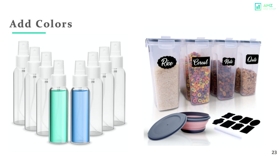
Try Adding Color!
Add color to your photos! Here are some ways that you can do it.
If the idea of having a boring main image isn’t appealing, then get in touch with me. I’ll show how introducing different shades or hues into an otherwise monochromatic background will give them new life without sacrificing originality for creativity – just like these examples below:
Show The Packaging!
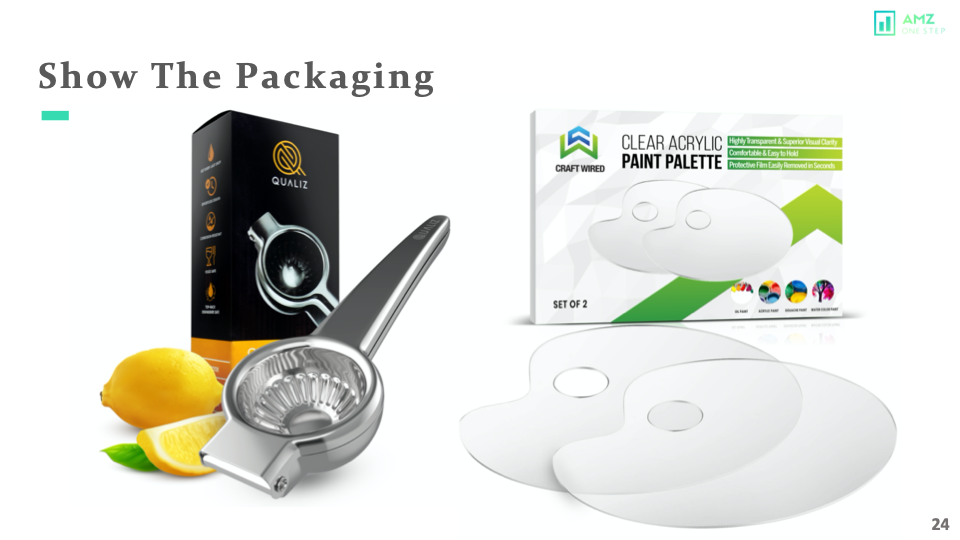
Moving on, If your product comes in custom packaging or a gift box. It is a good idea to showcase that in your main image. It will give the premium look to your product and you can definitely charge more if your packaging looks great. Another great way to get your product image to stand out.
When it comes to packaging and presentation, the way you package your product can have a huge impact on how much money people will spend with them. If the box is designed beautifully or if there’s some kind of special feature like an envelope insert that makes unboxing feel luxurious- then customers are more likely willing to pay more for whatever they get in return!
3D Rendering!
If we are talking about the main images, we can not miss 3D renders.
3D renders are getting popular and it’s one of the best solutions for reflective, transparent, or plastic products.
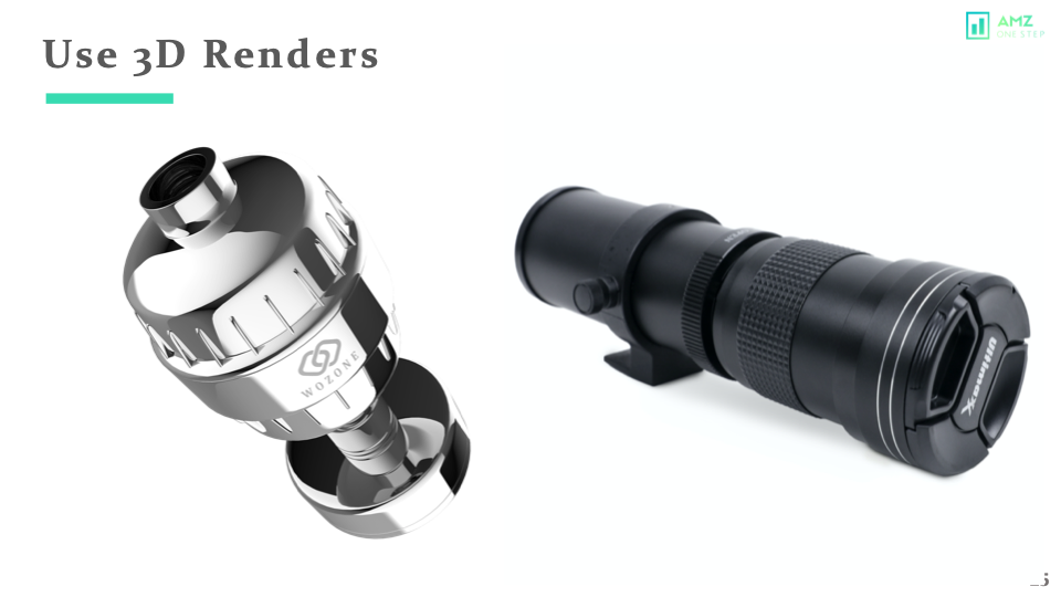
Some niches rely heavily on this technique so you will have no choice if your product has to compete at that level but go with 3d Renders instead of regular photography because they can get any angle otherwise it won’t be possible. Take a look at these beautiful images captured by professional photographers and edited by expert graphic designers who use their skills wisely!
3D renders are getting popular and are definitely one of the best solutions for reflective, transparent, plastic products.
Disclaimer:– 3D renders may look fake if they are done incorrectly.
If you need more information on 3d rendering, I will add a link in the description.
Show All Contents!
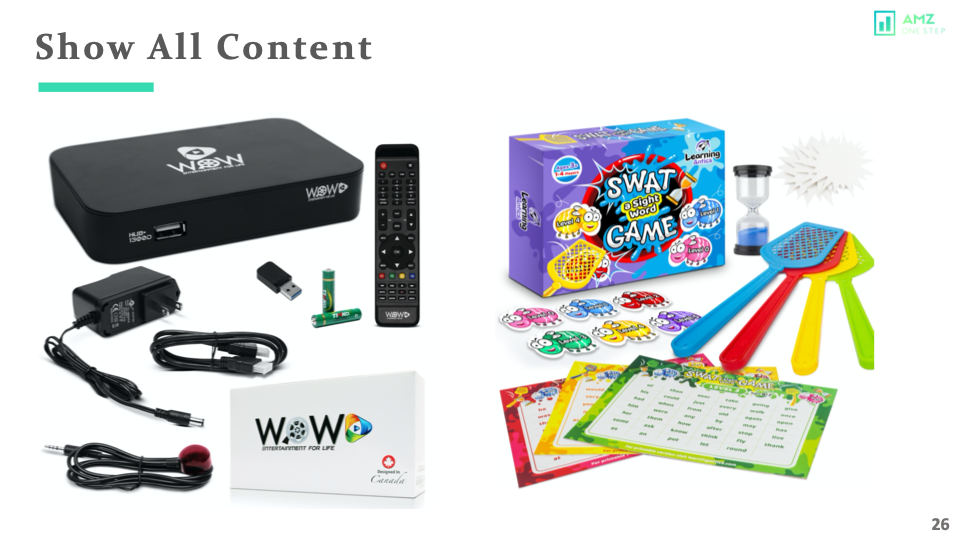
Let’s say if your product comes in multiple pieces or in a bundle. Showing all contents is a great way for your main image, but it needs to be laid out nicely. You can show off your product in all its glory by using a single image with an eye-catching main plot. If there are multiple pieces or parts to it, make sure you fill up as much space on the box itself so people know exactly what they’re buying!
Check out these two examples; you can see what comes in the package.
The design is very sharp and fun with a good layout that fills up as much space as possible!
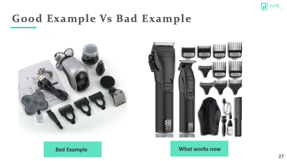
Now, look at these two different images.
The first one is done nicely but it’s nowhere near the second one, which has incredible lighting and coloration to make an awe-inspiring piece of art from what could have been just another picture of your product or service on Amazon! The image on the left is done nicely, but it is nowhere close to the image on the right. For Amazon, you just don’t need good photography, but you also need good editing.
Product in Action!
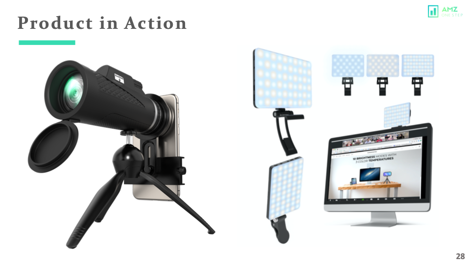
Last but not least however significant one, show your product in action. The product picture is not enough to explain what your product is or does. Showing it in the main image will give you a competitive advantage.
Showing your product in action is the best way to demonstrate what it does. The pictures speak volumes, but showing people how they can benefit from using that specific service or item really drives home. It tells why you’re so confident about these products! It gets the attention, and only relevant and interested people will click on your listing.
If you look at the image on the left, it is like a scope for a cell phone. Without the cell phone, it would have been difficult to understand what that product should do.
The image on the right is showing the product on the monitor, making it very obvious that it was made for monitors vs thin laptops.
Also, this image is also showing 3 different light settings and different shapes. This product can be used in the same image.
Split Testing!
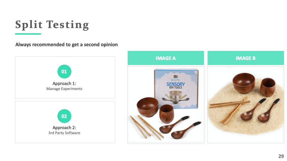
I would highly recommend doing a split test on your main images. No matter how great your images look, split testing different concepts can help you make better decisions. Even a few percentage increases in CTR can be a game-changer. Even a small increase in CTR could be worth it for businesses who are looking to get ahead of their competition by implementing these strategies early on rather than waiting until the last minute before launch time comes around again…
You can use an Amazon native tool called Manage Your Experiments or a third-party tool for instant results.
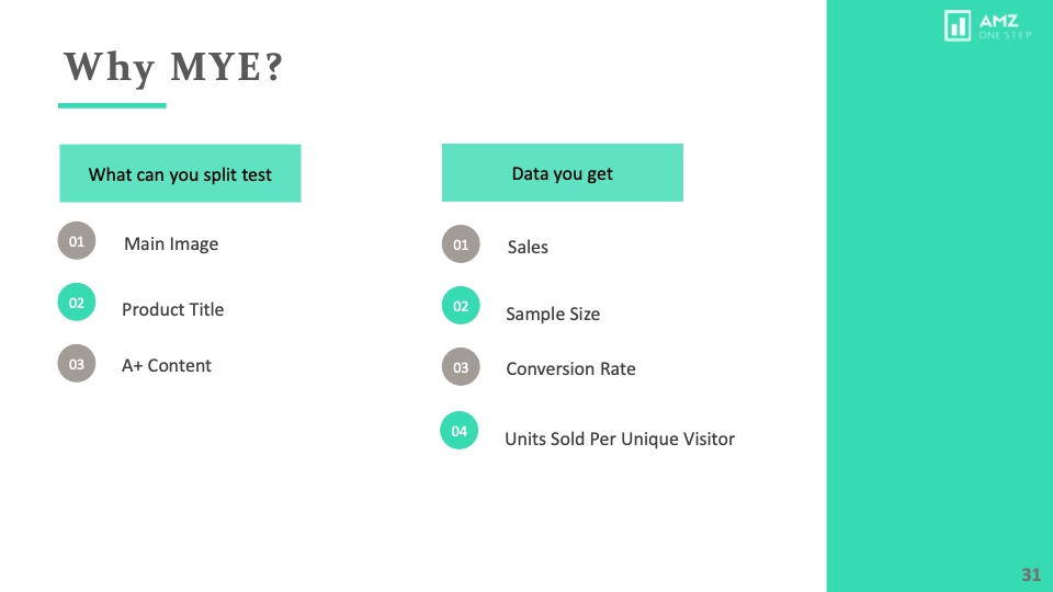
In MYE, you can split test A+ content and your title along with the main image.
You can use different metrics like Sales, Sample Size, conversion rate, and units sold per customer.
I think that’s really important.
We have a blog on split testing that I will link below.
MYE is available for brand registered sellers and you have to check first if your ASIN is eligible or not.
Use Brand Analytics!
There is one more cool way to find out what listings are getting the most amount of click share. It is using brand analytics.
Search for any keyword and choose the duration. 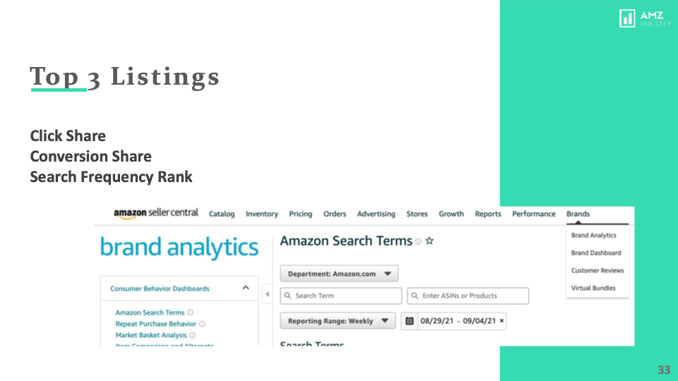
You will be able to see the top 3 listings that have the most click share and conversion share.
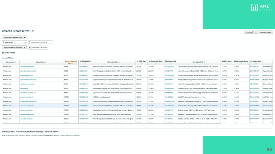
This will give you a really solid starting point on how your main image and overall listing should look like.
Conclusion!
Amazon’s main image optimization can make or break your listing. Although some of the strategies might get detected by the bots, It is a good idea to have a safe image as a backup.
Understand Amazon’s main image requirements and be creative with them.
I hope this was helpful. If you have any questions, please feel free to reach out to us at [email protected] or request a free audit.
If you need any help with your Amazon listings, schedule a call with one of the team members using this link.

Kamaljit Singh is the Founder and CEO of AMZ One Step and a former Amazon seller. Kamaljit has been featured in multiple Amazon podcasts, YouTube channels. He has been organizing meetups all around Canada and the US. Kamaljit has over 350,000 views on his Quora answers regarding FBA. Kamaljit also founded AMZ Meetup where he organizes conferences for Amazon sellers.
