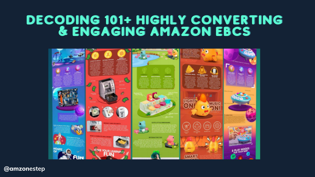
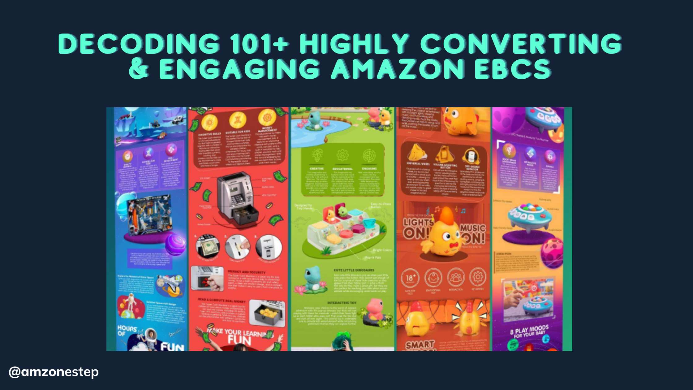
A Comprehensive Guide for Higher Conversions.” In this Ebook, we delve into the transformative potential of EBC on Amazon. By combining persuasive visuals, problem-solution alignment, and strategic storytelling, EBC empowers sellers to captivate their audience, drive higher click-through rates (CTR), and boost the unit session percentage for increased conversions. “After extensive research and analysis of over 25,000+ EBCs from top-selling brands, a consistent pattern emerges. By studying these successful EBCs, you can uncover the proven strategies that drive conversions and apply them to your own listings.”
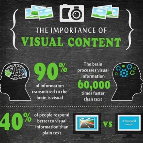
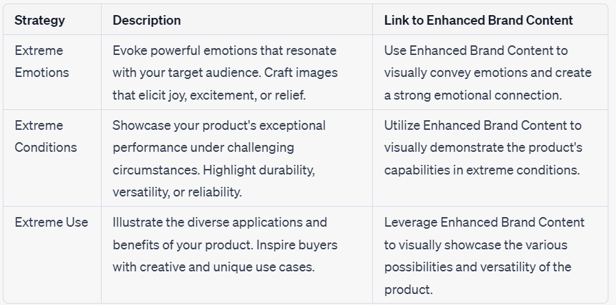
“The human brain is naturally inclined to process visuals at an astonishing pace, absorbing visual information up to 60,000 times faster than text alone.” Leveraging this cognitive advantage is vital when creating lifestyle images for your EBC. By utilizing the following three strategies, you can unlock the full potential of your listings. This not only drives click-through rates but also improves the unit session percentage, leading to higher conversions and increased sales.
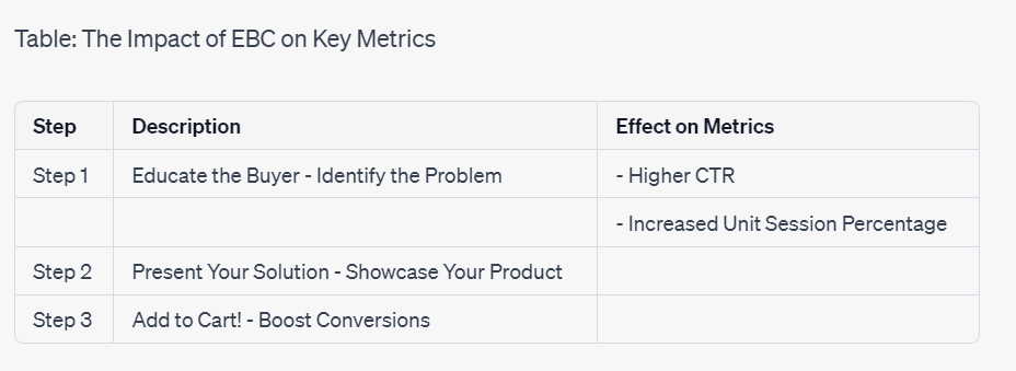
Step 1: Educate – Identify the problem:
Utilize Enhanced Brand Content (EBC) to educate buyers about their pain points and clearly highlight the problem your product solves. Engage them with compelling visuals and descriptions that capture their attention and increase click-through rates.
Step 2: Showcase – Present your solution:
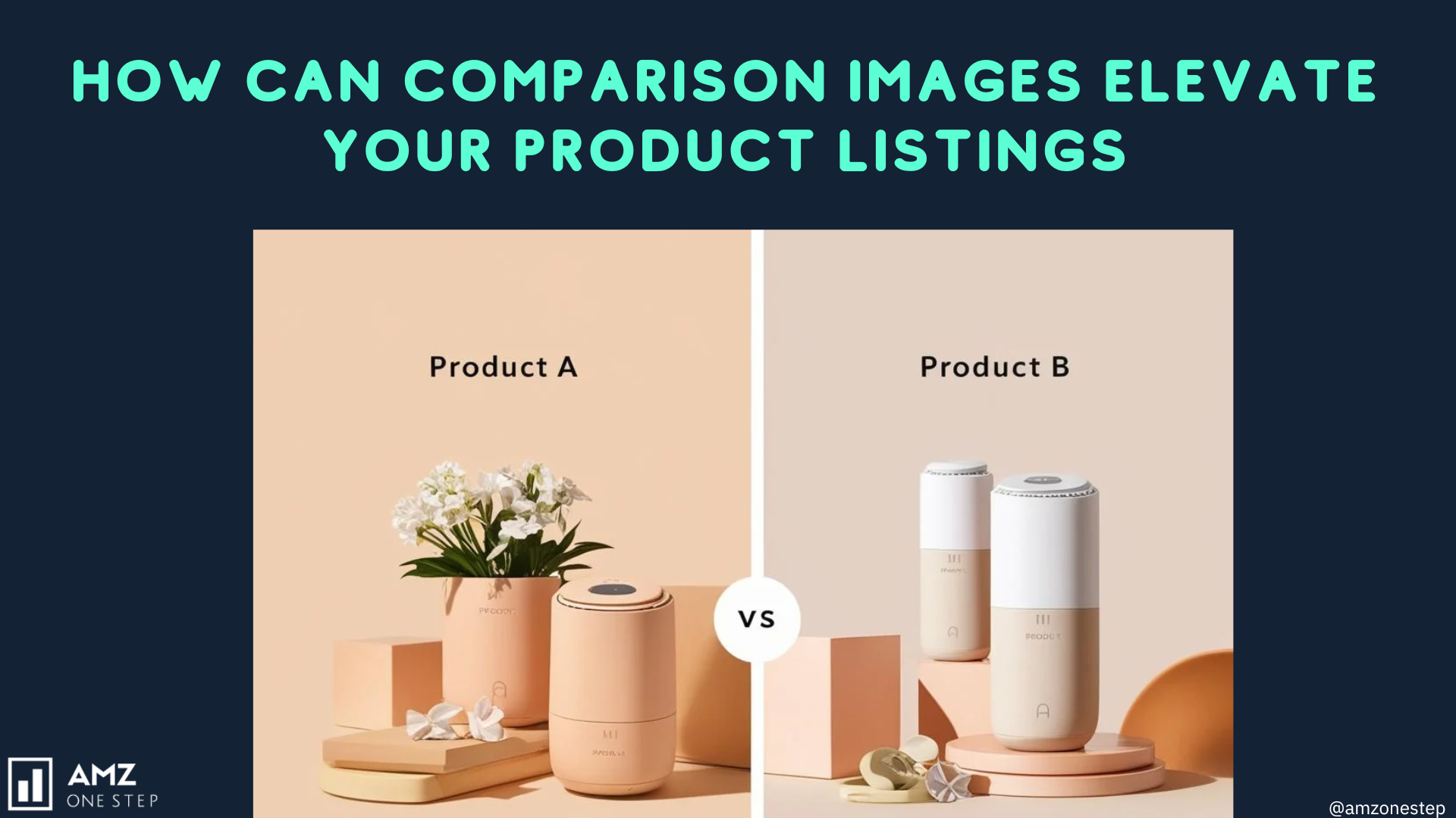
Leverage EBC to showcase your product’s unique features, benefits, and value proposition. Utilize high-quality images, infographics, and comparison charts to create an immersive experience that convinces buyers to explore your listing further.
Step 3: Convert – Inspire action, boost conversions: Craft persuasive EBC content that evokes emotions, demonstrates extreme use cases, and conveys the exceptional value of your product. Through powerful storytelling and compelling visuals, inspire buyers to visualize themselves benefiting from your solution, leading to increased conversions and improved sales performance.
Do you know the differences between A+ and A+ Premium Content? If not, you can review this table.
| A+ Content | A++ Content | |
| Cost | Free | Paid, Costs Thousands of Dollars |
| Access | Available to Vendors and Sellers Registered in the Amazon Brand Registry | Access by invite-only |
| Modules | 5 and 7 Module Layouts | 7 Modules Per Page |
| Image Width | 970 pixels wide | 1464 pixels wide, full-page width for images/videos |
| Suitable For | Products needing a more textual description | Products with premium visuals |
| Character Count | More Lenient | Made to Reduce Character Count |
1.
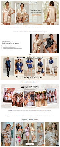
It is a premium EBC with different modules and high-definition images. There are several dynamic elements within the EBC. However, the one that stands out the most is the combination of videos and photos. The EBC is filled with professional models in different settings. Infographics are unimportant when you can charm the viewers with such striking visuals. All the models look beautiful in real-life images, which helps viewers to envision themselves in the same position.
Link to the Listing: https://www.amazon.com/dp/B0BLNJN21W/
2.
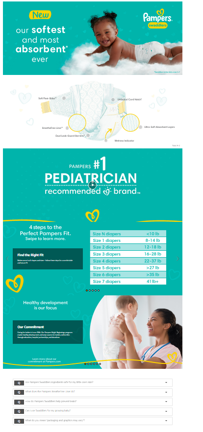
The first visual is incredibly striking and engaging. The baby is lying on a cloud while smiling, conveying that the product is soft and absorbent. It is such a creative idea with a smooth execution. The infographics, video, and size guide provide essential information. There is also a Q&A section at the end that addresses frequent queries.
Link to the Listing: https://www.amazon.com/dp/B010OVZO64/
3.
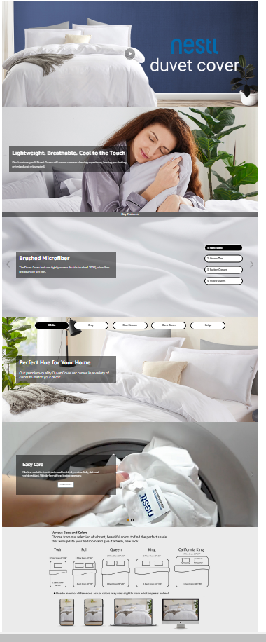
The premium EBC starts with an engaging product video. After that, several infographics are covered in the sliding banners. The size and color guide at the end helps the viewers to know what they need for their bed. It is simple but dynamic and visually pleasing.
Link to the Listing: https://www.amazon.com/dp/B01B87TMOS/
4.
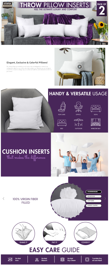
The pillows are neatly assembled on the sofa in the living room. A video and three infographic modules follow this initial module. They provide information with concise visuals. The consistent purple and white theme reinforces the brand identity. Even the blanket behind the pillows is purple, which matches the theme.
Link to the Listing: https://www.amazon.com/dp/B07N7GDB6Q/
5.
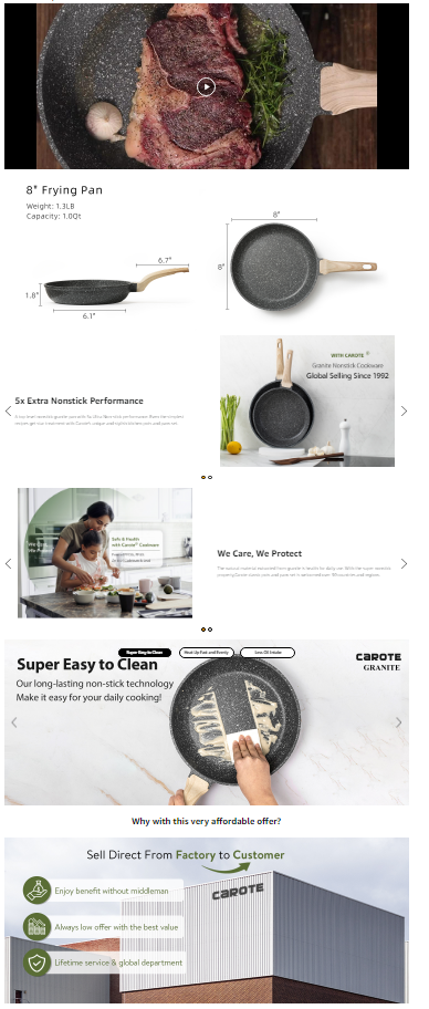
This premium EBC starts with a video to hook the viewer. The dimensions and features are covered in white background modules. The dynamic sliding module covers three product features, showing several images. It conveys product features with striking visuals.
Link to the Listing: https://www.amazon.com/dp/B0732NXYNS/
6.
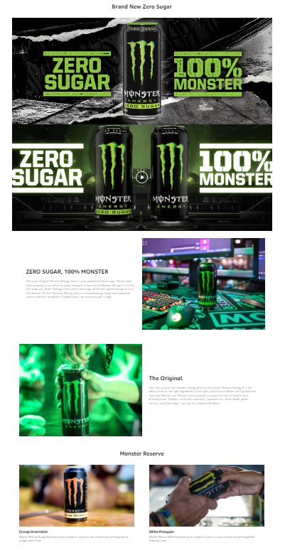
The seller has adeptly leveraged the significant popularity of their brand by incorporating the product itself as a prominent logo. This strategic branding decision reinforces the brand identity and strengthens its recognition among consumers. The emphasis on the zero sugar aspect is consistently highlighted throughout the EBC, underscoring its unique selling proposition.
Link to the Listing: https://www.amazon.com/dp/B0BJX5VNVF/
7.
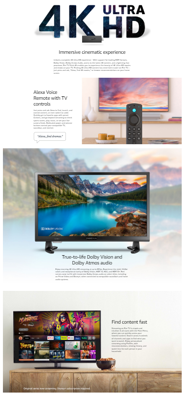
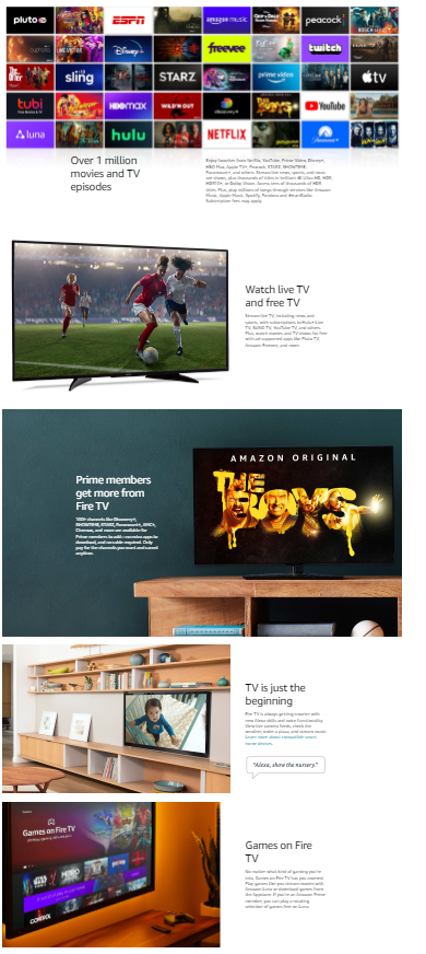
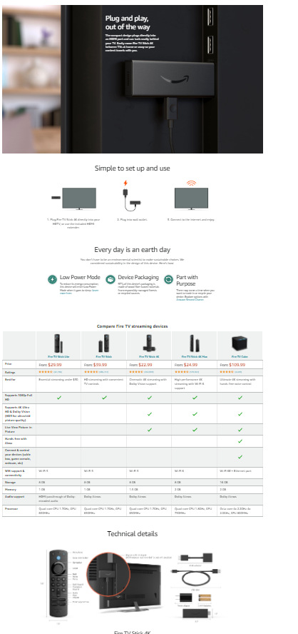
These three images show how much information can be packed into a premium EBC. It is the best choice for a technical product that requires extensive explanation and several lifestyle images. The premium EBC started with a visual that shows all the channels, apps, and services that can be used with the product.
Link to the Listing: https://www.amazon.com/dp/B08XVYZ1Y5/
8.
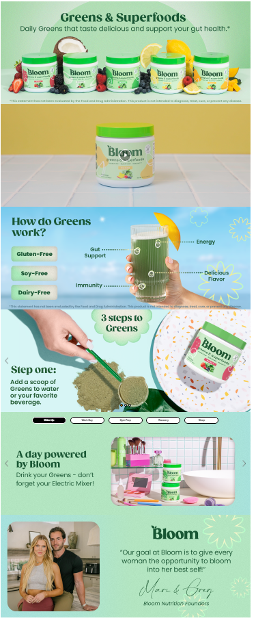
The primary ingredient of every flavor is placed alongside its box. It is a visually pleasing infographic that increases transparency, reinforcing the perspective that the product contains natural ingredients. The second last module shows different supplements for each purpose. The viewer can move the slider and find what they want according to their problem.
Link to the Listing: https://www.amazon.com/dp/B0B3D6TMKS/
9.
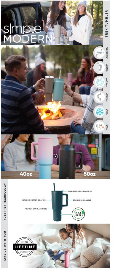
The EBC showcases the product’s versatility and functionality through several outdoor settings, emphasizing its ability to maintain beverage temperature in various conditions. The visuals depict the ease of portability, demonstrating how effortlessly the product can be carried and taken anywhere.
Link to the Listing: https://www.amazon.com/dp/B0BHBP1X1B/
10.
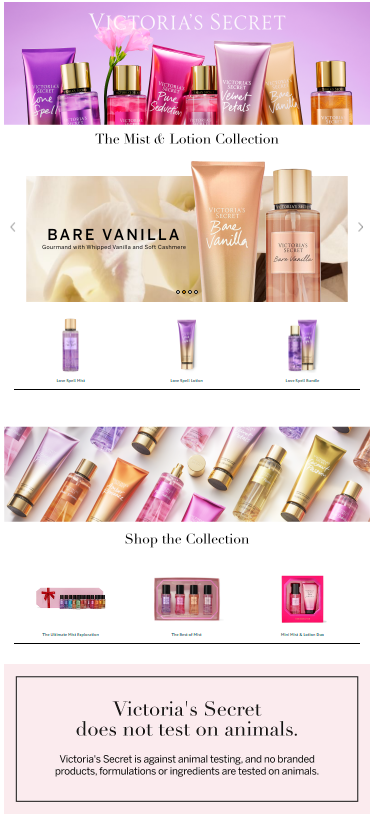
The product line is presented in an aesthetically pleasing composition, significantly enhancing the visual appeal. Different collections are shown in the EBC to lure viewers towards other products. The final module of the EBC communicates the brand’s firm stance against animal testing.
Link to the Listing: https://www.amazon.com/dp/B01687MKEM/
11.
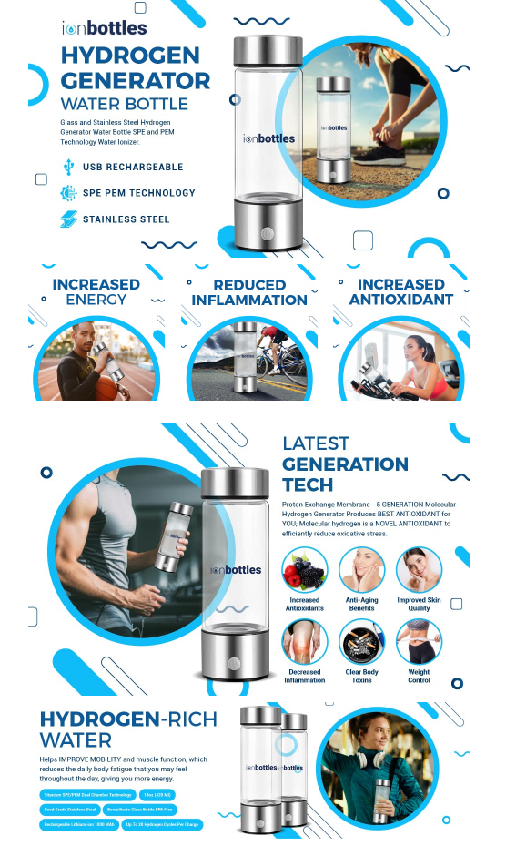
This visually stunning EBC effortlessly showcases essential features in module 1 while masterfully highlighting key benefits in module 2. Though slightly repetitive, the striking visuals powerfully communicate the product’s advantages, captivating consumers with its aesthetic appeal and informative content.
Link to the Listing:https://www.amazon.com/dp/B0964C3JKW/
12.
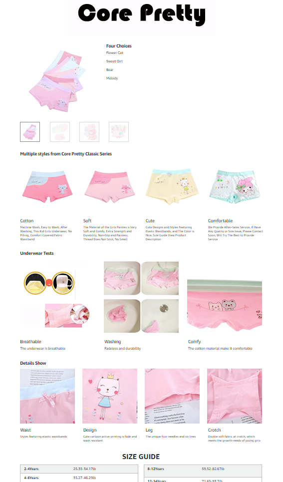
This EBC focuses primarily on conveying the comfortability of the product. All product variations are shown alongside their features. One of the modules also shows how easy it is to wash the product. The zoom circles and size guide provides essential information to customers. Overall, it has clean visuals that concisely convey information.
Link to the Listing: https://www.amazon.com/dp/B07RWD4MLG/
13.
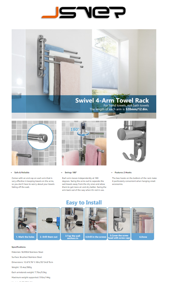
The product is placed in a real-life setting, providing an appealing visual reference to viewers. In the third module, infographics with zoom shots and graphics editing highlight the product features. The 180-degree image visually demonstrates its unique functionality, helping potential buyers to see its differentiation in action. Lastly, the detailed easy-to-install photos are informative and helpful in installation.
Link to the Listing: https://www.amazon.com/dp/B087BTWR4V/
14.
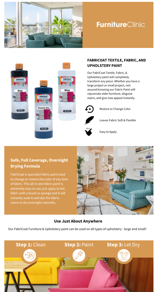
All product variations are placed alongside each other in the second module, allowing buyers to look at all available options. It also follows the rule of thirds, utilizing maximum visual space. Easy-to-understand instructions are presented in a visual, simplified manner. The visual references also show how the upholstery will look, helping buyers to envision the result.
Link to the Listing: https://www.amazon.com/dp/B094R46PT9
15.
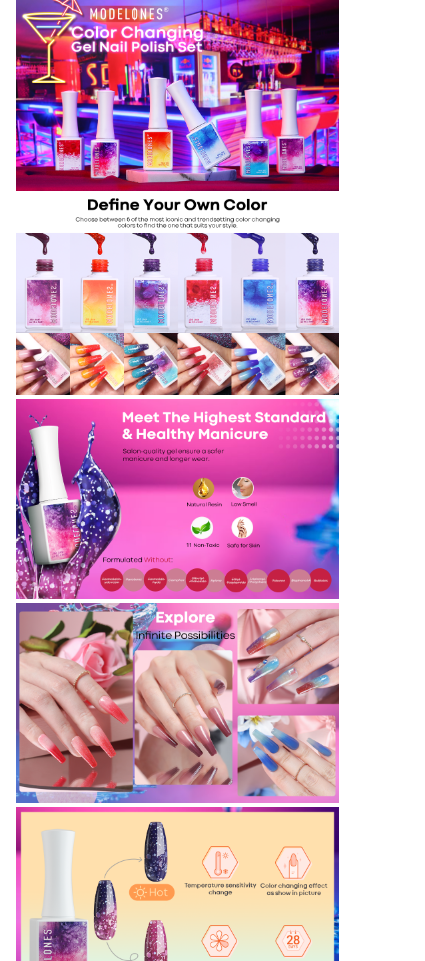
The vibrant multi-colored background in the first module communicates the multi-colored nature of the nail polish. The presence of colored nails serves as a visual reference, vividly portraying the appearance achieved by using the product. The 3D-rendered representation of the nail polish in the third module, accompanied by artistic splashes surrounding it, exudes an aesthetically pleasing allure.
Link to the Listing: https://www.amazon.com/dp/B087M24D81/
16.
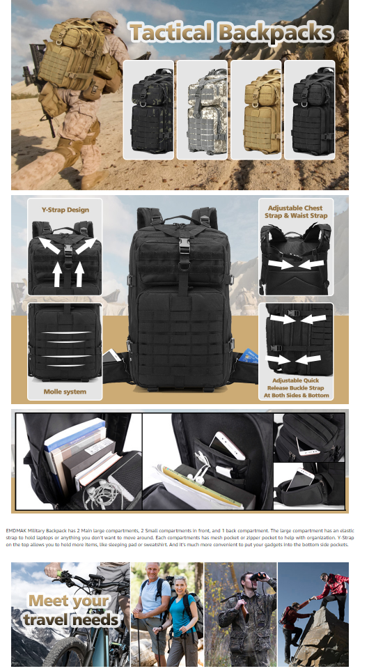
The background with the soldier is a great visual reference, showcasing the “tactical” nature of the product. Buyers usually envision the military or a battlefield when they read the word tactical. Hence, the background meets their expectations. The informative close-ups highlight product features and benefits. The fourth module shows that it is suitable for everyday items, while the adventurous settings in the last module showcase its outdoor usability.
Link to the Listing: https://www.amazon.com/dp/B088KCG2NG/
17.
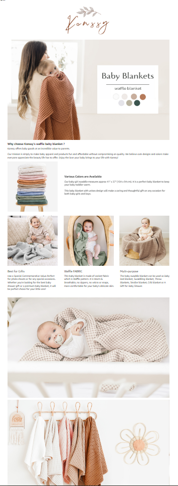
The first module shows a baby cradled in a soft blanket. This captivating visual evokes a sense of soothing tranquility, helping buyers to envision their baby in the same position. The stacked product variations in the second module allow buyers to look at all colors and variations. The charming lifestyle images with adorable babies elicit a strong emotional response, leaving a lasting impression.
Link to the Listing: https://www.amazon.com/dp/B0BQBMBNKC/
18.
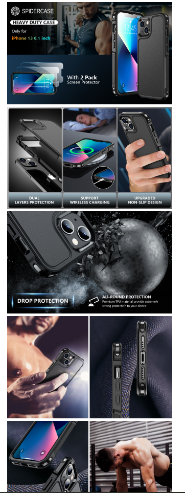
The exploding visuals in the first and second modules convey information about the multiple product layers. The collision of the case with the wrecking ball showcases the product’s durability, while the top and bottom views show that it provides easy access to all ports. These visuals are highly engaging and informative.
Link to the Listing: https://www.amazon.com/dp/B09FJDTX41/
19.
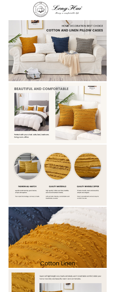
The rule of thirds is followed in the second module as different color variations are placed in the frame in a lifestyle setting. Product close-ups highlight the high-quality fabric, impressing buyers and affecting their buying decisions. The product is placed on a bed and sofa, demonstrating it can be used in many settings.
Link to the Listing: https://www.amazon.com/dp/B07R7M35LF/
20.
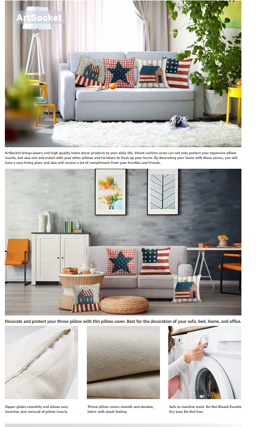
Every variation of the product is placed on the sofa, creating a pleasant visual, while allowing potential buyers to look at all variations in the same EBC. The aesthetic living room setting is helping the product to shine in this setting, highlighting its lifestyle benefits.
Link to the Listing: https://www.amazon.com/dp/B08P8BPP68
Want an EBC that stands out? Book a strategy call. Our experts will help you craft the best EBC possible!

Hi there! I’m the content marketing and branding specialist for AMZ One Step. I work hard to create engaging and informative content that helps our readers learn more about Amazon selling and how to make the most of their businesses. I love spending time with my family and exploring literary works when I’m not writing or working on projects.
