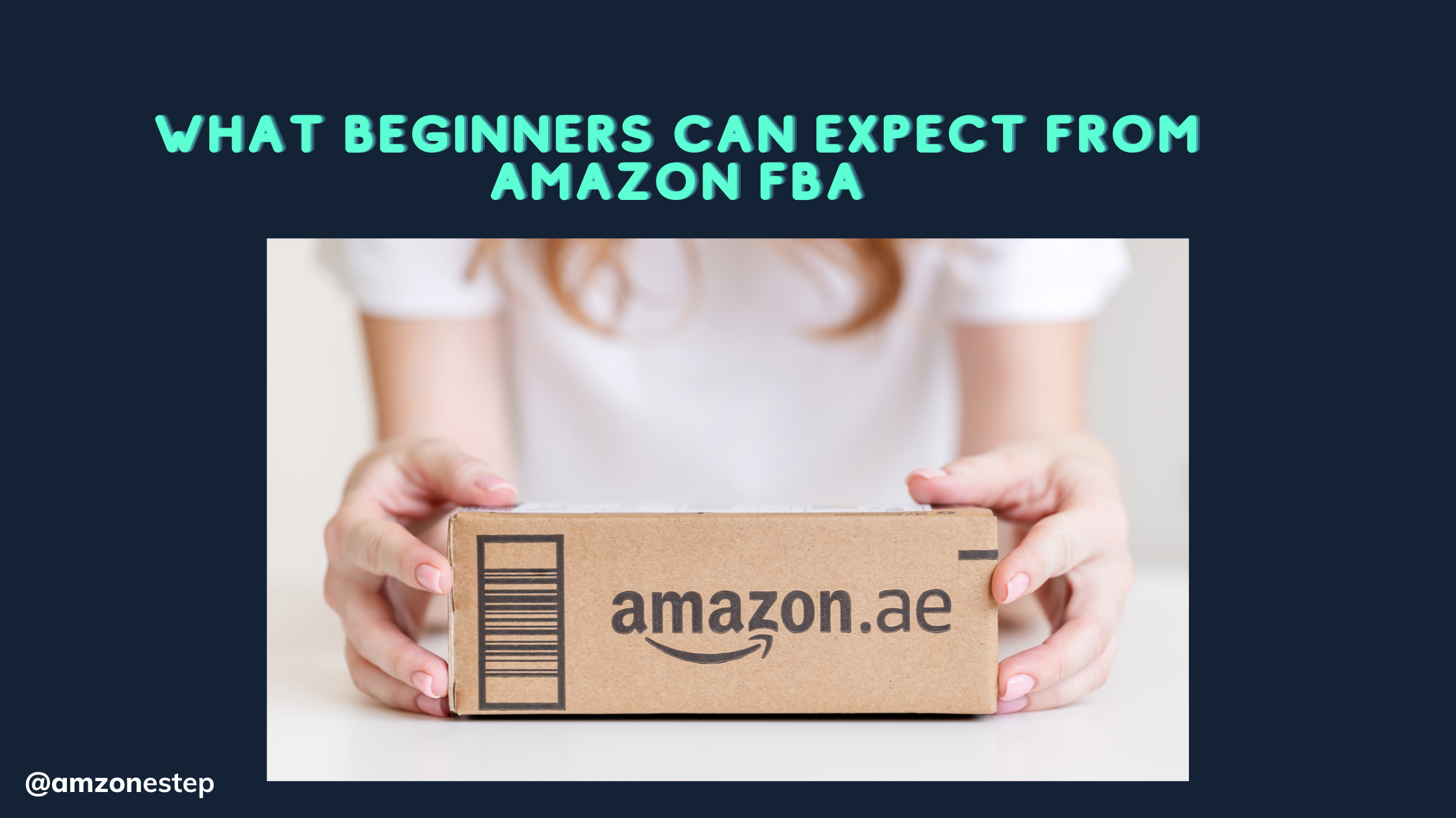

The Amazon marketplace presents an extremely difficult challenge to stand out from other competitors. Users across Amazon use fast visuals to choose between numerous items and make well-informed buying decisions.
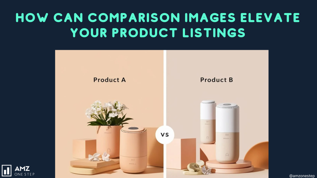
The combination of visual aids through Amazon comparison images presents a major advantage to Amazon FBA sellers in the marketplace. Through clear presentation of differences and advantages and leadership attributes your images make customers identify your product as the superior choice instantly.
Correctly implemented Amazon comparison images create immediate attention which leads to both higher credibility in your listings and more conversions along with separate listing positioning.
The time has come to convert undecided shoppers into devoted customers. Your product listings can reach higher heights through well-planned comparison images.
Explore More: How To Supercharge Amazon CTR for Your Unique Product Listings
Table of Contents
Make the Design Simple and Neat
It should not be very difficult for you to figure out the easy comparison image. Amazon shoppers make purchasing decisions in a snap, literally, given they make purchasing decisions in seconds after viewing a product listing.
Too much text, flashy graphics and distracting background in your comparison image make it hard for buyers to pick out the important differences between your product and the others.
It is about maintaining only the needed information in a structured manner to create a clean design. For instance, if you are selling a stainless steel water bottle, you have three main points that you could beat compared to: durability, insulation time, and leak proof design.
- Take away long descriptions under each feature and just simply write short, direct text like ‘Keeps Water Cold for 24 Hours’ instead of ‘Using high quality insulation our bottle keeps water cold for the whole day.’
It also makes the file more readable with a structured layout. Sections should be evenly spaced, and comparison points should be visually different from one another.
The best side by side layout works best in this case as shoppers will be able to quickly differentiate between two products. Place no more than a few elements into a single image at once, so as not to overload the viewer.
- For instance, if you are comparing your water bottle to a plastic alternative, your comparison image should be so clear that there is visual cue on how different they are.
- For instance, after dropping both a dented plastic bottle and your undamaged stainless steel bottle, you could show a real life image of the bottle on your left. Text based comparison of these graphs is much less effective than this kind of visual storytelling.
Also, try to stay away from colors, shadows, or decorative fonts that decrease the readability. Go for a minimalist design, use the white or light colored background where the product and the key text should easily be focused on.
High Quality Image for Professional Look
High quality images are associated with high quality products. It’s important that your comparison image is not blurry, pixelated or has low resolution product photos because it reflects unprofessionally and your brand as an unreliable one.
Good images to communicate makes a customer feel that they can trust and also feel more credible which will persuade them to choose your product above a competitor’s product.
Make sure you always use high resolution product photos of your comparison images in order to look professional. Using your own professional product shots instead of stock images is the preferable course.
- Take the screen protectors for a smartphone as an example; their comparison images will include close up, high resolution photos of two phone screens (with and without the protector). There should be a visual difference in clarity, brightness and sharpness to the buyer.
Image quality also depends on lighting. Well-lit images showcase the details of your product more effectively. When photographing your own products, use natural lighting or a lightbox to take the shadows out of your image and have evenly distributed lighting throughout the image.
Image format and resolution is another vital thing in keeping a professional look. Amazon suggests that images have at least 1000 pixels on the longest edge so that the zoom works properly. A comparison image should include all elements that are sharp and legible even when zoomed in.
Lastly, don’t use heavily edited, unrealistic visuals because this can have customers think they’re misled. When your product is a kitchen knife, don’t show a metal cut if your knife is not made for this. False or overly hyped visuals can result in disappointed customers, bad reviews which would hurt your products reputation.
Explore More:How Can You Optimize Amazon Product Images for Related Items and Sponsored Placements?
It’s Important To Highlight Key Differences You Have That Matter To Buyers
When creating a comparison image it should not be remembered to make comparison on the characteristics influencing the buying decisions. However, some Amazon FBA sellers often make a mistake of including details that matter little in the buyer’s choice.
So for instance, if you are talking about the ergonomic office chair, do not say ‘it comes in various colors’, because it is a matter of personal preference. Instead, highlight differences in:
- Lumbar Support: Is lumbar support adjustable in your competitor’s chair, which they don’t do otherwise?
- The chair material quality: Do you have a breathable chair mesh, that you don’t? Some are made from cheap fabric.
- Weight Capacity: The amount of weight the chair can support often determines its durability, especially when it comes to a longer period of use.
Shoppers don’t want to just see real benefits, but rather, they expect real benefits that matter to them as they use products in their daily life.
- For instance, if a better lumbar support available in your chair alleviates the back pain, share the comparison image of a user sitting on your chair with the proper posture and compare this to your competitor’s chair in which the user is not comfortable. Marked improvements in user experience are easy to articulate in comparison to a simple textual depiction on how your product makes a difference.
Also, side by side numbers or statistics help the customers understand the superiority of the product. An effective comparison image for your product, if it were a portable charger, could look like:
- Your charger: 20,000mAh – Charges Phone 5x
- Competitor: 10,000mAh – Charges Phone 2x
Since these numerical differences are clear, shoppers can easily tell why your product is the better choice.
Explore More:What Amazon Resources Empower Amazon FBA Brands?
Contrasting Colors Are Better For Better Readability
Color contrast is critical when designing Amazon comparison images. Choosing the right colors helps to highlight important product features and thereby make it easier to read for the buyers.
Readability is achieved with white text on a black background or with dark text on a light background. Bold, contrasting colors such as red and green can be used in a strategic manner as well. An example is to use:
- Green checkmark for strengths
- Red cross for weaknesses
In doing so, this instantly communicates which product has better values. Comparing your earbuds which have 20 hours battery life with one of your competitors which most probably has 8 hours of battery life in either bold text or green and red highlights will assist shoppers in making a decision in less than a second.
Nevertheless, avoid vivid neon colors and rich backgrounds that will impede readability. Use professional, Amazon approved colors such as:
- White or light gray backgrounds
- Black, blue, or dark gray text for clarity
- Green for positive features, red for disadvantages
The most crucial component of your comparison image should be a well-balanced color scheme that ensures the important points in the image are easily usable without distracting the viewer from your product.
Use Check Marks and Crosses to Simplify Comparisons
It is quite common for shopping clients to make decisions in a matter of seconds after seeing a product listing. To communicate your product’s benefits quickly to the client, one very effective way to achieve this is by using green checkmarks (✅) and red crosses (❌) in a comparison image.
This way of doing product comparisons very simply demonstrates how you are a better provider than your competitors thus making it easier for a customer to decide on something to buy.
- For example, suppose you offer a robot vacuum; a comparison picture may include the main functional differences of self-charge capability, HEPA filter inclusion, and runtime. What do you think about a simple yet effective design like “Self-Charging: ✅ | Competitor: ❌” and “HEPA Filter: ✅ | Competitor: ❌” with a straightforward layout? Online buyers usually browse rather than read every word, so such a straightforward visual format is meant to understand at a glance.
To reach the desired outcome, it’s essential that the written content is larger than or at least equal to the font size of one “capitalized” typeface, in capital letters. The distinctiveness of being “bold” will be mainly in its physical dimension.
The reason for requiring such a big font is that people usually do their Amazon-related work on their mobile phones. The readability factor thus remains a critical factor.
Firstly, you should care that the difference between your text and symbols and those of your competitors are their smallest and recognizable proportions, don’t you think?
People will not send this part of the process directly to the product page if it is too small. In addition, enhancing the clarity of differences using clean and uncomplicated designs is the other side of the “comparison” sword, proceeding to the purchase is very expensive.
Keep Text Short and Direct

Shoppers on Amazon are not usually the type of users who do thorough investigations of attributes in lengthy product descriptions among various images. In fact, they tend to look for important straightforward information to quickly confront the fact and buy the product.
Conversely, putting an image with many, long sentences as well as non-related and elaborated points in one area would not probably be the best approach. Preference should then be given to short phrases which would instantly take in the substance of the advertisement.
- For instance, in the case of a smartwatch, an excellent comparison image should highlight crucial differentiators, like battery longevity, water resistance, and the ability to monitor heart rates. A simple and focused method such as “Battery Life: 24H vs. 8H” or “Waterproof: Yes vs. No” will allow customers to be able to compare the quality of various products without further explanation.
- Instead of saying that “Our smartwatch lasts 24 hours on a single charge, whereas the competitor’s only lasts 8 hours”, using “Battery Life: 24H vs. 8H” makes the image more powerful.
This approach is particularly advantageous for mobile users as it does not drown them in excessive text. By ensuring that the most pertinent selling points are clearly visible right away, Amazon FBA sellers can improve user engagement and encourage conversion.
Explore More:What Are the Key Elements of a Winning Premium Product Image?
Ensure Accurate and Honest Comparisons
Nevertheless, while pointing out the benefits of a product is important, overestimating its functions or making deceptive claims can have a negative effect on the brand in the long run.
Customers prefer honesty, and if they feel misguided, it can cause bad reviews, returns, or even grievances that might damage the Amazon FBA seller’s integrity. Furthermore, Amazon has strict regulations against misleading statements, and non-compliance can result in suspension of the listing.
- For instance, if a running shoe weighs 200 grams, proclaiming it as the “lightest shoe ever” without any industry-wide data can be a gamble. Instead, it is better to make a comparison image that shows some factual differences such as “Weight: 200g vs. 300g”, where customers’ opinions on which one is better would be based on real differences seen by them.
Moreover, by providing actual, verifiable disparities, sellers build credibility and maintain their account status with compliance with Amazon policies.
Use Side-by-Side Product Shots for Visual Impact
One of the limitations with plain words is that they seldom can communicate all the beneficial features or characteristics of a product. By showing side-by-side photos of the real things, one can note the outstanding differences in a zealous and persuasive way.
That is one of the best techniques that one can use to show a product’s features like its robustness, size, or any improvements in the quality of the product.
- So for instance, when advertising a water-consuming appliance, it will be quite effective to place an illustration of a water bottle filled through a filter and a competitor’s one that is cloudy from hard water minerals besides it.
- The customer can see the good performance of the filter the product has by just looking at the pictures. Likewise, a stain removal agent could also be promoted using a picture taken before and one taken after the cleaning process to depict how effective it was on the surface.
For the most impact, it is crucial the pictures of the product to be of high resolution and well-illuminated so that it is very easy to observe the differences. This method helps in enhancing credibility and creating an entertaining experience for the participants, thus building strong connections with potential customers.
Incorporate Real-World Use Cases
When customers get a real-world example of a product’s usage, it makes them connect with it better. You can draw stronger emotional and rational appeals by not just stating features but by also having everyday demonstrations.
- For example, when demonstrating the product of noise-filtering headphones, you could use two people: one who is totally enjoying his music in a busy café and the other who is unable to hear any sound and only the noise of the other customers is visible. This transformation in the product’s evaluation is a clearer way for them to see how it can benefit them in the actual world.
Incorporating applicable use cases into comparison visuals allows sellers to forge a more substantial relationship with their customers, thereby rendering it simpler for them to picture how the product can make a difference in their existence.
Highlight Warranty or Customer Support Differences
Warranties and customer support for products remain two significant parameters that affect the purchasing process, particularly, in the case of electronic or major appliances where the price tag is higher.
In the forefront, comparison images should disclose the ability of the product to be one of those for which have longer warranties or also good customer support especially when the product is of high price.
- A comparison wherein the seller is offering a 2-year warranty as an advantage against the competitor’s 6-month warranty should be emphasized. A comparison image that proclaims “Warranty: 2 Years ✅ | 6 Months ❌” instantly assures customers that they are investing in a safer product. The difference in the support features stated like “24/7 Customer Support ✅ | No Support ❌” would give an extra layer of trust.
The strategy of this could not only make the product more trustworthy but also help to place it as a better option increasing the rate of conversion.
Optimize for Mobile Viewing
A great many Amazon consumers search for and buy products through their mobile phones. Abiding therefore by a mobile-friendly design is the most paramount element of a comparison image.
Comparatively, smaller text, over-crowded designs, and too many details can all make it difficult to discern the images on a smaller screen making them much less effective.
Amazon FBA sellers should come up with mobile-friendly comparison images by using bold font types, uncomplicated graphical representation, and not against resizing the words for a smaller screen to accommodate more stuff in a photo.
- For example, by the occasion of selling pet brushes that groom the animals, one can make an infographic with the headings, “Yes, Gentle Bristles: ✅ | No, Harsh Bristles: ❌” and “Yes, Pain-Free Grooming: ✅ | No, Causes Discomfort: ❌.” The consideration of increasing clarity on mobile platforms and involvement will in the end increase customer interaction and comprehension.
Explore More:How To Use Amazon Sales Estimator to Find Amazon FBA Potential?
Showcase Certifications and Safety Standards
The importance of certifications in the perception of the credibility of a product is appreciated. This is one of the three important factors by which the shoppers mainly judge the quality.
The comparison images should be the ones with a big size for the products that have all the certification such as USDA Organic, FDA Approved, or CE Certified.
- If you are selling organic baby lotion, a comparison image that states “USDA Certified Organic: ✅ | No Certification: ❌” instantly distinguishes it from non-certified alternatives. The majority of safety-conscious consumers prefer certified goods instead of those that are not.
Inclusion of certifications in comparison images enhances the product’s credibility and establishes potential buyers’ trust in the seller.
Demonstrate Durability Through Visuals
When the feature of durability is a significant selling point, it should be presented visually, and not only in textual form. Being exposed to a product that demonstrates its ability to resist severe conditions has a more persuasive impact on a potential client than reading about it.
- For instance, if shockproof phone cases are sold, putting a strong comparison image in the selling process that one phone case survives a drop test while a competitor’s case like a cracked one under the same conditions. It is marketing through visual proof that suggests the reliability of the product and plays a vital role in the purchase decision.
Use Infographic-Style Comparisons for Clarity
Network products are quite different and there is often confusion caused between them. Amazon Infographics style comparison comes in handy here. And it helps the tech industry, especially with multiple feature comparisons, to be easily digestible.
- For instance, in the case of a fitness tracker one could create a comparison infographic that would showcase battery life, heart rate monitoring, and GPS tracking sections in an organized table manner. A well-structured layout allows customers to determine the principal distinctions without any ambiguity.
Align with Amazon’s Image Guidelines
Amazon has very stringent rules about product images and any violation could lead to either a listing of the product being withheld or taken down. Competitors’ brand names or logos must not be included in the images.
The comparison images must also have at least 1000 px resolution and they must not contain unreasonable assertions.
By strictly following Amazon’s regulations, sellers can use their boldness to produce persuasive, rule-adhering comparisons using images which will thus create product exposure and recommend an increase in sales.
Explore More:How to Increase Amazon Listing External Traffic: 20 Tips
Displaying Before-and-After Results in Comparison Images
Showcase Real-World Scenarios for Relatability
Before-and-after images can be made more useful by letting them reflect real-life situations that customers can relate to. If the comparison looks so set up or unrealistic, it can lead to the possible buyers getting disconnected from your promotional material.
Realistic body language will highlight the vital aspects of the customer’s lifestyle in which the product fits in a way that the user easily simulates, increasing the purchase likelihood.
- For example, a vacuum cleaner brand may display a “before” shot of a carpet almost fully covered with pet hair, real dirt, and crumbs which is later by the perfect clean “after” photo showing the same rug. This not only gives an account of the proficiency of the product but also resonates with the comparison best with the pet owners and family-tied households. Instead of merely declaring boldness as a capability of the vacuum, the practical approach shows the action of this feature.
- Another example is a furniture polish brand that shows an old wooden table with scratches, stains, and dullness in the “before” image, followed by a brilliant, polished surface in the “after” image. This comparison allows clients to project their product usage scenarios and visualize, instead of just being mere assumptions made on generic claims the polarity of which is not real.
More specifically, the consumers of the day are often the same people portrayed in the before-and-after visuals of the campaign. For example, a teeth-whitening product may feature the “before” image as the stained teeth of a coffee drinker and the “after” image as those of the person with noticeably whiter teeth.
This directly addresses the teeth discoloration problem of coffee consumers, making the change more relatable.
To increase credibility, applying real client photos in before-and-after images tends to fortify the aspect of relatability. The product’s genuineness is increased when shoppers see others like them achieving the goals that similar products promised.
To boost the feeling of credibility and the fact that many others like them are also in the same boat, you may want users to submit actual before-and-after images with brief testimonials of their own.
By making sure that the transformations are talking through common matters and solutions, the before-and-after images become useful and allow for more emotional connections with buyers. In other words, a person is more likely to try a product if they can imagine themselves getting similar results.
Guarantee That Differences Are Noticeable at a Glance
This is the way that a before-and-after comparison becomes successful, that is when the difference is perceptible right from the start. If shoppers have trouble telling which one’s the before and which one’s the after, the whole image is wasted.
The change should be evident enough that the viewer, even if he just glances at the photo, can catch the improvement.
- For example, a weight-loss supplement can utilize an approach in which the data is shown in the way of a graphic. The initial state before the product is applied is shown to the side of the new dimension after its use with a clear decrease in the size. If the difference is insignificant, then focusing on the specifics of the change, such as an apparent reduction in the waist circumference, can help to realize the transition more obviously. In the absence of a general change, users may not believe in the power of the item they would like to buy.
- Likewise, a car headlight restoration kit would require a photo of a uniformed, yellowed headlight in the “before” scenario and a clearly seeing bright headlight in the “after” one. If the two images are not contrasting enough, then the effect of the enhanced image will be equal to none. Such instances as the angle change, the lighting change, or finally the cropping of the image in a way that it highlights the difference can be smart options to take up.
In such cases, the creators of e-commerce mobile platforms must take extra care to build satisfactory transformations. A shopper uses their mobile device for inquiring and once they find what they are looking for, she or he instantly moves on to browse other items.
The devices differ significantly in size and resolution; therefore to guarantee the overview finishes fruitful one should see the image sizes supplied in the mockups with.
If the users are to trust the product, the changes should be shown visibly as in normal circumstances; For example, a kind of wrinkle remover should clearly reveal the difference between being untouched and treated. It is the only way to ensure that customers are aware of the improvement.
Optimized before-and-after shots give a significant lift in click-through and conversion rates on Amazon. They would be inclined to try the product if they immediately recognized the difference with no hassle. This fact orders customer beliefs about product effectiveness and their actions of purchase.
- For example, creators can use the above case. Just like normal people, these objects look different when they are in other places due to a lack of recognition. The maturation machines are repeated after such phases. A sample of before and after putting it on very dry skin showed it healing. The product should not be assumed to promote huge miraculous changes in the users that look not at all ordinary.
Rather, it should look like it’s for women who had not sun-tanned. And such an easy job becomes difficult for them to believe. Because of that, they will not use it. If the user is afraid of being straight then she/he decides to purchase a product that facilitates this task.
The only way to give her safety is to show her “Here I am, a girdle. Therefore, let someone see this ugly chair.” The message is unclear. And psychological factors are at play.
Explore More:Is Your Amazon Listing Missing the Power of 3D Product Images
Limit Over-Editing or Misleading Enhancements
Manipulating photos by correcting colors or cropping is standard procedure. Continuing with excessive manipulation can lead to disbelief.
When customers feel that before-and-after photos are excessively altered, they immediately get suspicious and reject the product. This is the main reason they would not buy such a product.
For customers, genuine representation is most important, and anything that implies digital alteration can result in doubts about the product’s reliability.
- To illustrate, the ideal image of a stretch mark removal cream must clearly display the way the stretch marks become lighter than before, rather than removing them completely through Photoshop. Too perfect transformations would make people think that the results are not true but rather artificial and not really achieved by the product. More of a realistic strategy is when stretch marks are less noticeable but are not totally gone and thus are more trustworthy.
- For instance, a teeth-whitening product that brightens the “after” image to an unnatural level can create the perception of manipulation. Instead, keeping the lighting and exposure levels of both images consistent so it appears real is possible.
Amazon’s rules are very strict about posting a fake image of a product and over-altering images can cause compliance problems. If customers feel misled, they can report the listing or write a bad review that deteriorates the brand’s credibility.
Utilizing images taken by actual customers can also help mitigate doubt. If real users post pictures of their results that are not changed, the authenticity ensures potential buyers. Having a disclaimer like “Results vary according to individual usage” also assists in managing expectations while retaining transparency.
By ensuring the representation of real life through before and after images, customers will build trust and see the product’s claims as the truth. When transformations are represented truthfully, customers tend to be assured and make purchases confidently.
Use Split-Screen Images for Direct Comparisons
The split-screen image layout combines before and after images into one easy-to-view format that has more impact.
Instead of asking customers to scroll through two separate images, the split-screen format presents the “before” and “after” comparative states together, thereby making the comparison immediate and effective because of its visibility.
- For instance, a shoe cleaning product displays one half of the sneaker with dirt and the other part untouched. With this technique, viewers easily recognize the transformation while their focus is not diverted.
- A similar thing can be achieved for the cleaning spray brand by choosing a greasy stove top on the left and a clean, shiny cooking surface on the right. This way of comparison is visually simple, and makes the product’s cleaning power clear.
Split-screen images have a unique connectivity for mobile shoppers, hence, easy comparison is possible without the need for several clicks or extensive zooming.
Customers are not only more likely to be inclined toward the product when they can see the change instantly but they will also tend to be more convinced by the product’s effectiveness.
Explore More:Amazon Main Image Optimization Strategies – Double Your CTR
Use Clear and High-Quality Images for Instant Recognition
The image quality is what either hinders or helps a shopper notice a product’s transformation process. Vague, pixelated, or poorly lit images do not hold attention, thus making communication of the intended message difficult.
Sharp and clear images help to ensure the buyer’s attention is captured at its fullest as the contrast of “before” and “after” is straightforward enough to see even if we are scrolling through the listing fairly fast.
- Consider, for example, the functionality of an acne treatment serum being sold by a brand in the online marketplace. It should be guaranteed that the images show and are representative of the color, texture, and impurities of the skin before and after treatment.
- In case the customer’s skin in the “before” image was blurry while the “after” image was sharp, it is likely to cope with their doubts that the transformation is real. Professional photography is indeed important in this regard. An improvement in the results of before-and-after photos is guaranteed by using the right high-resolution camera, light, and a plain background.
Mobile shoppers require images that are much more detailed and perfect for lighting in order to distinguish those small changes. Numerous people shop on their phones on Amazon, so it is easy to miss an unclear before-and-after comparison, which diminishes its effectiveness.
The clarity of product images, in addition to engaging users, is also instrumental in demonstrating a user’s product trust.
- Having the right light settings helps in showing the subtle difference like hair color or night cream, for example, which ensures the transformation is evident and customers don’t have to zoom or squint to see the change.
In addition, optimization of the file size guarantees that the images load rapidly without any loss of quality. Prospective buyers might leave the webpage before proceeding with the product, which will ultimately frustrate them when the images are gradually appearing.
Amazon, however, states that images are best presented with a white background, as they are more visible and professional. Following these tips could largely increase the conversion rates since the customers will prefer the products that are visually powerful and show good quality.
It is also vital that Amazon FBA sellers make sure their products are in alignment with the Amazon guidelines as misleading enhancements or over-editing are to be avoided.
If the overly touched photos look suspicious customers will suspect them to be fake and eventually leave negative comments if the product does not match the experience they had.
Rather than an overly edited product, the brand should take genuinely photographed before-and-after pictures and let the viewers be the judge of the effectiveness.
By allowing imagination to be king and that interesting stories that truly shine and draw people to their image are kind of captivating, excited talking to their images too, more are becoming the bestsellers in the world of Amazon.
Good strategy like this should be effective on its own anyway, while its customers are doing the heavy lifting, giving it a stunning smile and spotting it on a shelf. This type of marketing builds trust and also generates engagement leading to sales and favorable customer reviews.
Consistent Background and Angle for Authenticity are Crucial
When it comes to playing after the quality of the picture, it is one of the most critical factors. Any change in the background, the light or the angle of the camera, can be misleading and create doubts in the mind of the buyer about the women and eventually product but not by them.
Using an identical background allowed buyers to believe in the change brought about by the product instead of showing them just the different angles of the pictures.
- For instance, the model of a teeth-whitening product, in both “before” and “after” images should have the same background, lighting due to conditions, and the subject being in the same position. If the “before” photo has to be shot in low light while the “after” photo, even in daylight, is very different; customers may think that this change is due to artificial light and not the product itself.
This can lead to distrust and prevent conversions. An environment where one has control over the light conditions would remain the same to produce an image representing the product at its true effect.
- One of the most frequent blunders made by Amazon FBA sellers is employing different angles for the “after” image. In case the angle of a customer’s grin in the teeth-whitening kit “before” image is very different from that in the “after” photo, it might look designed to manipulate the transformation purposely. The customer can assess the transformation with the assurance that the angles are equal.
- A skincare brand, presenting a dark spot removal cream, should be the same in positioning the model when showcasing the product. If the model in the “before” and “after” images turns their face differently, the real effect may not be obvious; thus, the power of a visual comparison may be lost.
Keeping the subject in the same pose makes it look more relevant and the change more believable. Consistency of the before-and-after images can be guaranteed through the use of a tripod and constant lighting equipment.
Professional product photographers usually work in a controlled studio environment in which the lighting is always the same, thereby ensuring that the same conditions are assigned to each image round.
When it comes to capturing images submitted by customers, sellers should include clear instructions on how to take identical background images and angles to ensure authenticity.
Explore More:Amazon Enhanced brand content design- EBC strategies
Highlight the Transformation with Visual Cues
Successful before-and-after comparisons depend primarily on how easily shoppers can see the difference. Whereas some alterations can be readily detected, others need extra help to make sure that prospective customers see the variations.
Including visual aids like arrows, outlines, labels, or contrast in colours directs the attention to the improvement made, reinforcing the impact of the transformation.
- For instance, a car scratch remover brand can use dashed outlines to highlight the scratched area in the “before” image while leaving the “after” image clean and without markings. This way, even the tiniest imperfections or scratches are visible which lets shoppers appreciate the effectiveness of the product.
Without these pointers, subtle changes can be overlooked, and the image would lack uniqueness which would ultimately make it unpersuasive.
- Text labels can help the before and after images serve their purpose through the provision of context. A wrinkle-reducing serum can include an annotation such as “Before: Notable Wrinkles” and “After: Smoother Skin in 4 Weeks.”
Such markers serve to buttress the desired effect making it easy enough for casual shoppers to get the transformation at first sight rather than through reading long product descriptions.
Additionally, these indicators also minimize any confusion from potential customers misinterpreting what was changed in the photograph since they would accurately pin down information from the labels.
- Another way Amazon FBA sellers can depict transformation is by applying split-screen effects strategically. Online retailers may opt for an operator-controlled swipe process on the website where a whole vertical line divides the two parts with one of them retaining its original state while the other side displays an improved model where necessary changes have been made.
This technique is especially useful for items like wood polish that require a photograph showing both a neglected side and the newly polished side side by side.
Furthermore, simple interventions such as brightness modifications may facilitate highlighting variations without giving an edited feel.
- A cleaner brand may apply slight shadowing to the stains on the “before” image so that discrepancies emerge more prominently but would not be exaggerated thus misleading customers into thinking they would get the same results as in the “after” example. On the contrary, retailers must absolutely refrain from heavy editing which could mislead consumers. Visibility should only be enhanced not artificially created.
Real-world case studies provide evidence of how visual cues improve conversion rates. An experiment was conducted by the weight loss industry. In one experiment, sets of before-and-after pictures were created, one group that was affected by arrows and labels while the other was not.
The version containing the additional prompts was performed 30% better in terms of clicks and consequently had a grunt growing number of conversions. This discovery can be explained by the fact that when shoppers are able to see a change in a short amount of time, they are more likely seeing the product as trustworthy and buying it.
Use of visual cues in marketing should be subtle but to the point. Overloading photos with excess items would lead to the design being cluttered and the transformation being overlooked. On the other hand, a perfect mix in the graphic area can engage the customers.
This happens when the visual is neither boring nor overstuffed. The seller should highlight the person changing itself instead of the background to be the strongest, best piece of evidence using before-and-after visuals also increases interaction with the customers and drives more sales.
Use a Timeframe to Set Realistic Expectations
The time each transformation took is the first question on customers’ minds when they see a before-and-after image. If no time frame is specified inaccurately, customers might assume that the miracle is just one application.
Therefore, stating the half time it took to achieve the results clearly helps to avoid unreasonable anticipation and strengthens belief in the issues.
- To illustrate, a hair regrowth serum that impresses with before-and-after shots should also indicate in the caption the number of weeks or months the customer used the product for the transformation seen in pictures.
To present the information gradually and thus ensure customers’ understanding of their commitment in order to achieve the similar desirable outcomes that may take time, sellers should, therefore, use the caption such as “Results after 90 Days of Use”.
Without mentioning timeframes, however, some customers can anticipate fast improvements and subsequently they both leave dissatisfied reviews due to no change and worse still review it poorly.
The timescale you set provides a chance for openness and, as such, the building of trust. A good number of buyers on Amazon exhibit doubt toward drastic changes, believing that they might be digitally manipulated or that they might just be plastic tricks.
- In other words, by mentioning a plausible period for the old ways to change like “Visible Reduction in Acne After 6 Weeks”, sellers just show their integrity thus it is higher that buyers will believe in the efficacy of the treatment.
The overall blunders committed by Amazon FBA sellers in using timeframes that are not precise seem glaring. A remark like “Fast Results” is not precise enough for shoppers who want to know whether the product will meet their expectations.
On the other hand, exact figures—like “50% Reduction in Wrinkles in 4 Weeks” or “Noticeable Weight Loss After 30 Days”—allow customers to have a more precise benchmark to factor into their decisions.
Explore More:How To Resolve A+ Content Upload Issues On Amazon FBA?
How Amazon A+ Content Enhances Comparison Image Effectiveness
Provides a Dedicated Space for High-Quality Visuals
Amazon A+ Content allows sellers to demonstrate larger high-resolution images compared to standard product listings. This designated space makes effective before-and-after comparisons possible.
Thus, high-resolution images enhance shopper engagement as they can zoom in and carry out a detailed assessment of the changes.
Consumers who visit Amazon product pages are normally very visual and want to see the product’s effectiveness. Standard product images may not always yield adequate clarity or size to showcase detailed transformations.
A+ Content steps up to the plate here by giving Amazon FBA sellers the ability to use high-resolution images in a designated place. Customers can scroll through these images just as they sift through the main product description that is shown just above.
- For instance, a skincare brand vending a wrinkle cream can use A+ Content to indicate an enlarge-before-and-after image, allowing customers to see the time-elapsed fine line reduction. Without A+ Content, these specifics might run the risk of being missed in smaller product images, thus the perceived effectiveness of the transformation would be downgraded by some customers.
The ability to present minor details like dry skin texture, dark spots reduction, or better hydration made use of by fine details will make buyers feel they can trust the product.
Besides, high-quality visuals equal lower return rates. Many return requests are made by customers just to be disappointed. Customers become more informed when they can clearly see the images for comparison. This information builds trust, so customers are happier and refunds are processed less often.
Explore More: Amazon A+ Premium Content: Why Do You Need It For Your Amazon listing?
Creates a Structured Layout for Easy Comparison
A+ Content provides sellers with structured modules that allow them to position before-and-after images in an orderly manner. In this way, the layout clearly demonstrates the side-by-side differences without the shopper scrolling or searching excessively.
Images of before-and-after that are not well structured might lose their effectiveness without a proper structure. Very often, customers are left behind re-evaluating and guessing what the differences are, especially when they have to click on several product images to see the whole before-and-after result.
Luckily, A+ Content made it possible for sellers to create specialized layout modules that are designed for comparisons.
- For instance, for a cleaning product brand, a split-screen layout showing a stained fabric compared with a clean one can be used. The well-structured nature of the format immediately conveys value to the customer, thus making the change more convincing. Rather than just focusing on a single image among many product photos, the side-by-side presentation makes the distinction very clear.
This method also works great for complicated products. Say, a weight loss pill might require several images to outline various aspects of the transformation.
A+ Content provides not only the processing but also the title for each point made thus creating a chronological storytelling, e.g. 30, 60, and 90 days of weight changes. This sensible exposition of the comparison creates stronger appeal to potential customers.
Enables Descriptive Text to Reinforce Visual Impact
Indeed, pictures are an important part of the product efficiency demonstration, but the text that ac brands them is useful in understanding the whole transformation.
Being a great part of the Amazon A+ Content, one element that Amazon FBA sellers can pick is the incorporation of a longer text next to a before-and-after image to give extra proof of the case through relevant facts.
- The presence of one compelling comparison image may not be a sufficient condition to convince skeptical people. There are some questions consumers often want to be answered like “How long did it take the results to be achieved?” or “Do I need to apply any other product to achieve the transformation?” A+ Content addresses this by providing brands with the option to include descriptive text, making the visual aspect much stronger.
- For instance, a hair growth serum can associate its comparative image with the following statement: “Results after 90 days of continuous use.” Thus, unrealistic expectations are avoided and additional credibility is provided, ensuring that customers know how long it would take to see any visible changes.
Additionally, brands can use text descriptions to voice their customers’ specific doubts directly.
- For instance, a teeth-whitening product may provide additional information to explain that the thickness of the teeth enamel may differ from person to person, thus the results may vary.
When brands offer such information, the customers feel more confident about their purchase and also, less likely to be unhappy after it, because they know what to expect.
Explore More:How to Optimize Your Amazon Product’s Main Image?
Allows for Zoom and Enhanced Image Display
High-quality images that can be zoomed in for better visibility are supported by A+ content. This feature is particularly beneficial when subtle transformations occur, such as fine lines on the skin or stain removal from delicate fabrics.
- Many transformations using products involve details that might not be visible to the naked eye. For example, a cleaning spray applied to the wrong part and seemingly still greasy, albeit the display of the printed photo is, in fact, without any producer’s promotion.
The ability to use zoom avoids those kinds of purchasing mistakes by helping clients be sure of what they are really paying for.
The seller of a teeth-whitening kit can apply a close-up zoom feature, bringing to the surface the visible differences between the “before” and “after” teeth. At times, the details may be so small in a standard picture that the zoom function becomes a necessary tool to keep the transformation prominent.
The feature is especially vital for goods like beauty, skincare, and home improvement, where minor variations become essential for the product’s perceived value.
Adds Trust Signals Through Brand Storytelling
The most significant part of A+ Content is the fact that it can include brand storytelling. Joining together before-and-after images with the story of the brand humanizes it, thus increasing trust and the likelihood of the customer feeling an affinity for the brand.
- When a brand narrates its own story instead of just treating it as a product picture? People trust it more. For instance, a producer of mattresses can provide a before-and-after photograph of a bed that got old and a new mattress and let the customer know how its high-density foam technology fosters sleep quality.
By presenting the visuals and the narrative, the marketer brings forth the long-term benefits of the product beyond the emotions attached to its visual appeal.
The Amazon FBA sellers of A+ Content are free to blend their brand message into the comparison, turning it into a different piece of art than just another photo of a makeover.
It could have testimonials, scientific explanations, or a personal journey which would land on the customers. This additional confidence generally means increased trust and improved conversion figures.
Supports Multiple Image Variations for Different Use Cases
Sellers exhibit differences between A+ Content before and after renovations. Shifting to a multiple-image approach allows the brands to advertise the different benefits of the product thus attracting more audiences respectively.
A single before-and-after photo may not do the full justice. The convenience of A+ content permitting you to show variations of product effectiveness in an orderly manner is what makes it so unique. This finding is critical for a product that can perform multiple roles for various customers.
- An example would be a multi-surface cleaner exhibiting before-and-after images for kitchen counters, bathroom tiles, and stainless-steel appliances. By going this way, you are pointing out that your product is not only effective across the different surfaces however it also does provide verification for their shoppers hence boosting purchase confidence.
The same way a hair care brand can do through transformation images for different hair types- straight, curly, wavy- to show the universal effect of the product.
The sellers can conquer various concerns from a more populous buyer group by presenting more variations.
- For instance, someone with sensitive skin shall not dare to buy the skin cream if the only photo they see is of a wholly different texture. However, when the A+ Content has numerous multiforms—such as acne reduction, even skin tone, and hydration—the customers will most likely relate to at least one situation which would ease their decision-making process.
Explore More: How to Rank Your Product on Page 1 of Amazon
Combines Comparison Images with Feature Highlights
Amazon FBA sellers can use A+ Content to integrate before-and-after images and feature breakdowns, thus producing a richer justifying shopping experience. Every transformation should have a clear cause-effect relation with a specific product benefit to enhance the perceived efficiency of the solution.
Many buyers are not simply content with results being shown, they also want an explanation behind the attainment of those results. A+ Content enables brands to couple an image showing the transformation with a text explaining the creativity of the product in functioning.
- A hair color brand, for example, can put up a picture that depicts before and after using the product, portraying the salon life-like color obtained, and add tenaciously details about its non-use of ammonia and the product’s technology dealing with long-lasting pigments. Hence, both the benefits of the product and the mechanism by which those benefits were achieved were presented to the consumer.
- Another case can be a fitness supplement brand that is breaking down its protein formula in A+ Content to explain how the product is responsible for the recovery of muscles. The visual of the push-up exercise of muscle getting long out of the front with a barbell together with a statement of essential ingredients such as BCAAs and whey protein isolate shows customers how the product enables them to reach fitness goals.
This combination of appealing imagery and brief explanations is a powerful persuasive force. The customer does not have to guess how a product exhorts him, he watches it all and gets a clear explanation of it emerging as the brand he can trust the most.
Encourages Emotional Engagement Through Lifestyle Imagery
A+ Content has the ability to bring the lifestyle images that make the real-world applications of the product, thus giving human aspects to them. The effect is an emotional tag on the transformation. Zen and refs. are a great combo. Show them side by side. Do them before and after.
People usually buy not just goods with some functionality, but they also buy memories of themselves through those things. The image content of the brand in the A+ section of the site shows that not only can the brand change their appearance but also their emotions. The result is that potential buyers are closer.
- In the sense of a weight loss supplement seller, a picture of a person who has difficulty in wearing old jeans can be put in the “before” place, and a picture of the same person in a well-fitted outfit in the “after” slot can be put. A customer can relate to the story being told through such visuals, thus he will trust the product.
In a similar manner, the home decor brand can show in the “before” image a cluttered, dull living room, while in the “after” image, a beautiful, cozy space can be seen.
The brand through the better appearance of the items helps the shoppers to feel their home is like the one depicted. The improvement of the ambiance is demonstrated.
The A+ Content has its way of bridging the gap between a product and its real-world deals. Viewing a product’s or service’s difference in the daily routine it consumes can tie customers more strongly to the transformation and thus they are more likely to buy.
Enhances Credibility with User-Generated Content
An application that maintains the transition from customer satisfaction to real-life transformations, A+ Content is thus a rarity. Properly featured true needs and stories from real buyers don’t just add credibility, they also obviate doubts.
Customers today are more skeptical than ever, often questioning whether a product’s results are authentic or digitally enhanced. One of the best ways to overcome this skepticism is by showcasing real customers’ experiences.
A+ Content makes it easy to include user-generated before-and-after images alongside testimonials, strengthening trust in the product.
- For example, a pet grooming brand can display a customer-submitted comparison image of a dog’s tangled fur before grooming and its smooth, shiny coat after using the brand’s shampoo. Pairing this with a testimonial such as, “This shampoo made a huge difference in my dog’s coat within a week!” reinforces trust and encourages new buyers.
- Another example is a fitness equipment brand featuring before-and-after photos submitted by customers who followed a specific workout plan. Instead of using professionally staged images, these real-life transformations provide undeniable proof that the product delivers results.
Incorporating user-generated content into A+ Content makes the comparison images feel more authentic. It reassures potential buyers that others have successfully used the product, reducing hesitation and increasing conversions.
Boosts Conversion Rates by Reducing Purchase Doubts
Ultimately, the combination of before-and-after images, structured layouts, detailed descriptions, and trust signals in A+ Content reduces uncertainty and boosts conversions.
When shoppers clearly see the transformation, understand the timeframe for results, and trust the authenticity of the images, they are more likely to complete a purchase.
One of the biggest hindrances to online shopping is uncertainty. Customers cannot directly see or touch a product; instead, they depend on visuals and descriptions to make reasoned choices. A+ Content significantly reduces this doubt by making a rich, engaging, information-rich presentation.
As a case in point, a dental braces brand can utilize A+ Content to publish detailed transformation chronicles, illustrating minute advances during six months.
By putting customers’ minds at ease via an engaging format such as a side-by-side photo montage displaying the evolution of teeth situation utilizing A+ Content, they thus guarantee the product coherence resulting in increased sales and less product return.
How Comparison Images Improve Amazon Sales Rank
Increases Click-Through Rate (CTR) on Search Results
Amazon search results are notoriously competitive, and often, the product’s main image is what sways a shopper into clicking on it or not. Comparison images are attention-grabbing as they portray immediately the value of the product, thus, they’re likely to be noticed by shoppers.
- For instance, the vacuum cleaner brand can effectively use a side-by-side comparison image in its main thumbnail thus the consumer will see a dirty carpet on one side and a clean carpet on the other. Hence, after seeing this illustration of the product’s usefulness, a shopper is likely to click on the listing rather than the standard product image of a competitor.
Increased CTR is a fundamental ranking component of Amazon. When numerous shoppers click on a listing, Amazon deduces that the product is related to the search query. Consequently, the listing rises in search rankings due to visibility and the prospect of more clicks.
Additionally, an upsurge in CTR results in higher conversions where there will be more visitors on the product page.
Furthermore, the CTR drives the efficacy of Sponsored Ads. In cases where a compelling comparison picture is employed in an ad resulting in a high engagement rate, Amazon will consequently provide CPC at reduced costs while making more impressions.
This cycle develops a better organic ranking since the sales that are generated through ads play a role in Amazon’s ranking algorithm.
Maximizing Amazon CTR with comparison images depends on clarity and direct relevance as the main factors. Amazon FBA sellers should ensure that before-and-after images or feature comparisons are instantly clear and interpretable at a glance.
The contrast between the two sides should be evident enough to be visible even in a small thumbnail preview. If done correctly, comparison images can render a listing the most appealing option in search results, drastically improving its Amazon sales rank.
Enhances Conversion Rates (CVR) by Demonstrating Value
After a shopper clicks on a listing, the next step is making them trust to purchase from you. This is very much true when it comes to purchases that promise a life-changing result. Comparison images make getting an instant explanation of how the product works so easy, making it easier for them to become buyers instead of visitors.
- For instance, a weight loss supplement brand can provide a before-and-after photo of someone showing a significant change in body fat percentage over an allowance of time. When prospects see real-life examples, they become more inclined to believe that the product is capable of fulfilling its promises and hence, they go ahead with the order.
Aside from this, a text overlay that reaffirms the transformation duration with a message such as “Results in 8 Weeks” enhances the credibility considerably.
High conversion rates are a sign of present sales rank improvement since Amazon usually favors the listing that quickly turns visitors into buyers. Moreover, a higher CVR is treated as a pointer that the item correctly answers customers’ needs by the system, hence better placement in the search results.
- More than that, listing the item with styling conversion is a component of the success of Amazon in the high-traffic regions like “Frequently Bought Together” or “Customers Also Bought” sections automatically. This additional exposure is spun by a circulation of pathways of higher conversions, better ranking, and consistent sales growth.
Comparison pictures also aid in the elimination of objections. Excitingly greedy shops generally have these doubts about whether the item will provide purposeful benefit for them.
A good comparison image created to show the differences for which the product was used—like different skin types in skincare—could help smooth such worries thus producing higher conversion rates.
In the end, the rates of conversion are what make it or break it for a listing in the long run. Comparison images are especially persuasive, they greatly influence its overall ranking on Amazon and sales.
It Reduces Bounce Rates and Involves Customers
Bounce rate influences Amazon’s algorithm in ranking. If the customers many of which visited a listing and then left without making a purchase, it made the people believe it did not meet their expectations. Amazon can use this standpoint situation to lower the position of the listing in the search results.
It is the comparison images that not only contribute to the reduced bounce rates but also engage the shoppers. It happens when visitors arrive at a product page.
They often browse the images before the reading of the description. A good comparison image catches their attention immediately, making them stay on the page longer and explore.
- The way a skincare item that is said to have acne-fighting properties shows a complete transformation over several weeks can be such an example. If the photo is demonstrating a gradual improvement with significant differences at every step, customers are more likely to be drawn in.
They can enlarge the photo and examine the details, read the product descriptions, and look through customer comments—all of these activities signal high engagement to Amazon’s algorithm.
When there are the characteristics of the low bounce rate, and the high duration of time people stay on the page, it is interpreted by Amazon that the product is relevant and thus, it is promoted in search rankings.
Furthermore, when shoppers are still in touch with a listing, they are more likely to click on a purchase. These events are more likely to trigger positive ranking signals.
To contribute more efficiently to the images for comparison to the bounce rates, the lost people should be happening, visually attracting the customers and delivering the message that they are giving are the important points that do matter to them.
The right image comparison is one that is giving an indication to the shopper of the key question in front of them: “Is this product effective?” If the image is able to give this message, the attentive shopper will keep on browsing and not leave concerning this product. The customer’s rank will be increased due to the obtained time.
Builds Consumer Trust and Reduces Purchase Hesitation
In the world of eCommerce, one of the hardest things to do is to build trust in a product that people have only seen in visual media. The main reason comparison images are a selling tool is that these images help customers trust brands and reduce their doubts about service usability by showing what the service actually does.
- For instance, a teeth-whitening brand can use a before-and-after comparison image which shows a drastic change in the color of the sample. A potential buyer will be more easily persuaded by a well-documented improvement, rather than just among those who claim to be experts in product marketing, therefore they would not consider buying the product if not being convinced of its efficiency.
It is a well-known factor that conversions depend on trust and future transactions. When customers feel that a product is the right choice for them, they tend to leave more useful and positive feedback, advise the brand to friends, and buy more. All these actions enhance the sales rank on amazon.
Through trust-building comparison images, brands can also fight cart abandonment rates. For some people, completing a purchase is not as easy as adding items to their basket.
- A before-and-after picture showing a clear difference plus captions with strong words like “Clinically Proven Results” can tend to a customer’s doubt and take them to the checkout.
Amazon is a market leader and rewards high engagement with fair conversion and return rates. Amazon FBA sellers can be sure that the high ranking and sales level of their products will be tremendously improved through the strategic collaboration of comparison images which demonstrate originality.
Lowers Return Rates by Making Realistic Expectations.
Amazon ranks products based on customer feedback, and high returns are often rated as one of the primary reasons for a product’s low ranking. Too many returns of a product made by customers are taken as a signal by Amazon that a certain product is defective or fails to deliver its main benefits.
Comparison images are an effective remedy for this problem because they visually present to buyers what they should expect, thus making them purchase decisions based on informed information.
The hair growth serum can, for instance, mark on its product comparison image with different points indicating a product’ efficiency over three months.
- Together with the caption “Results may vary, typically visible within 12 weeks” they can help manage the awareness of customers. The strategy prevents consumers from presuming that they can achieve instantaneous results and return products on a whim.
- Comparison images are also crucial for size expectations. A furniture seller can present a life-size scale that shows a person sitting on the actual sofa through a side-by-side comparison image.
This type of visual merchandising helps the buyer to accurately conceive the size, and the probability of dissatisfaction because of the incorrect size choice leading to a return of the product is reduced. In the same way, the clothing brands often shoe fit comparison images to illustrate how the same product looks on different body types.
By lowering the number of returns the sales of Amazon listings stay higher. A low return signal to Amazon indicates that its customers are satisfied and as a result, the product gets a better position in search results.
Additionally sellers earn more from customers who do not return their purchases thus strengthening their brand in the long term, and less refund translates to more net sales in general.
Amazon FBA sellers are required to work in line with the market so as to avoid misleading enhancements. When a seller over-promises what their product can actually do, it first leads to disappointment and then the customer returns the product.
A brand should also cautiously depict the advantages of their product through a real-specific example. Finally, the customers inevitably feel satisfied, therefore, the ranking remains stable and high.
Increases Positive Reviews and Social Proof
Amazon’s ranking mechanism relies heavily on customer reviews. Items which have better ratings as well as a greater number of reviews do usually rank better. By developing consumers’ confidence and satisfaction, comparison images can then lead to positive feedback.
- To illustrate, a brand of stain remover can also include a before and after comparison of a stained shirt turning spotless.
Customers are constantly more likely to include a five-star review confirming the effectiveness of a product when it delivers on what they were led to believe. Amazon will promote the list to the new buyers due to a sudden increase in positive reviews.
Moreover, displaying products through visual comparisons supports the generation of user-created content. The satisfied clients might also upload their own before-and-after images which enhance the credibility in the review section.
This causes a snowball effect in which new purchasers trust the product by considering the real client experiences leading to even more conversions and positive feedback.
Moreover, customers who see a clear demonstration of a product’s value are less likely to leave negative reviews due to unmet expectations. A well-designed comparison image sets a realistic benchmark, thereby ensuring satisfaction and not complaints.
In terms of A+ Content and image galleries, sellers should cleverly employ comparison images that show the substantial transformations and features of the product being used. The more authentic and striking these images are, the better the chances of generating positive reviews and thus, achieving a higher ranking on Amazon.
Strengthens Product Differentiation in Competitive Categories
Amazon is a truly vast e-commerce platform where all products are the same at the same time competing for customer attention. By using comparison images, sellers can simply and easily show that their products are different from their competitors, thus causing them to become standout products in the midst of a jam packed marketplace.
- For example, the brand of wireless earbuds has to showcase in a comparison image that their battery life lasts 10 hours longer than that of the competing model. A shopper who sees this comparison of the great advantage that the products of the former brand possess compared to those of the competition is more likely to choose it.
Feature comparisons that are side by side are especially efficient in industries where the specifications matter.
- A seller of laptop stands can, for instance, use a comparison image to illustrate how the higher weight support and the better ventilation of its product are superior to those of a typical alternative. This not only brings in more customers but also leads to more conversions resulting in a higher sales rank.
On Amazon, the algorithm gives priority to items that not only earn but also engage more and more customers. A listing that contains comparison images bringing out the key differentiators can become the differentiating factor, thus, drawing more buyers and accelerating the climb of the search rankings.
In order to capitalize on the competitive weaknesses, sellers must analyze the competitors first and then utilize comparison images to highlight their product’s advantages.
Highlighting the durability, performance, or unique features through a comparison image is well-executed selling data that can drastically vary an Amazon ranking or final purchase choice a customer makes.
Encourages Higher Order Values and Upsells
Amazon promotes high Average Order Value (AOV) since it boosts the revenue amount for each purchase. The most usual way of utilizing comparison images for a better realization of the bundled goods, premium updates or other products.
- For example, a skincare brand selling a vitamin C serum can use a comparison image to illustrate the difference between using the serum alone versus using it with a complete skincare set.
When the graphical representations of the obtained results after customers used the full piece set for a longer time than using it without it are eye-catching, people are more likely to buy all the goods, which leads to the increase of AOV.
- Another case is a computer gaming accessories vendor. A comparison picture could depict the difference between a common gaming mouse and a more sophisticated one that has extra buttons and LED speakers. Customers are likely to purchase the more expensive one by intuitively grasping the amplified experience.
Thus, higher order values are more than just indicator tools for revenue but an increase in the sales velocity – this is the Alpha and Omega of the Amazon ranking engine. When a specific product record generates high revenue per sale, Amazon labels it as high quality and provides such products with the spotlight.
Amazon FBA sellers should take care to implement this tactic to its full potential by incorporating comparison pictures that illustrate the upgraded versions, packages, or optional extras the customer may want to purchase. This not only escalates profits but also aids ranking through the better sales numbers.
Boosts Visibility in Sponsored Ads and Organic Listings
Images that depict the comparison of the goods do not only serve organic rankings; they also support the functioning of the Sponsored Ads. Since the cost-per-click (CPC) of ads with a high engagement rate is reduced, due to the highly engaging ads, Amazon usually favors.
- For instance, suppose a brand of ergonomic chairs is running a Sponsored Ad that includes a posture comparison image. In that case, this ad is likely to get more clicks than the one featuring a typical product image. The more clicks, the better the ad’s relevance score which helps in reducing the CPC also as in enhancing the ad visibility.
Consequently, traffic is being generated from the product listing which is a direct cause of increased sales which leads to the improvement of Amazon’s natural ranking.
Moreover, a performance-oriented Sponsored Ad, which contains the comparison image, has a higher conversion rate thus letting Amazon know the actual worth of that product. Subsequently, paid visibility is turned into organic growth where the overall ranking strategy of the product is fortified.
It is important for Amazon FBA sellers to include comparison images in their Sponsored Ads and to creatively test various renditions in order to ascertain which visuals yield the highest engagement rates. A well-optimized campaign with comparison images can lead to significant improvements both in paid and organic ranking.
Encourages Social Sharing and External Traffic
This is due to the fact that Amazon’s rank algorithm considers external traffic a real sign of the potential demand for a product.
Thus, the images that show a comparison of products naturally touch people and they are more likely to be shared through social media, blogs, and review sites, bringing extra traffic to Amazon listings.
- For instance, a kitchen interior makeover brand that has a leading and after setup through its own items can have its comparison picture shared by interior design influencers. When the traffic of views going to the product through outside sources get larger, Amazon sees a genuine increase in demand and helps the said product get a better place in the ranking.
- Likewise, a weight loss drink brand that encourages people to compare their previous and current weights and share the alongside images might become the talking point of Instagram or Pinterest. This not only results in higher sales but will also help the brand gain credibility and subsequently, rank higher on Amazon in the long run.
Comparing Warranty and Support Features Visually
Enhances Clarity on Warranty Length and Coverage
Warranty policies differ a lot depending on the brand, with customers having difficulty in making the right choice because they cannot tell one from another.
People sometimes ignore long texts that explain the details about the product, which might make them confused and eventually lose interest before putting it in their shopping cart.
A flashy direct comparison image makes a very complicated issue easy to access by providing warranty information in a clear and uncomplicated layout.
Instead of lengthy text paragraphs that may not provide comprehensive coverage information, a side-by-side image is much more effective in communicating the differences between warranties.
- For instance, an electronics brand selling wireless earbuds runs a visual comparison where its 2-year warranty, which is a comprehensive one, is directly compared with the 6-month warranty of a competitor, which is a limitation.
By using applied visuals that are easy to grasp, such as a shield for full coverage and a red flag for limited warranty, customers can automatically know the value of a product that is under long-term protection.
Instead of getting themselves through too many policy manuals, an attractive side-by-side comparison image will let customers take a quicker and better-informed decision.
Long warranties are often associated with a reliable product and the confidence of the brand that made it. Customers who choose a product that is backed by longer warranties not only feel they have got a good deal in terms of reliability, but they also perceive the brand as trustworthy.
Most clients correlate longer warranties to superior quality which makes them eager to obtain the item that is protected with such assurance. The ability to visually render the said differences upholds the given judgment, thus allowing the conversion rates to shoot up and cart abandonment rates to drop.
The customer warranty comparison images can definitely help improve customer satisfaction aside from sales. Customers who know what their warranty covers before they buy the product are less likely to feel deceived or disgruntled after they file a claim.
Brands with clear product coverage communication can avoid negative feedback and customer conflicts which can ruin their Amazon reputation.
Furthermore, marketing teams that work with high-end products are able to defend the price of these products by highlighting their warranty coverage. Customers have to think more about the warranty length when choosing between two pretenders with similar technology.
A well-designed visual comparison will not only help clarify expectations but will also portray the seller as the more valuable brand.
The Amazon FBA sellers who display the warranty distinctions efficiently in their pictures can easily defeat their adversaries, minimize hesitation in buying, and finally will see a significant spike in sales.
Since Amazon is ever-increasingly becoming user-centric and straightforward in its product information, implementing visual warranty comparisons is going to be the sellers’ weapon of advantage in a cutthroat environment.
Highlights Return and Replacement Policies
Most customers check the return and replacement policies before buying something, especially electronics, appliances, or costly items. Yet, most lengthy policy descriptions tend to scare off shoppers. The perfect way to compare the return and replacement details is with a well-organized comparison image that simply shows the key return and replacement terms.
When customers can see which product allows better return freedom at one glance they will feel more confident to make an order.
- For example, an air purifier selling home appliance brand can prepare a contrasting graphical representation showing the customers the “Hassle-Free 30-Day Return Policy” policy of its brand in contrast to a competitor’s “No Returns After 14 Days” policy.
They can share important information through a calendar icon representing the return window, and a checkmark indicating hassle-free returns, making it easy for customers to distinguish between the two options.
Instead of having to go through a lot of text, they are presented with the important data in just a few seconds, which is an improvement that will be visible in their overall shopping experience.
The transparency of the return policy reduces the uncertainty of customers therefore, they tend to opt for such policies which help brands to increase their reach.
Customers have the confidence that if they unboxed the delivered item and tried it, if they did not like it, they could return it at a reasonable time. A complex or restrictive return process may be seen as intimidating and lead the buyer to withdraw from the transaction.
The friction was taken away by comparison images which present the return terms in a side-by-side way, thus aiding the buyers in making a decision that they felt confident about.
Moreover, utilizing replacement visuals can make a difference in markets, in which the products are likely to be defective or incompatible.
- For instance, a mobile support services provider that provides laptop chargers as a product category can show that its product comes with a “Free Replacement for Defective Products” policy, whereas the rival product has: “No Free Replacements” policy.
With the help of icons, such as a refresh arrow representing the condition of eligibility for replacements and a red cross for non-replaceable items, the vendor can give a quick assessment of their products.
This comfort usually leads to a higher degree of customer satisfaction because customers are reassured that if there are any problems with their product, they will get a replacement.
Furthermore, Amazon’s algorithm favors listings that have high customer engagement and low return disputes, thereby increasing the chances of selling the products at higher positions in search results.
Through visual representations of return and replacement policies, sellers can eliminate confusion, build trust, and thus increase conversion rates. Whenever shoppers feel safe and sure they can make purchases, they will, therefore, be willing to complete transactions, give good ratings, and be returning customers.
Differentiates Customer Support Availability
Availability of customer support is a very important factor in causing purchase decisions, especially in the case of products that may need assistance after the sale. Most buyers prefer those brands that provide customer service around the clock, not just limited weekday support.
Nevertheless, this essential aspect is often hidden deep within the product descriptions making it difficult for the customers to judge the support options. A comparison image can be an effective way for sellers to visually express their incomparable support availability clearly and engagingly in a pithy manner.
- For example, a laptop brand can design a featured visual comparison between its “24/7 Live Chat + Phone Support” with one of its competitor’s “Email-Only Support (Mon-Fri, 9 AM – 5 PM)”.
With the use of icons like a headset for live chat availability and an email envelope for restricted support, shoppers can instantly have a grasp of the difference illustrated.
Customers looking for immediate and dependable support will more likely choose the product that provides instant help, leading to a higher conversion rate.
Having better customer support options also reduces post-purchase frustration, leading to lower return rates and higher customer satisfaction. A well-supported product often receives more positive reviews, which directly impacts its Amazon ranking.
When customers know they can easily reach out for help if needed, they are less likely to leave negative feedback or return the product due to minor issues.
Moreover, premium brands can use customer support as a differentiator to justify higher pricing. If a seller offers dedicated expert support alongside their product, visually comparing this against a competitor’s limited support can make the premium product more appealing.
- For example, a high-end home security system can highlight “Dedicated Technical Support for Life” using a professional-looking badge in a comparison image. This reassures buyers that they are investing in a product with long-term assistance.
Amazon also considers customer service responsiveness when evaluating Amazon FBA seller performance. Brands with high customer satisfaction and lower dispute rates are often rewarded with better visibility and rankings.
By making their superior support options more apparent through comparison images, sellers can increase trust, drive conversions, and improve their competitive position on Amazon.
Displays Additional Protection Plans
Beyond standard warranties, many brands offer extended protection plans that provide additional security for buyers. However, customers may not always notice these plans unless they are presented in a visually compelling way.
A comparison image allows sellers to showcase the advantages of extended coverage, making it easier for shoppers to see the added value.
To illustrate, a seller of smartwatches might create a picture that is side-by-side comparing its Complete Protection for Three Years instead of the first competitor’s One-Year Standard Warranty Alone.
The message of extending protection is also being communicated through a related visual, such as a picture of a lock signifying secure coverage. This method not only makes the product stand out but also nudges customers in the direction of picking extra coverage, thereby raising the entire order value.
Clients who put their money into goods that come with additional plans for protection are more likely to be satisfied with their purchase and, thus, will return fewer items. If something breaks, they are aware of the fact that they are entitled to a warranty exceeding the regular one.
When it comes to electronics, appliances, and other expensive products, this certainty can be especially useful, especially if it seems that there might be a chance of the product getting damaged that affects the buying decision.
On top of that, images that feature comparisons of protection plans can influence the Buy Box algorithm for Amazon. Products with greater customer involvement and lower return rates are typically ranked higher on the list of results generated by a search engine.
Sellers can improve their conversion rates, allay the buyer’s fears, and make their product the market’s top choice by exhibiting the advantages of extended coverage in a clear manner.
Strengthens Trust and Brand Credibility
Trust is of extreme importance in remote shopping. It is a perfect showcase of warranty and support features that would guarantee the product’s reliability.
Undoubtedly, a huge number of shoppers are reluctant to buy products that are not accompanied by an unambiguous or credible warranty, thus they are afraid of experiencing the absence of support if something goes wrong.
- A side-by-side comparison contrasting “Certified 1-Year Manufacturer Warranty” and “No Official Warranty Provided” – the latter is the one of the competitors – can be highly influential.
A premium power tool brand may, for instance, display a certification badge next to its warranty information, whereas a rival product may not have such proof of safety. This visual evidence instantly conveys reliability and persuades buyers to opt for the trusted brand instead of an unverified Amazon FBA seller.
When customers recognize that a product is produced by a known manufacturer, they are more likely to carry out the purchase and give favourable reviews.
This translates to increased sales, improved ratings, and heightened brand loyalty. Converting comparison images that effectively emphasize the robustness of the brand can upturn conversions, cut the return of goods, and thereby help solidify the firm customer-brand relationship.
Hesitation and Cart Abandonment are Minimal
Amazon’s many visitors, especially those buying expensive items, usually are hesitant to complete a purchase. If they are worried about warranty or other support services, they leave their cart completely.
But clear visual side-by-side comparison images addressing these concerns can greatly reduce hesitation and subsequently increase conversions.
- Take a gym equipment brand that markets treadmills as an illustration. A comparison image may be done to show, for instance, its policy “We will take back your product for the full period of the warranty regardless of the ground” in the middle against a competitor’s “We will replace your product only within the first warranty period” just by coloring the icon green for the brand’s product and red for the competitor’s.
The use of icons like a green checkmark for hassle-free replacements and a red cross for restrictions immediately conveys the difference. A straightforward and generous return policy will give customers confidence that they will finish the transaction.
Customers tend to abandon their shopping carts when they are uncertain about product support. If the consumer is not clear about receiving the free repair or substitute, they are likely to delay till the end or cancel their purchase.
An appropriate comparison image takes away any doubts via easy to understand warranty and support policies presentation. Customers don’t have to hunt through the fine print anymore—they get a visual guarantee of post-purchase support.
Above all, Amazon considers conversion rates in listings to rank the highest ones. Therefore, on this platform, products with higher cart abandonment rates are usually lower in search results.
Users of this platform who address buyers’ concerns through comparison pictures will be those who manage to lower cart abandonment rates and improve their visibility.
The sellers who can effectively clarify issues around warranty, support, and replacement policies through visuals, thus making buyer confidence up and cart abandonment rates down, will be of great help to the buyers.
The customers will likely complete the shopping process when they fully comprehend the benefits of a specific product over others.
Encourages Positive Reviews and Customer Satisfaction
Unambiguous warranty and support policies influence not only customers’ decisions but also their post-purchase experiences. If customers clearly know what kind of protection and assistance they can expect, they will not feel resentful if something goes wrong.
“Lifetime Technical Support” as the best option and “No Support After Purchase” as the second one are two variations of the comparison image that will help to set expectations and boost the satisfaction level.
For instance, a premium camera brand can use the imagery of a star rating and phone icon to demonstrate “Dedicated Expert Support for Life.”
The visualization of this message becomes a signal to customers that they will feel assured regarding the product they are buying. If any problems arise, they will have a way of obtaining assistance instead of just relying on the product, which will motivate them to leave a positive review.
The main cause of negative reviews is unhelpful support. A product without a transparent warranty policy might be seen by the buyer as the one that will not help them in case of any troubles, hence, a reason to complain and a reason to return it.
A side-by-side comparison image that discusses support options is necessary to ensure customers are well-informed about their post-purchase benefits, and that their dissatisfaction is minimized.
On top of that, the reviews being positive will influence how the Amazon algorithm exposes the products in the search results. Also, the products that have high ratings in customer support become visible, which gives potential buyers motivation to buy them.
Using a diagram showing the differences in the support services the sellers provide visually, they would be able to raise their review score, create customer satisfaction, and drive future sales.
Increases Sales by Differentiating Premium and Budget Options
- When a customer is considering choosing between premium and budget products, they go beyond features and evaluate the warranty period and how effective customer support is, for example.
A side-by-side comparison image that works on these differences helps a customer to justify a higher price point of a premium product compared to others.
Consider a manufacturer of robotic vacuum cleaners which has a great ability to create a visual comparison demonstrating:
- “2-Year Full Warranty + Free Spare Parts” (Premium option)
- “6-Month Limited Warranty (Parts Not Included)” (Budget option)
Thanks to the clear icons, highlighted text, and contrasting colors, the images very clearly point out the premium product’s added value. When consumers find out that they get a more extended warranty and better support with a more expensive product, they have a stronger tendency to justify the additional expense.
Furthermore, this tactic also stops buyers from making decisions simply based on price. Price is often the number one concern for the buyers, but it is okay to think that products are all the same.
A graphical comparison of the product’s features makes customers think about value despite price, making them go for the product with better support.
By simply making it obvious which features are exclusive to the premium option, Amazon FBA sellers can stimulate customers to buy, thus justifying the higher prices and making customers more confident in them.
Improves Amazon Advertising Performance
Amazon Sponsored Products are the cornerstone of getting consumers through the door of product listings. Nonetheless, even ads with the cheapest artificial product pictures might not hit the spot for some buyers.
More especially such images are the comparison ones which have the warranty and support advantages. In those instances, the Amazon ads were more often clicked on and the engagement of the ads was higher.
An example of a situation where a gaming chair brand could utilize A/B testing for two ads:
- Generic picture showing the chair alone
- Comparison testing showing “5-Year Frame Warranty + 24/7 Support” vs the competitor “No Warranty + Email Support Only”
- “5-Year Warranty with Free Replacements”
- Competitor’s “1-Year Warranty (No Replacements)”
Using Heatmaps to Optimize Comparison Image Placement
Identifying High-Engagement Areas on Product Pages
With heatmaps sellers can track general usage patterns and make key decisions based on the heatmap of users’ clicks and their movements as they view Amazon pages.
Obviously, marketers need this type of information for their target audience by the correct placement of those key elements which normally increase the desired effects on the users such as comparison images to be affected, the decision-making process to be done by the consumer.
On the other hand, the places that cannot go unnoticed on the page are the main product section, the bullet points, and A+ content modules. Such sections are the winners here, since they deliver concise product information in a visually attractive way.
However, it is important to note that not all visitors follow the same path when navigating through the pretty similar page. Thus, some shoppers go maximum on images and some look through such materials as bullet points and so on in equal parts.
To do this, the sellers can analyze the heat maps of scrolling and hovering to see where the comparison images of the products fit outstandingly well or should they be moved in favor of a more visible one.
- For example, if the comparison image is placed below the fold (meaning users must scroll down to see it) heatmaps may show that a small part of visitors engage with that section. This means they need to rise to a higher area of engagement to be able to see and impact. It does not mean that if it is a successful product comparison, it is good enough, so it can be open at the bottom of the page.
Such as, evidence from the heatmap could show that users stop most on the price of second and third images in the product gallery. The placement of the comparison image in one of those steps can remain a crucial factor to enhance the chances of the same image being clicked on.
- A similar example would be if the heatmaps expose users hitting over the bullet points so a swipe of a comparison image might be added as a teaser with the most interesting bullet point to catch the shoppers’ eye and to express interest in seeing the whole thing which is placed in the gallery.
When analyzing heatmaps, another essential revelation is that whether users leave the page before they reach key information is.
If there is an image for comparison hiding in the A+ Content area, but the data from the heatmap indicates that the image was not visible to many users who did not scroll, then there is a need to change its place.
Movement can be at the top of the page, in the beginning of the A+ Content modules, ones to be visible the longest.
All in all, heatmap analysis makes the placement of the image decisions an unambiguous process. No longer do sellers have to work on guesswork, and instead, they have the privilege of relying on the data on real users to determine which places would be best for comparison images to get the most killer effectiveness of all.
Also, the Amazon FBA sellers can keep their customer experience high, and conversions up if these graphics are placed in the spots of the highest engagement.
Enhancing the Main Image Gallery for Immediate Impact
The main image gallery is the very first part that shoppers get to see and have interaction when watching an Amazon page for particular products. Since most shoppers rely on images more than on lengthy descriptions thus they are pivotal when it comes to making purchasing decisions.
The heat maps illustrate it well, that a person not only first looks at the 3 to 4 images of the gallery but they also interact with them the most, which is the best place for impactful comparison images.
The marketplace being launched, shoppers focus on the first image in the gallery, which is the one usually showing the product that they are checking on in the marketplace.
Through either swiping or clicking through images they try to find the right features and information such as quality, originality, or a comparison with competitors to help them assess different products.
By making a comparison image one of the first three images, sellers enhance the chance for viewers to analyze the best aspects of their products in the early stages of the buying process.
- A comparison image that, for instance, presents a side-by-side comparison of the product warranty offers with that of competitors should be positioned straight away after the product’s primary image.
Only then, will customers see the extra authenticity that is also presented before they calculate the alternatives. Just as well, putting side by side product characteristics with the other firm’s weaker features can be compelling when advertising superior durability.
Heatmaps show that users are more likely to click through images that are easy to read and understand. To make a real impact, therefore, sellers ought to create their comparison images with text that is easy to read, contrasting colors, and few overlays.
A straightforward “Why Choose Us?” infographic that stresses better quality resources, better performance, or better customer satisfaction results can back up its validity and reliability.
A further vital issue is to guarantee that the comparison images are mobile-friendly. How mobile users touch and scroll through the image galleries is not the same as how they use the desktop versions.
Thus, putting the comparison image in the first place is indispensable as they are likely to be hooked by it before browsing through other listings.
Testing the Placement of Images in the Bullet Points Section
Bullet points are the first segments that buyers usually go through when making product evaluations on Amazon. Hence, they are one of the most critical parts here where unique selling points, such as warranty and return terms as well as customer service reviews, must be emphasized.
Nevertheless, users may sometimes ignore heavy text formats and go beyond the necessary details without enough concentration. Heatmaps show that users typically navigate through the initial few bullet points, and their interest declines after that.
By checking the click and eye-tracking heatmaps the Amazon FBA sellers can determine whether their critical product advantages are actually being noticed like customer service or the warranty aspect.
The heat map reads the continually low engagement with the text written information about the warranty which shows the brands should make the link to a comparison image or a preview, in particular, to that section for them to see it.
One of the best methods is to add a short but compelling callout among the bullet points to make users access the comparison image in the gallery. For instance, if a seller would decide to put a 3-year warranty on a product as opposed to the only 1-year warranty of a rival brand, he might write:
- 📌 Check out how our warranty compares in the comparison image!
This method encourages customers to actively search for visual confirmation of the presented value of the brand, thereby supporting the brand’s strengths in a superior way that is also a little more casual.
- What is more, Amazon allows some formatting in the bullet points by using some HTML tags, for example, the sellers can use bold type or emojis to emphasize the key benefits in the products.
Another approach is checking if by having a preview of the comparison image instead of the bullet points, more users are adept at interacting.
Some sellers notice that when allowed according to Amazon’s rules they have more clicks on the complete image gallery integrating a thumbnail of the comparison image.
The heatmap shows that users sometimes only skim through the bullet points instead of actually reading the information related to the warranty, returns, or product support which may be a clear indication that there is too much information without visuals involved above.
Therefore, simplifying the bullet points and mentioning the comparison image could lead to a greater result.
The first thing that makes analyzing heat maps useful is that they help sellers notice the most important product differentiators for their target customers.
Amazon FBA sellers can visibly increase customers’ interaction, better conversions, and also reduce their indecision by including visual comparisons of their products or showcasing visual previews integrated into the bullet points section.
Optimizing Placement in A+ Content for Maximum Engagement
Amazon A+ Content is a multifaceted platform for storytelling and branding, giving users the opportunity to present rich visuals, comparison charts, and features or highlights. Nonetheless, the heatmap studies indicate that not all the shoppers can be deeply involved in a brand’s A+ Content.
In most cases, the most intense engagement is found in the first two modules while the remaining parts of the A+ content are significantly less viewed.
Analyzing scroll heatmaps sellers can spot whether the comparison images are presented in the unmissable spot. If the heatmap data highlights a drop-off before users have a chance to view the crucial comparison visuals, it would be judicious to bring forward the said visuals.
- To illustrate, rather than displaying a side-by-side comparison table at the bottom of the A+ Content, sellers should place it in the first or second module. The before-and-after comparison image-a vacuum cleaner’s power vs. the competitor’s weaker version-would be more effective if placed at the start of the section.
Amazon FBA sellers should also apply different A+ layouts and monitor which version is most successful in terms of interaction. Tracking Engagement through heatmaps can demonstrate if a full-width image, a side-by-side layout, or grid comparison is the most captivating feature and generates the highest number of clicks and interactions.
If heatmap analysis reveals that customers interact more with text than with images in A+ Content, sellers have the opportunity to enrich the comparison images by putting in bold, short titles to catch the eye. An instance would be a seller that, instead of a typical comparison table, can use an attention-grabbing header:
- ✅ Why Choose Our Product?📌 3X Longer Warranty | 24/7 Support | Free Returns
This type of visual arrangement of the content ensures that the shoppers can immediately notice the key differences even if they browse through the A+ Content quickly.
With the help of heatmap insights, sellers can achieve a more efficient A+ Content structure, leading the way that comparison images get visibility in the high-visibility zones and get the maximum engagement.
Leveraging the ‘Frequently Bought Together’ Section
The “Frequently Bought Together” section on Amazon is significant for cross-selling and comparison of products. The data from the heatmap often show how customers take a break and interact with this section when they are weighing the products they are interested in against one another.
Thus, this section is one of the most appropriate places to support features comparison images with better warranty, support, and product quality.
Sellers can use this behavior by strategically placing the comparison image right in the product description, just above the “Frequently Bought Together” section.
- An example is if a brand sells a better quality phone charger with a longer warranty as compared to the one from the competitor, a direct comparison image where its sturdiness is shown next to an unpleasantly flimsy competitor option will affect the choice of the buyer.
Looking at the analytics for the product’s heatmap through the stores, one can see that most customers spend a lot of time looking straight down when deciding whether or not to buy a product for that occasion.
Moreover, it is a prime time to direct potential customers to compare images of different products that are closely positioned to the “Frequently Bought Together” section.
Further, if it appears from the heatmap data that prospects are not keen on viewing that area itself, it might indicate that the Amazon FBA sellers need to simplify their comparison visual or change its position so that it is in line with the usual user scrolling activities.
Utilizing the data from heatmaps to adjust image placement can help in persuading potential customers through the sellers’ product listings, boosting the vendors’ conversion rates, as well as getting the customers to prefer their products over the competitors.
A/B Testing Image Placement for Better Performance
In addition, it is critical for sellers to apply A/B testing for optimizing comparison image placement on the Amazon website.
Even though heat maps show how users engage, A/B testing allows sellers to diversify the placement of their information and observe the result later in the slides of CTR, conversion, and user engagement so they can compare the above with the original placement.
Amazon FBA sellers are going to carry out A/B tests to find the best placement for their comparison images based on heatmap analysis. The following are the key A/B testing strategies:
- Testing Image Gallery Placement: Place the comparison image in the third image slot and compare performance with placing it in the fourth or fifth slot.Analyze whether users engage more with an earlier placement versus later images in the carousel.
Place the comparison image in the third image slot and compare performance with placing it in the fourth or fifth slot.
Analyze whether users engage more with an earlier placement versus later images in the carousel.
- Testing A+ Content Placement: Place the comparison image in the first A+ Content module and compare it with positioning in the last module to measure drop-off rates.
Place the comparison image in the first A+ Content module and compare it with positioning in the last module to measure drop-off rates.
- Testing Bullet Point Engagement: Include a callout in the bullet points referencing the comparison image and compare results with a version that doesn’t mention it.
Include a callout in the bullet points referencing the comparison image and compare results with a version that doesn’t mention it.
Heatmap analysis helps us find the variant that is most likely to receive the most clicks. For example, if the third gallery slot receives the most clicks and the time spent there was the longest, we could conclude that customers were interested in it earlier on in their buying process.
On the other hand, if the heatmap data shows the image at the bottom of A+ Content receiving little to no attention, it might suggest elevating it up higher so everyone can see it right away.
By repeatedly evaluating and adjusting placement using real-time information, sellers can make their listings more powerful, so that comparison images will be responsible for the most efficient purchasing decisions.
Ensuring Mobile-Friendly Comparison Image Placement
The primary mode of shopping on Amazon now is done on mobile devices, with a significant majority of the users being either mobile-ready and/or have made up their minds to purchase simply by browsing on their phones.
Nevertheless, the heat maps for mobile reveal that users like to scroll quickly and pay less attention to the bottom of product listings. This is why optimization for mobile viewing via comparison image placement can be a very important aspect.
Mobile Users Behavior Heatmap analysis that often gives results as follow:
- Buyers are interacting basically with the first three images in the gallery.
- There is a faster scrolling pattern, thus the lower A+ Content sections are not engaged in the same way as the desktop version.
Developers have a tendency to allow for the adoption of less traditional, less-clear forms of textual representation on small screens.
- To boost the comparison image’s effectiveness on mobile, the sellers should:
- Place them higher in the image gallery (the second or third slot is the best one).
- USE A+ Content layouts for mobile that are the most visual and have less text.
Make sure that the text in the pictures is clear and big enough to be read, avoiding text that is small to read on small screens.
- For instance, a seller who displays a before-and-after image of a skincare product to prove its effectiveness should ensure that the difference is visible even the mobile way. If the heat maps indicate that users skipped viewing the comparison image, then a larger one, more colorful, can be used for testing to boost engagement.
An Amazon FBA seller can use mobile heatmap insights to customize their comparison images for smartphone shoppers.
Explore More: How To Supercharge Amazon CTR for Your Unique Product Listings
Capturing Attention in the ‘Customer Questions & Answers’ Section
The Customer Questions & Answers (Q&A) section of product pages on Amazon is a high-traffic area where buyers search for clarifications before they make the purchase. The heat maps usually show the users’ long pauses, making it a suitable area for sellers to represent product benefits via comparison images.
A lot of buyers are known to scroll down to this point if they want:
- The product durability
- The warranty coverage
- Feature differences
Therefore, this area with a high engagement level can be leveraged by:
- Responding to the most important inquiries and putting a link to the comparison image in the gallery.
- Giving an illustrated breakdown of the differences between the product and the competitors.
As an illustration, let’s say a customer asks, “How does this coffee maker compare to Brand X?”, the seller can reply:
- 📌 A very interesting question! Look at the third image in our gallery to check a side-by-side comparison of features, durability, and warranty benefits.
By offering customers visual evidence, sellers get additional support of their competitive advantages without relying on just text explanations.
If the analysis of heatmap indicates some substantial engagement with the Q&A section, the sellers could consider finding a room for a comparison chart in either their A+ Content or bullet points for greater visibility.
The combination of heatmap data and direct customer communications allows potential buyers to see the noticeable quality of the product, hence, the transition via conversions and purchase hesitations reduction.
Using Heatmaps to Improve Image Size and Format
Comparison images, regardless of their physical position on the platform, are able to be influenced by their size, format, and design. The analysis of the heatmap can tell if users are ignoring a particular visual comparison because it is:
- So small that it can hardly be noticed
- Not visually appealing
- A text overload
The adjustments that can be made by sellers based on heatmap insights are:
- Increasing Image Size: When users ignored the previous small image that was placed on the comparison site, testing a larger image with an outwardly distinct presence may have stimulated more participation.
- If heat maps show that users are skipping over a small comparison image, testing a larger version with more prominent features may increase engagement.
- Better Contrast and Easier Reading: Low contrast and non-fascinating visual effects make customers hesitant to click through even though they hover over such selection. To increase audience interaction, one must better the design of background color, font size, and details.
- If users hover over an image but don’t click, it may indicate low contrast or weak visual appeal. Improving background color, font size, and clarity can drive higher interaction.
- Minimizing the Number of Words in the Text: It can be detected through heat maps that the users are less associated with the images that have a lot of text. Therefore, it would be better to create clear visuals with less verbiage.
- Heatmaps may show that users engage less with text-heavy images. Thus, in order to improve effectiveness, it might help to simplify the layout and use clear visuals with minimal text.
- So, an instance of a warranty comparison image could be that Amazon FBA sellers can find too many little things to be shown, and they can transform it into three main points, which are easily absorbed at a glance.
Furthermore, the sellers can calculate ceaselessly and revamp the design of images, thus they can be assured that the comparison visuals are effective and a gripping medium, no matter where they are.
Aligning Comparison Images with Amazon’s Eye-Tracking Patterns
Reading content on Amazon for shoppers is in the F-shaped order:
- Firstly, the horizontal one (images, product title, price).
- Secondly, the vertical one (bullets, key facts).
- Thirdly, the horizontal one (product description, A+ Content).
Sellers can use smartly the visibility through:
- In the first three slots of the image gallery, a comparison image is inserted.
- In the A+ Content modules on the left, the key images are aligned with the place where the eye is first landed.
At the beginning of the product description, put pics of warranty and feature comparison in order to grasp the attention of a halfway-through reader.
- For instance, a tech gadget with a longer battery life should place a side-by-side battery comparison chart at the top of the description, so that users could take in the information at the beginning of their browsing.
Leveraging heatmap data to align images with natural browsing behavior, sellers can enhance engagement. Thus, they can make sure that key product differentiators are abruptly noticed, and this will lead to higher conversions and lower bounce rates.
Enhancing Product Bundles with Side-by-Side Visuals
Emphasizing Gift-Worthiness
When a product is presented as a gift, visuals can have a huge impact on the message. This is the dynamics of side-by-side comparison and contrast that the story can be told and be personalized to birthdays, holidays, or anniversaries.
- Instead of just putting stuff in a basket with the title “gift,” the seller can show two products at the same time – one of them contains the stuff that the customer wanted and another one is a decoration that attracts the consumer’s attention.
A good example can be a skincare kit for men that contains a razor, aftershave, and beard oil. They can be displayed in open product packaging sorted in a way that clearly shows what is inside.
- Adjacent to this same kit, a picture of a gift beautifully wrapped with the words, “Best Choice for Father’s Day” can create a premium aspiration. Consequently, it enables potential buyers to imagine the bundle as an already-formed gift instead of just a bunch of products.
- In a similar manner, a spa gift basket that has scented candles, bath salts, and essential oils can be offered in two ways: one is through the items displayed, while the other is through a festively decorated basket in which all items are displayed. The two images used together here clarify that the basket can be used either by itself or as a gift.
Through this method, sellers can thrive on the season of gifts and special events, making them more appealing to those shopping for quick impactful choices.
Explore More: How Attractive Product Packaging Improves Amazon FBA Reviews?
Demonstrating Different Variants Within the Bundle
Different color shades, flavors, or styles normally come together in one set. If a clear visual illustration of the options is not provided, potential customers will have a hard time picking the preferred one.
A comparison of several hues as an example can be made using side-by-side images that in turn permit easy identification of the distinction from one another by the preferred options.
The following is a demonstration of how a protein powder product with three flavors such as vanilla, chocolate, and strawberry might be shown whereby the three tubs sit alongside each other, with each bearing the name of the flavor beside it.
Yet another photo can illustrate the different flavors by displaying each shake in a separate glass thus reinforcing the concept of variety.
A multimedia offering that a brand might make, which allows a person to have their pick from items such as wireless earbuds in black, white, and blue could look like the following: simply have an image where all the colors are displayed side by side. This will enable customers to make a correct decision with regard to the color they want.
- In an instance where a purchase is made for a clothing bundle of t-shirts of varying sizes, then the implication could be a snapshot of how the small, medium, and large individuals fit them side to side. This means customers will know their size easily instead of being confused, so they will be encouraged to buy confidently.
When shopping for bundles or choosing between one, shoppers are more likely to understand the various items of a bundle when they see what they will comprise. The sooner the information is given the more likely they are to do what is asked of them.
Illustrating Size Differences
It’s common for customers to purchase product bundles without being aware of the size differences among them. The use of side-by-side images can clarify any doubt, as ones seeing those proportions will certainly understand their features.
It allows them to visualize the relative proportions of each product for example, which may help those who are uncertain.
An example of this is having a small bag of pet food and an additional larger bag of 20 lbs. for later use as a seasons-long pet care system. To differentiate these two products, taking the side of at once example would help customers understand immediately the difference between them due to the clear size labels.
Targeting a new pair of glasses along with some skincare product such as a big bottle in a single image is more than just an innovation it also shows a difference in volume.
A very helpful approach is when people seek a combination of regular items together with special ones that they would carry out while being on short trips of any kind.
A fry pan set consisting of small, medium, and large sizes can be arranged like a cascading structure, showing their dimensions side by side with a label indicating their size. By doing this, buyers are able to see through how the frying pan set looks as well as how big it is over choosing the kind which fits the needs they have.
Through the use of side-by-side displays of varying sizes, sellers can diminish ambiguity and increase the security of buyers in the purchasing decision, resulting in less product returns and greater satisfaction for customers.
Creating a “Before and After” Effect
Attracting attention away from the prior and generation and instead only focusing on the succeeding of a product is a very convincing way to show its superiority. By doing it this way it would help buyers imagine the benefits of using these products thus giving them more chance to be convinced to buy them.
- A picture of a dirty, dull car on one side, and the same car after detailing with a product that was sold in the couple on the other side, was one of the most appealing ways to pack the many parts on the display. It makes the customer think about the effectiveness of the bundle and is likely to make them buy it.
- A bundled set of tooth whitening consisting of toothpaste, whitening strips, and a UV light device can be marketed using side-by-side images showing a person’s smile before and after using the products. The difference in brightness serves to authenticate the bundle’s efficacy.
- In the fitness industry, a fitness kit including exercise bands, dumbbells, and a jump rope can be promoted using transformation pictures. An image showing a person before they have started their workout program can be placed beside that of them after weeks of constant use to show the tangible improvement.
Using a before-and-after technique to persuade shoppers to consider the value of the bundle will make them more inclined to follow through with the purchase.
Explore More:How Premium EBC (Enhance Brand Content) Improves Amazon FBA Strategy?
Enhancing Bundles with Limited-Time Offers
People tend to make urgent decisions, which brings into our detail that we can highlight limited-time deals within a bundle using side-by-side visuals. \ Therefore, sellers can facilitate customers to commit by transparently and clearly marking the differences between the standard offer and the promotional one.
- For instance, a coffee maker bundle that usually embraces just the machine and filters can be accompanied with a picture illustrating the second image which is a special bonus- a free 24-pack of coffee pods. Making the deal stand out can be done through a bold tag on the promotion image that reads “LIMITED-TIME BONUS – Free 24-Pack of Coffee Pods!”
Particularly for a gaming bundle like a console, controller, and charging dock the promotional image can add one more game at the customer’s expense during holiday promotions. As easy as pie is it for customers to notice the value added by the side-by-side images. The possibility of them getting it on impulse therefore increases.
- For example, in an online course bundle, the seller can create a visually distinct offering by positioning the standard educational package alongside an exclusive time-limited discount course or providing students with a free course not given for this period of the year. With the two choices offered so differently, buyers will be pushed towards the right purchase.
With visuals that emphasize urgency, brands can increase their conversion rate as well as sales. The urgency of the period is essential for maximizing promotions.
Showcasing Customer Reviews in a Side-by-Side Format
Trust is an important part of buying a product online, and customer reviews are one of the most effective ways to gain credibility. Images that show customer reviews side-by-side with the products can help to show how good a bundle is.
- For an at-home spa kit containing bath salts, scented candles, and essential oils, an image of the bundle can be placed next to one which is a five-star customer review with the message; “Best relaxation set ever! Love the variety and scents.” The product’s quality is thus effectively emphasized while at the same time potential customers are reassured that others had a positive experience.
- A computer accessories kit that includes a wireless mouse, keyboard, and laptop stand can be presented as follows: an image showing the kit next to a validated purchaser’s review saying, “Perfect work-from-home setup! Everything works flawlessly.” In this way, new clients are encouraged to buy because of social endorsement.
Showcasing Each Item in the Bundle Individually
Putting every item individually in a product bundle aids customers in understanding clearly what they are about to buy.
This technique avoids confusion and thus creates trust which enhances the likelihood of conversion. When the individual components are presented, customers can think of their real value and quality before deciding.
- For instance, a skincare kit can consist of a cleanser, a toner, and a moisturizer as part of a seller’s offerings. A clearer way to convey the item description is instead using a side-by-side image presenting each product separately with labels, not just to state what’s included.
- The cleanser can be shown on the left while at the center is the toner and on the right the moisturizer, each with descriptive info pinpointing its role. A banner below the image can read “Complete 3-Step Skincare Routine – Everything You Need for Radiant Skin” to further validate the total bundle’s value.
A tech product bundle, like a gaming set comprising a keyboard, mouse, and headphones, can be illustrated in a clearer way through distinct images of each product.
- The image should contain product callouts, like “RGB Mechanical Keyboard – Smooth & Silent Typing Network”, “Wireless Gaming Mouse – Ultrasensitive Response Time”, and “Noise-Canceling Amp – The Sound Will Leave You Breathless.” Customers see the individual components of the complete package, and these details make the set more attractive. They can also tell that they will be getting a premium product.
There is a similar application for kitchen bundles. In the case of a cooking set made up of a non-stick pan, spatula, and measuring cups, the most efficient way of showcasing the items is through the use of a single image.
- Each item can be shown separately along with a brief description like “Dirt-Busting Non-Stick Coating”, “Hygienic Heat-Resistant Spatulas”, and “Low-impact Seals”. This points out the completeness of the range to the shoppers.
By breaking every product out of the package, the retailers make it easier for the customers to comprehend, where it would be of course harder to buy them individually with the price being a factor, which way to go they should choose. The completed sets would look valuable to them.
Explore More:How to Lower Amazon CPC: Get the Best Value for Every Penny
Comparing the Bundle vs Buying Separately
By visually contrasting the total amount of the bundle with that of the separate items, it is possible to persuade a buyer effectively. In many instances, customers avoid purchasing bundles because they think they are just buying extra items that they do not require.
Without this worry, potential customers will notice the better pricing that the package provides.
As a case in point, consider a package focused on fitness at home where the product mix would be resistance bands, and a yoga mat, as well as a pair of dumbbells. The vendor can show the image with products:
- Left Side: Individual products are listed with their price (e.g., Resistance Bands – $20, Yoga Mat – $15, Dumbbells – $30).
- Right Side: The bundle is listed as a whole, as well as the discount (e.g., “Complete Home Gym Set – $50 (Save 23%)”).
By providing a visual representation, this method effectively communicates the economic advantages of buying the complete set.
In the same way, the kitchen equipment group where the blender, food processor, and juicer are offered together can benefit from side-by-side analysis:
- In the Individual Purchase: Blender – $60, Food Processor – $80, Juicer – $90 → Total: $230.
- Bundle Offer: All Items All for Just $180 – Save $50!
Another remarkable instance of this strategy is presented by subscription-based service. A streaming service package that consists of music, movies, and audiobooks can illustrate:
- Separate subscriptions: Music – $9.99/month, Movies – $14.99/month, Audiobooks – $12.99/month → Total: $37.97/month.
- Bundle Deal: incl All for Just $29.99/month – Save $8!
This price comparison strategy is particularly popular in regions of product categories where consumers already have unspecified individual item pricing as a reference. The graphical mode not only brings needed attention to the discount but also highlights fair play at buying everything at once.
Highlighting Complementary Use Cases
Side-by-side pictures can provide a great illustration of how bundled items are meant to work together, which will create an environment for customers to understand the logical aspect of such combinations and subsequently boost the perceived usefulness of a bundle.
For example, in a kitchen tools bundle, an image can show:
- A knife cutting vegetables
- Using the cutting board
- Sharpening the knife with a knife sharpener that restores the blade’s edge
The reassurance of the visual representation of every item indicates its practical benefit, which decreases customers’ purchasing reluctance.
A bundle of photography equipment made up of a camera, tripod, and lighting kit can contain a picture like:
- Camera placed on a tripod for stability
- Image quality improvement with the help of the lighting kit
For a hair care bundle, a side-by-side image can show:
- Before: Hair all frizzy and without any styling
- After: Hair smooth and well-styled after sounds of all included products
When shoppers perceive a comprehensive solution in the pack, they would prefer to purchase the entire set rather than search for independent products.
Explore More:This Is What You Should Do If Someone Has Stolen Your Listing Images On Amazon (2022)
Showing the Bundle in Different Environments
Many bundles are adaptable and can be used in various environments. By visualizing the same bundle in the different settings, side by side provides a good visual.
For example, a “travel essentials” pack, including a neck pillow, eye mask, and noise-canceling earplugs can show:
- Image 1: The set on an airplane by the traveler
- Image 2: The set being used in the car by a person
- Image 3: The accessories being used by a person commuting on a train
This helps different types of buyers see how the bundle fits their specific lifestyle.
A camping gear bundle can showcase:
- One image of a tent set up in the mountains
- Another image showing the same tent being used at a beach campsite
For an office setup bundle, the seller can display:
- One image of the ergonomic chair in a corporate office setting
- Another image of the chair being used in a home office setup
By showing different use cases, sellers can appeal to a wider range of customers who may not have initially considered the product bundle relevant to their needs.
Using 3D Rendering for More Effective Comparison Visuals
Enhancing Realism in Product Bundles
Using 3D rendering, sellers are able to create very realistic images that depict the products from different angles.
This technique is especially effective with product bundles as it reveals all the items that are contained, very clearly.
Unlike the methods of taking the pattern photographs which, at times, require bewitching and keeping too many shots or tedious repeats of photos to achieve the required angle, the 3D rendering technique can demonstrate a seller’s full control over the picture in question.
The manipulation of the lighting, textures, reflections, and even the camera position can create images that look extremely close to reality.
- For example, a kitchen appliance set that includes a blender, toaster, and coffee maker can be shown in one image consisting of every product with accurate details. Rather than shooting multiple angles of the items at various times, a single 3D-rendered image can create a clear, well-lit view of everything in the bundle.
Reflections on the metallic surfaces of the blender and coffee maker can be adjusted to provide a shiny look while textures such as rubber grips on the toaster’s handle can be enhanced to feel more tactile.
Such detail level boosts the clients’ assurance by supplying a closer replica of the product when compared to earlier forms of photography. When consumers see items laid out in a precise and definite way, they feel they can achieve the same result and therefore take action.
In addition, using 3D rendering avoids chances of errors in the photos of products due to different lighting conditions or objects’ positions in space which pathogenetically varied them in traditional product photography.
- Additionally, 3D-rendered images promise a cohesive and unique style on all listings. If sellers offer the same product bundles with differences, they can create a brand uniformity by transferring the lighting, view, and backdrop from one photo to the others. This implies a professional brand presentation that increases the trust and attractiveness of the offer.
- The ability to reveal hidden features is another major advantage of 3D rendering for bundles. To illustrate, a cutaway rendering of a coffee machine belonging to a kitchen collection may show the cutaway side against the wall of the product with its critical parts, such as the water tank, filter, and the heating part, being visible.
This gives customers an insight into how a product works, something that is often difficult to achieve with traditional photographs.
In addition, 3D-rendered images are very flexible and adaptable. If a seller wants to add a new version of a product or change its color, they do not need to start from scratch with their real photo shoot.
They can just go to the rendering software and change the digital model. This presents both a quick and economical solution.
Besides e-commerce use, these photo-realistic 3D renderings also serve as a possible tool for advertising, such as ads, social media posts, and marketing videos.
A high-quality, well-made image can be the one that grabs people’s attention in the fierce competition of the market, leading them to more contact and purchases.
Thus, sellers seriously consider 3D rendering as a tool that can help them to add a “real life” flavor to their products. The opportunity to use photographs with vivid textures, proper light, and a radiant design should enhance customers’ reliability and lead to purchases.
Showcasing Product Functionality
A 3D-rendered comparison image can be a very efficient method for demonstrating the functionality of each item in a bundle. This is especially true for products that need to be assembled, have moving parts, or are meant for specific tasks that may not be easy to figure out just by looking at a standard image.
By crafting 3D-rendered images of a product in its working state, sellers help customers visualize the product’s use in real life.
- For example, a fitness equipment set could include resistance bands, dumbbells, and a yoga mat, all drawn with some animated or interactive elements that ensure the customer understands how they are supposed to be used.
So, the 3D-rendered image may showcase the picked dumbbells being lifted, the yoga mat partially rolled out, and the resistance bands stretched in different forms. It is extremely beneficial for potential buyers to learn precisely how each product will assist them in their overall workout.
- Another kitchen tool example can be a bundle that has a chef’s knife, a cutting board, and a vegetable slicer. Thus, a 3D-rendered image showing the knife cutting the vegetable, the cutting board being used, and the slicer performing its work on a cucumber are produced.
Immersing customers in the action of products helps them to determine immediately their usability and thus makes them more willing to buy.
The 3D rendering ability to showcase gadget usability is even more powerful in modern electronic devices.
- For instance, a bundle of gaming tools that includes a mechanical keyboard, a gaming mouse, and a noise-canceling headset can be presented using the colorful RGB glow effects of the keyboard, can press custom buttons on the mouse or have the headset’s mic move in front of the user’s mouth.
These are the visuals that display the working of the whole functional set. Besides, they are some of the most engaging factors affecting the purchase decision of customers.
Moreover, 3D rendering allows cross-sectional representations which are especially useful for showcasing product inner parts.
- For example, a mattress package with a memory foam pillow and mattress can be broken down in a way that the composition of its layers can be well understood by the buyers. The cooling gel, the various foams’ densities, and the support structures are among those verified to be beneficial in regards to the product’s quality.
In the past, to display the working mechanism of the items, multiple pictures would have been the only option, and sometimes the moving features would still be hard to show in one specific picture.
However, 3D rendering brings the advantage of showing the product in action or use by presenting it in a more tailor-made atmosphere. Thus, the ability to portray the product’s different functions makes it more visually appealing to potential customers, which naturally, increases the percentage of sales.
Explore More:2 Million Pakistani Sellers Expected to Start Selling on Amazon in the Next 6-12 Months
Product Customization Choice Exposure
Purchased bundled items can come in the same item but in different colors, finish, shapes or even longer lengths and of different sizes. 3D techniques allow for displaying all available yet different variations of the product in one picture altogether instead of having the same product repeated in many pictures.
Making a decision to buy a highly customizable product becomes easier through adequate browsing since all the available options are displayed in one form, thus saving time.
- One instance can be demonstrated as a case in point: Take for example an interchangeable band smartwatch package set that includes 3 different types of bands namely leather, silicone, and metal.
When doing a 3D side-by-side comparison of the smartwatch with those bands, everything can be created as closely as possible to the truth.
The customers are then helped to make their own choice through picking the band that suits them the best and it is like the brand giving them the sample in person.
Another common use case is in fashion and apparel. A clothing bundle containing a range of T-shirts in different colors may be made in a 3D image where all colors are presented clearly.
Rather than taking separate photos for each style, a single render can clearly represent the complete range of colors, accurate fabric textures, and lighting. This approach not only saves time but also is a more attractive presentation.
Tech products also benefit from this approach. A smartphone accessory bundle with some cases in different designs can be presented in one 3D-rendered image that rotates to reveal each option.
The fact that customers can visualize the product from all the angles increases the consumer’s involvement in the decision-making process and their confidence level.
- Customizing products is essential for many home décor buyers. One such example of this is the modular chair sofa set that includes sections in both black & white fabrics and colorful options rendered in such a way that potential buyers would see how they’d look at home in different situations.
A 3D-rendered image could display a white sofa in a minimalist room, or a rustic space, thereby allowing consumers to take a path based on their preferences.
Traditional photography changes into a costly process where inclusion of each variant requires taking photos or usage of film, thereby it becomes impossible to showcase the customization option.
On the contrary, 3D rendering enables sellers to make changes to colors, materials, and configurations with just a few mouse clicks, making the presentation of product variations smoother and more efficient.
Not only does this improve the shopping experience but also helps overcome the challenges involved in the presentation of multiple options.
Comparing Product Size Differences
The issue of customers understanding product dimensions is one that comes up very often in e-commerce.
A solution to this problem can be provided through a 3D-rendered image that compares different products in a bundle in a clear and engaging way. In 3D rendering, sellers can provide accurate size differences in a vivid manner rather than just using flat images, which may lack any context for understanding.
- For instance, in the case of a luggage set that features carry-on, medium, and large suitcases, such items can be designed in a manner such that they can also be displayed just as they are, helping buyers to visualize how they are different from each other regarding size.
A typical product photo might not help to get the accurate sense of proportion that a 3D-rendered comparison can give when the suitcases are shown beside a human figure. It sets a clear motive for customers to expect what they are ordering.
When it comes to kitchen products, size accuracy is also a common concern. Let’s take a cookware set for example, which comes with pans that are small and large. The right method would be to show the pans in a side-by-side position, where we can see the real volume of each.
One of the simple but effective techniques can be, for instance, a hand holding the simplest pan or the same pan on top of some other kitchen items that are considered common, such as the stove or a cutting board, to contrast the sizes so the difference becomes more obvious.
- For inventory management, the size comparison will become as significant as using tech. In a situation where a customer buys a laptop range with the same cart, they will opt for the model that comes in such a way “a” smart device 13-inch, 15-inch, and 17-inch, which can be contained in a laptop in the same way.
One of the things that would help such customers make their choice is a sample 3D-rendered image that will put all three together in a desk setup, showing which size will be the best for them.
A number of returns in the furniture industry may stem from the customers’ failure to assess the scale of the offered products correctly. The furniture sets can be equipped with correctly proportioned accessories to enhance the customer decision-making process, for instance, a customer may view a queen-sized or a king-sized base, chair, and set of lamps, all displayed in the same proportion.
Demonstrating Bundle vs. Individual Purchases
Customers often find themselves having to choose between packing a product or buying the products separately. Creating a comparative photo with a computer showing the value of the bundle and the cost involved gives an excellent chance to touch the audience.
This allows users not only to realize the financial part but also the ease of purchasing several products at a time.
- For example, the setup of a home office consisting of a table, ergonomic chair, and task lamp can be demonstrated in an image generated by a PC with a split-screen technique. On one side, the products can be seen in the shape of a complete set, carefully organized in such a way that they match each other. On the other hand, the individual product prices are shown separately, indicating how individually purchased items would cost more.
The rendering can also indicate savings by placing a price tag there, consequently suggesting that the bundle is better value.
- Another example can be a skincare bundle consisting of a cleaner, a moisturizer, and a serum. A 3D-rendered comparison can demonstrate the cost per item when purchased separately as opposed to the price as a set, in addition to the one, or only, that was advantageous like discount or free shipping.
The image could also be used to highlight the fact that all three products are designed to achieve the total care effect, emphasizing those features that are attractive to the buyer but irrelevant for the bundle products.
- This strategy can be quite effective for tech product bundles. A one-minute animated tutorial of a gaming accessories package containing a mechanical keyboard, a gaming mouse, and a headset can easily be designed as one piece of art where one half will contain a bundled price the other half is dignity between the sum of individual products.
The animation can also be used to attract additional value to prefer the one, like exclusive benefits to the bundle such as an extended warranty, a bonus or free accessories, or a subscription to software.
- In fact, this visual understanding capability can influence the buyer’s decision process in a significant way when it comes to home appliances. We can create a unique 3D-rendered image to show the blender, coffee maker, and toaster in a similar kitchen, thus integrating each product into a real kitchen space.
By the way, the individual pricing can be shown on the side to illustrate that we offer a better deal for the bundle. This simple comparison helps customers to be sure that they took the right financial decision.
A tax or comparison of the cost of the whole bundle versus that of the individual electrical appliances side by side is a great way for Amazon FBA sellers to point out the attractiveness of purchasing a package deal with 3D rendering.
This method can make customers feel in control of the choices they make but also it will persuade them to opt for a bundle option, thus those retailers will achieve high sales and high customer satisfaction as well.
Explore More:Amazon Product Photography Tricks | How Product Photography Increases Your Sales?
Building bimodal 360-degree comparisons
A 3D rendering transforms traditional product photography completely by allowing users to see bundles of the products in the format of an interactive 360-degree product viewer.
This feature permits customers to rotate a product set and examine every detail from different perspectives, thus, providing a more immersive shopping experience. When customers can interact with the visual product, it will give them a stronger feeling of confidence regarding their decision to purchase it.
- An example of the above is a wireless mouse, mechanical keyboard, and ergonomic stand combi’ of tech accessories. In the 3D-rendered interactive view, customers rotate the setup to see the design of the keyboard from different angles, the ergonomic shape of the mouse, and how the stand can be adjusted.
This kind of interactivity is what can mimic the experience of being in a physical store, thus removing any doubts.
A different illustration is a home furniture combination that incorporates a dining table and chairs. Customers can observe each set’s different aspects by rotating the 360-degree view, including the chairs from distinct angles, how the table’s finish reflects light, and how the elements work together as a whole.
This gives customers an idea of how the set of furniture will look in their house, thus boosting their confidence in buying it.
- For clothing, shoes, and accessories, the application of interactive 3D rendering is very promising. Different color variations for a shoe bundle can be displayed via a rotating view in which customers can switch between styles and examine details such as stitching, sole texture, and branding. The quality, style, and features of this item become more evident than in a still photo.
This function is also a great help in toy and gadget bundles. A drone bundle that comes with additional batteries, a carrying case, and a controller can be shown in a 3D-rendered, interactive way where users can turn the drone and accessories themselves and see all the details before they decide to buy.
Through the provision of a multimedia comparison, Amazon FBA sellers are able to engage customers, decrease returns, and foster a more active shopping process. This method helps consumers to be more confident in making buying decisions, and thus ensures better conversion rates and customer satisfaction.
Visualizing Product Assembly and Setup
Some product bundles include assembly or setup, which can perplex customers. A compelling 3D-rendered instructional comparison can help out greatly by giving the buyers a step-by-step guide in visual format so that they can easily understand how to properly put the stuff together.
- This is particularly useful for things such as furniture, electronics, and DIY stuff. For instance, with a modular furniture bundle that can be a bed frame, the headboard as well as the nightstands, it can be represented in an exploded view. In this case, every piece is shown separately with arrows that indicate how they fit together.
The visual approach is a great improvement compared to conventional instruction manuals. It avoids confusion and makes assembly more coherent.
Security cameras, lights, and Wi-Fi hubs in a bundle also prevail such as smart home packs. The users must be able to see how the devices are connected, where they must be, and how they are part of home automation.
With the help of the clear visual guide, customers can be sure to set up the products correctly, which no longer bothers the users to call for help.
- Furthermore, this method helps tech gadgets as well. For example, a gaming setup bundle consisting of both a monitor, speakers, and a gaming chair can be viewed from exploded 3D-rendered perspectives rather than it’s all just virtually 3D rendered on a computer.
- For instance, gamers will be amazed to know that the monitor together with the speakers is very easy to hook up and with the left Execute button even the subwoofer can be adjusted.
Using Augmented Reality for Virtual Placement
Augmented reality (AR) is an exciting application of 3D rendering that allows customers to see how they will be using the product bundle in their space before making a purchase.
- This feature is particularly useful when it comes to home décor, furniture, and electronics where ensuring the fit of items within a given space is important to customers.
By marrying AR to 3D-rendered product images, Amazon FBA sellers are able to provide an interactive and personalized shopping experience that increases customer confidence and decreases return rates.
For example, a home décor bundle featuring wall art, decorative vases, and accent lighting can be rendered in 3D and then incorporated into an AR application.
The customer simply points their smartphone camera at the wall where they want to hang the artwork, and in real-time, a perfect virtual image of the wall with the art on it can be superimposed on that wall. This visualization helps them make informed decisions, reducing the risk of dissatisfaction upon delivery.
Also, Applying these principles to furniture retailers is equally effective. A dining set bundle with a table and chairs can be rendered in 3D and then placed in an AR environment where customers are able to visualize how the set will be integrated in their dining room.
They can then make the final alterations in color, angle, and even various room lighting fixtures to ensure that the purchase aligns with their style perception. This procedure is more interactive and it is like stepping into the shoes of actual shoppers in the physical store.
- On the other hand, AR visualization is also beneficial when assembling electronic bundles. The smart home entertainment system including a smart TV, soundbar, and gaming console, for example, can be rendered in 3D and brought to life in the customer’s living-room using an AR app.
It is possible for the client to see if the television size fits the most suitable place in the room and ensure that the soundbar will be appropriately installed on their media console. The consumer now knows exactly what is going on in his/her environment without any feeling of uncertainty which allows them to confidently select the right thing to buy.
- Through the use of AR, via 3D rendering, brands can distinguish themselves from the other online brands. When customers see how their product bundle would fit into their home or office, the prospect of them completing a purchase becomes higher. This certainly improves the shopping experience and decreases the chances of returns which is favorable to both customers and Amazon FBA sellers.
Explore More:Amazon FBA Product Sourcing | Options Other Than Alibaba
Enhancing Lighting and Shadows for a Professional Look
Correct usage of light and shadow is the pivotal point in making product images appear to be high quality. Such a uniform light condition is quite difficult to set and thus, the photographer needs to use a camera with high-end settings and later tweak some details.
However, 3D product images enable the vendor to have the power to the variables of the light environment in such detail that the absolute part of the product is ON stage.
- As an illustration, a collection of a foundation, a lipstick, and a mascara of the same brand that is for sale can be displayed in such a way that the light will be soft and the products will be anchored to the heart, and the colors will be extremely realistic.
As the lighting is fully adjustable, no unflattering shadows or glares will be present, allowing customers to see the precise shades they will be buying. This is of great importance in the beauty sector where accurate color representation is a key factor of an informed purchase.
- The kitchen appliance kit, along with a blender, a coffee maker, and a toaster, has also got marvelous lighting, and very realistically rendered shadow in 3D. To make the coffee-making machine blend, the other kitchen gadgets into the daylight, the natural transition of the daylight effect can be the applicant. Tweaks to those shadows can be done to make them deeper and add visual cues to the product.
At the same time, these two operations help to bring the more visual to the surface. That way the consumers would know that the items they want to purchase would be in the exact space of the kitchen. Thus, they will be encouraged to place an order.
- The ambiance of lighting in which fashion accessories are properly illuminated is a factor that should not be loose. A set of luxury handbags that include a leather bag, a purse that matches it, and a keychain can be created using directional lighting to reveal the texture of the material.
The luster of the leather, the delicate sewing, and the metal details on the keychain can all be brought out so that a feeling of luxury is formed. The elaborate details in this case elevate the perceived value of the product in the eyes of buyers which makes them more concerned about it.
Using specific lighting techniques in the 3D rendering, the marketers are able to create product images that can be compared to the images obtained from professional photography. After all, it is a visually attractive display that catches customer interest and increases the rates of conversion.
Furthermore, the digitized option of changing the lighting makes the need for expensive studio setups null and a cost-efficient option for e-commerce brandmen.
Demonstrating Goods in Different Settings
Before making a purchase some clients want to know the appearance of a product in different environments. With the help of 3D rendering, remakes of many products, and their surroundings including the customer’s favorite ones can be done without arranging physical shooting sessions.
By displaying the same item in different contexts, Amazon FBA sellers increase their audience reach and show potential customers the versatility of the product.
- For instance, the set of travel musts such as connecting a backpack, a travel pillow, and a water bottle into a completely new design can be done on a computer. This would happen in two different places: at the airport lounge and on the hiking trail.
- On the trail, the backpack may be displayed as being used by a hiker and water bottles may be strapped to the side. Such pictures show that the package is convenient both for city and country travel and so it can interest more customers.
- The care bundle for a baby that contains a stroller, diaper bag, and baby carrier is another example. The rendering of the package can happen in such a way that it represents two types of home settings at once, first, the stroller is shown in the nursery parking and then it showcases the stroller being in use at the outdoor park.
This helps parents to better understand how these products work in everyday lives, hence, they are more likely to buy them. By means of example and variation the versatility of the product is stressed.
- For instance, the range of electronic items is there and some of them are chosen, such as a wireless mouse, a laptop stand, and an external keyboard, to be shown in two of the environmental settings – as a part of the university set-up and as a part of the café set-up.
- In the office rendering, the items are arranged nicely on the table, while in the café setting, the laptop stand is shown in use on a small table, which highlights portability.
Advertisers now can present the same product in several environments through the development of 3D rendering techniques. This strategy allows customers to relate the product to their own lifestyle, making it easier for them to imagine how the items will fit into their daily routine.
Also, this method with a single 3D bundle modeling leads to saving money as expensive photoshoots are avoided and engagement goes up instead.
Highlighting the Benefits of Material Quality
Visuals play an important role in product evaluation among modern buyers and this is the reason customers might be looking for some representation of the actual material of the product they want to purchase.
3D rendering lets you create high-resolution images to clearly display the composite items’ material quality. Zooming in on textures and finishing staff of the store might also help the customers make the decision regarding the choice of the product.
- As an example, a set of deluxe bedding that comprises a silk pillowcase, Egyptian cotton sheets, and a memory foam mattress topper can be depicted with close-ups of all constituent materials. The silk pillowcase can be presented such that the light-absorbing properties of the material are accentuated, and hence, its softness is brought to the fore.
- The cotton sheets can be simulated in a way that individual threads on them could be seen, demonstrating the excellent quality of the fabric. The memory foam mattress topper can be presented in a way that it could be seen that the surface is slightly depressed to bring out the effect of getting a perfect fit, and therefore also indicate its level of comfort, thus enabling customers to see that.
Material-oriented rendering is also a proportion in the leather behavior. Pictures of the leather grain in a duplicate of a travel set, including a leather duffel bag, a passport holder, and a toiletry case, can be shown from the back sides, near up shots.
Careful observation of the texture, stitching, and embossed logos can make it clear that the products are made from the same leather material that is of high quality. This way, the buyer is convinced of the real value and therefore the high price is justified.
- Delivering the best products is the most critical factor in the presentation of kitchen sets. The group, including stainless steel pots, non-stick pans, and wooden utensils, can be shown from a much closer view of all of the items.
- The stainless steel can be finished with a brushed look, while the non-stick items can be made shiny with a smooth coating, and the wood on the utensils can be shown with a focus on the specks of grain. This area of the detail will make the customer understand that these are the items which will stick around for a long time.
By creating the inner material strength highlights on 3D renders, Amazon FBA sellers are able to achieve the best visual presentation possible for their products. This approach not only boosts customer trust but succeeds also in the higher price irregularities that come from high standards and durability.
A rendered material depicted to the fullest extent will give the buyer confidence and reduce the options they consider leading to a quicker purchase.
Get started on better visuals today with AMZ One Step
Hi there! I’m the content marketing and branding specialist for AMZ One Step. I work hard to create engaging and informative content that helps our readers learn more about Amazon selling and how to make the most of their businesses. I love spending time with my family and exploring literary works when I’m not writing or working on projects.