Over 9.7 million Amazon sellers exist around the world, so there is a lot of competition. It’s more important than ever for goods to stand out when they’re being marketed, and the premium A+ content feature is one way for sellers to get noticed.
Leave basic looks behind and welcome Amazon’s new strategic content tool, which makes stores more appealing and increases the chance of making a sale. Okay, that sounds good, right?
We should definitely tell you about standard A+ before we talk about this helpful work. Very simply, basic A+ material is great. You can share a product’s story as well as its look for free and easily.
Registered sellers and vendors can access A+ material, as well as titles, bullet points, and product descriptions.
Read More: How To Resolve A+ Content Upload Issues On Amazon FBA?
How To Test If Your Premium A+ Content Is Improving Your Sales
Keep an eye on your records to keep track of your “Unit Session Percentage” and sessions. If you divide the number of people who visited your ad during a certain time period (i.e. sessions) by the number of units sold during that same period, you get the “Unit Session Percentage,” which is also called your “conversion rate.”
- Units sold / # of sessions = Unit session percentage
To see how far you’ve come, you should keep track of these numbers for at least two to four weeks. It’s not a magic bullet, and you probably won’t see big changes right away. Do not rush! That can be found in Seller Central in this way:
- Choose Reports > Business Reports > Sales and Traffic by Child Item on the Detail Page Get the thing you want to measure. Try to get more sessions by using PPC to get more people to your page.
- If you want to sell something on Amazon, you need to do A/B testing. You might not get the same results from a product that works for someone else.
- After about a month, if you don’t see any progress, try out some different layouts or pictures.
- Use Amazon’s test tool called “Manage Your Experiments.”
- This will make it very easy to A/B test your A+ content pages if you have it. But this function is still in beta, so only a few sellers can use it right now.
These are the conditions to be able to take the A/B test:
- Own brand
- Have popular ASINs
- They have A+ content on ASIN.
Read More: A+ Premium: Engage Customers with Dynamic Visual Content
A+ Content Timeline
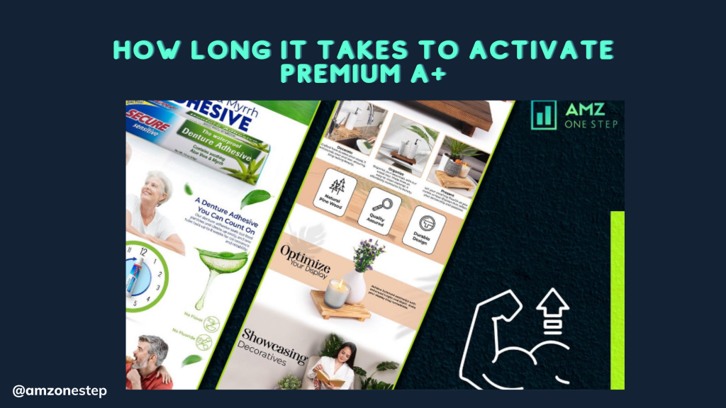
Now for the important question: how long does it take for A+ Content to show up on your product page? Amazon’s official answer is eight business days after you send in your work for review. There are, however, a few things that can change the timeline:
- If you have simple A+ content with basic elements, it might get accepted faster than designs with lots of small details.
- When there are a lot of reviews, like around the holidays, the process might take a little longer.
- To avoid delays caused by changes, make sure your material follows Amazon’s A+ material guidelines.
A seller uses visual content to display off their headphones by including high-resolution lifestyle photos of them being used while traveling and working out. In the benefit bullet points, features like noise cancellation and better sound quality are highlighted.
A+ Premium Content Modules
The best thing about A+ Premium is that it now has video. Users can add a video module to their goods to inform customers, share a lifestyle vibe, or make them stand out. Videos can be added with or without text on top of them and with or without extra pictures.
The interactive hotspot images feature in A+ Premium is another great addition. It lets you highlight Amazon listing images and show more information and details when you hover over them.
There are several choices in the navigation carousel module that let customers scroll through different pictures and read the information that goes with them. The last part, the Q&A feature, can use a sleek design to draw attention to the five most-asked customer questions.
Is A+ Premium Worth It?
Since a picture is worth a thousand words, being able to get even bigger Amazon listing images and more room for free sounds like a dream come true. Do you think A+ Premium is important on Amazon?
According to Amazon, using A+ Premium can lead to up to 20% more sales than using normal A+. If you can get this unlocked, it’s a great way to see what material options you have and think about how they could help your brand.
Because of how A+ Premium works and the fact that it was originally made for big, popular, high-converting brands, it might not be best for every Amazon brand that sells things.
Before you start redesigning all of your content, here are some things you might want to think about in addition to going over some basic A+ Content best practices.
- What kind of items do you have? The most that a brand can handle is clearly limited, and it will be different for each company. For your information pages, do you have a lot of high-resolution professional photos and high-definition videos to choose from?
- As an example, if you’re making material for a technical product, can a hot spot image really help people find out more? Your A+ Premium won’t get you very far if you don’t.
- The way Amazon launched A+ Premium made it clear that it was meant to show off some goods more than others. For example, consumer technology and beauty have traditionally been good fits for the modules that A+ Premium provides.
- Does this kind of material help a simple t-shirt or a taco holder as much as it helps high-tech gadgets? Most likely not. If your store has a lot of items, it will be very important to know which ones make sense.
- The main benefit of A+ Content is that it helps customers learn more, which means they are less likely to leave bad reviews or come back. It’s not going to work to use modules that only show pretty movies and don’t deal with customer issues or questions. Pay close attention to what people ask.
- Do they need to know how to put something together? Are the product’s measurements or how well it works with other things or accessories important? Do you need a full explanation to show how valuable the product is? What kind of story are you telling? For example, how did the business start? Setting up your content into parts that make the most sense should be done with the end goal in mind.
You have to follow Amazon’s rules even if you have A+ Premium. That means claims must be backed up, there can’t be quotes or reviews, price information or information that needs to be shared quickly, and there can’t be links to other brands or sites that aren’t Amazon.
It’s important to think about the risks of changing your pages since we don’t know how long Amazon will offer free A+ Premium. If you can’t update your current A+ content on all pages, try putting products in order of importance based on the points above and see how that affects sales. Not forgetting the A/B test!
It’s important to think about how to best use the choices to show off your brand, even if you have A+ Premium unlocked. You can make better use of the A+ Premium or A+ Content you have access to if you look at your catalog, product category, and tools as a whole.
Read More: Amazon A+ Premium Content: Why Do You Need It For Your Amazon listing?
The Basics of Amazon Launchpad
The program name, “Amazon Launchpad,” is catchy, and it helps smaller brands do better on Amazon. Products range from vegan lip butter to the Bug Bite Suction Thing, which was backed by Shark Tank.
The Launchpad store is an online market on Amazon where people can buy goods from the program. Aside from that, members get better placements on Amazon in places like category pages, marketing emails, and deal uploads.
Helps people find your site by putting ads in a special Launchpad area, sending emails to customers, and other features.
Premium A+ Content that lets sellers change and adjust their pages. This lets you use features that regular Brand Registry sellers can’t, like Amazon listing images with hotspots, carousels, and bigger images.
Gives users access to a special page called “The Brand Portal,” where Amazon gives them advice on how to start products, make them better, read guides, and more. This is an extra level of help on top of Amazon Seller Support.
Helps with growth into other Amazon locations around the world by finding opportunities and helping with applications and the usual problems buyers run into when they try to do business in another country.
Read More: A+ Premium: Engage Customers with Dynamic Visual Content
Use A+ Content to Build Your Brand on Amazon
Optimized Content is King
Work experience at a web-based firm will teach you that information is king and user experience is queen. In fact, search engine optimized content is ideal. Keep in mind that even the most basic web browser should be able to read all of your written content.
In order to write top-notch material, this is critical. An individual searching for your type of items should be able to understand it as they read it.
Having concise, easy-to-read explanations and “romance copy” is crucial. Market the lifestyle, the product’s features, and all that is associated with it.
Express yourself succinctly, making sure to avoid flowery language. Conversely, speak to the consumer face-to-face to provide them with all the information they need. Try to convince them of your point of view to the best of your ability.
Images Matter, Too
To sell something, text and pictures should work together. Make sure the pictures of the product are strong, clear, and catchy. Show it being used and how it looks in both social and beauty settings.
Use the consumer’s emotions and senses to your advantage. When it makes sense for educational reasons, include pictures of how things work and what they look like.
Tag Your Images Well
You can always add alternative text tags to pictures with Amazon’s A+ content builder tool. These pictures are about as helpful as a blank page when you need to find something.
For each alt tag, follow the name rules for your brand. Do not just say “woman holding coffee cup.” “Brand X Morning Collection 16 oz Coffee Mug XBC789” is a better example of a full name.
This picture and its detail page can help a customer find the name, the type of mug, or the exact SKU. Some versions of this text should show up as the description or next to it in the A+ content area. These versions should be easier to read.
Recommended Framework
Within the header row, there is a branded picture or text that introduces the collection or family of products.
Enhanced brand content goes into more detail about the product, lifestyle, features, and functions in rows 1–3. Amazon listing images should always be included, and comparison charts are welcomed.
Include a brand story or a standard row in this footer module to end the text of the product page by telling people about your brand. Maintain a straightforward, useful, and remembered style.
Apply the same layout to all of your product pages for your A+ material. It’s an important part of your total company or product branding. The printed product packaging and ads used to promote your goods are the same, after all.
Is Your Amazon A+ Content Optimized For Mobile?
Good news: Amazon will format your A+ content instantly for browsers and mobile apps. But you should still check to see if it looks good on phones before you share it.
Before you send in your content, Amazon lets you see what the description will look like on both a desktop computer and a mobile device. You can then see how it will look on someone’s phone.
It is very important—maybe even more important than preparing for the desktop—since 150 million people bought things from the Amazon mobile app in 2019. Also, the way an Amazon ad and amazon listings looks on a phone is a little different.
People who use the goods will see the description first, then the bullet points. On desktop computers, it’s the other way around.
Case Studies: Successful A+ Content
XYZ Electronics – Enhancing Product Descriptions
The popular electronics brand XYZ Electronics wanted to make their Amazon product descriptions more visible and appealing. Their standard product descriptions were turned into visually appealing stories that stressed key features and benefits by adding A+ Content.
Companies like XYZ Electronics helped customers understand their goods better by using high-quality Amazon product images, infographics, and detailed descriptions. This built trust and led to more sales. When this happened, XYZ Electronics’ sales went through the roof, making them even more of a leader in what they do.
ABC Apparel – Improving Brand Image
ABC Apparel, a lifestyle brand that focuses on activewear, knew how important company image was in a market that was very competitive. They updated their product listings with A+ Content to better reflect their business and values.
According to ABC Apparel, their listings gave customers a sense of quality, style, and authenticity through stunning Amazon listing images, lifestyle photos, and interesting stories. This consistent brand experience hit home with shoppers, leading to more brand loyalty and return purchases.
DEF Home Goods – Boosting Conversion with Enhanced Product Information
While selling home decor items, DEF Home Goods had trouble getting their point across using standard product titles alone. Utilizing A+ Content, they gave buyers thorough product details, such as how to use the product, how to keep it in good condition, and creative design concepts.
By providing more information and context, DEF Home Goods helped customers make smart purchasing choices, which resulted in a rise in sales and positive reviews.
How to add Amazon A+ Content
Sign Into Your Account
- Access your Amazon Seller Central account. Sellers can go to Amazon Vendor Central instead if that’s okay.
- Go to “Ads” after joining the Amazon Brand Registry to find the A+ Content Manager.
- If two buyers or vendors offer A+ content for the same product, the vendor’s content will be picked.
- Sellers also won’t be able to change or add to A+ content that they have already set up.
Pick An ASIN Or A Name For The Item
Pick out the product whose material you want to write A+ for. Plus, you can “Start creating A+ Content” and give it to a product later.
Should you not know where to begin, Amazon will tell you which ads get the most visitors and benefit the most from premium content. Additionally, it is suggested that the information regarding difficult or often returned things be kept up to date.
Select Your Layout
Every product has a logo and a short text explanation. Additionally, you may include up to five content sections. All of the module options can be seen below.
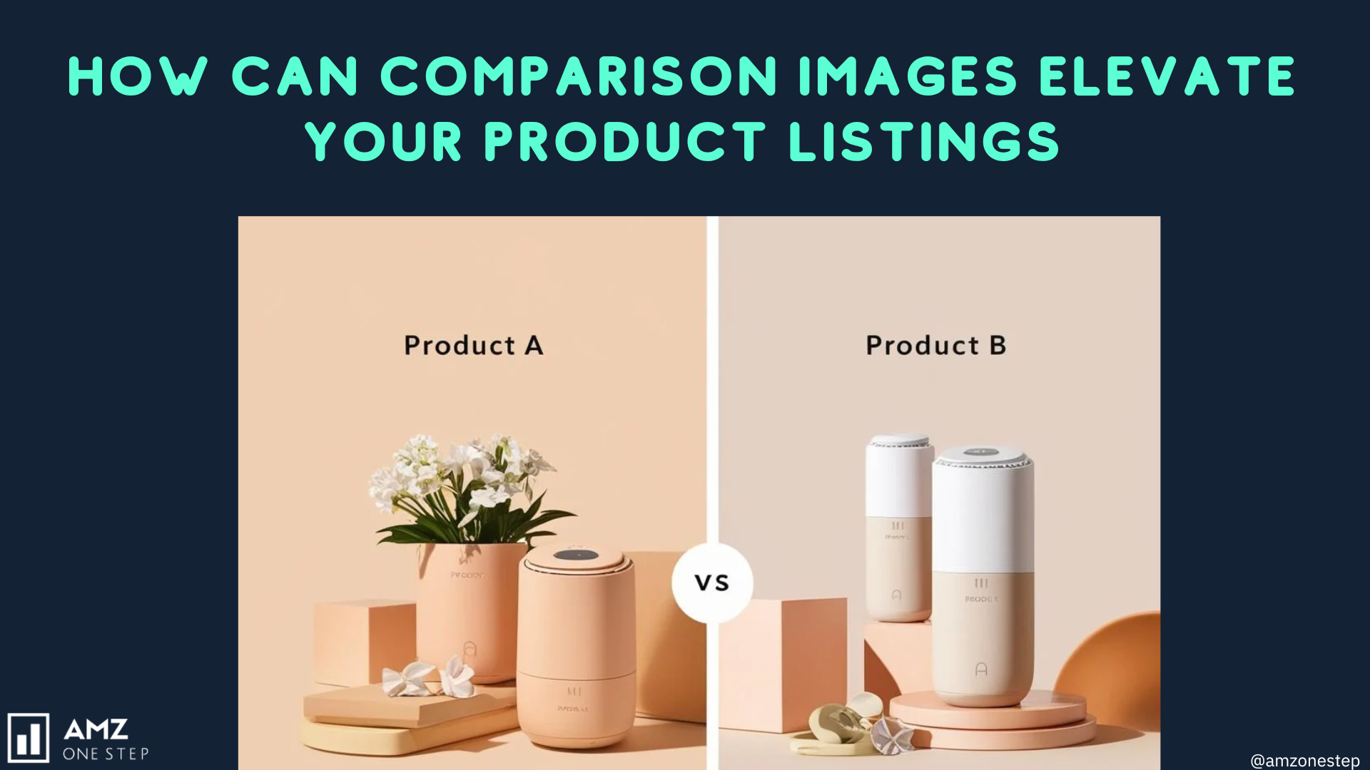
A comparison chart can help your customers pick the best form of the same product if you offer more than one.
Additionally, you could utilize the four-image highlights part if your product looks eye-catching. It’s possible to use modules on Amazon if your goods fall into certain categories. Whatever you sell, Amazon will have parts for you to use.
Add Your Content
Shoppers should be able to zoom in on photos if they have a good resolution. Make sure that any text you add to your Amazon listing images can be seen on phones if you add it.
One of the main reasons Amazon turns down A+ Content applications is this. The information you submit must also be original in order to be accepted.
Check to see if your style and copy match what your brand is saying on other channels. The A+ material you make should fit in with your brand.
Also, keep in mind that every picture you post needs to have alt text. Make sure you write a short description of each picture so that people who can’t see it can understand what it’s about.
Preview And Submit
Both laptop and mobile devices will show you a preview of how your product description will look. You can send your design for approval once you’re happy with how it looks. Anytime you send Amazon up to 20 pieces of A+ content, they’ll usually get back to you in two weeks.
Improving your A+ Content
Once accepted, it will be changed within 24 hours. Amazon will ask you to check your entry if you don’t.
If your A+ content makes claims that can’t be backed up, including promise information, shipping information, language that is time-sensitive, or information about guarantees, Amazon will reject it. The words “cheap” and “free” are also not allowed in ads. Additionally, you are not allowed to talk about competitors or their products.
Some rules must be followed if you want to use award quotes or suggestions. That you know all of Amazon’s rules is very helpful. They might be a little different depending on the cargo.
You have two business days after your A+ work goes live to make changes. Once more, read your work to make sure you’re satisfied with it. You can also use this approved A+ material on more than one ASIN retargeting. If the parent and child ASINs don’t change much, this is very helpful.
The process of adding A+ content to your listings should also go faster, since only 20 items can be active at once.
The “Manage your Experiments” feature can now be used to compare two or more styles, pictures, or texts. Also, you can make things in more than one language. Amazon might even make changes to the words for you right away.
Cross-Selling Tables in Amazon A+ Content
There is a marketing strategy called “cross-selling” that uses a current customer relationship to sell or promote more products without having to pay extra. Many Amazon businesses also want to increase customer loyalty, but increasing sales is also very important.
Cross-selling creates extra value and makes it easier for customers to find related or extra goods. By using this marketing approach, you can get more loyal customers and make more sales. Sellers with A+ writing can get an extra 5% in sales.
The cross-selling table is an important part of A+ pages. The A+ content gives you a chance to show off products from your own brand that are related or go well with them. People won’t have to look for options from other brands, and they’ll be more likely to buy more from the brand they’re looking at.
Premium Comparison Table 1: Standard Comparison
This table compares premium prices and is very close to the standard comparison table for A+ Basic. Differences only exist in the number of comparison goods and the comparison metrics. The A+ Premium table can hold between 3 and 6 comparison items.
A total of 5 to 12 comparison measures can also be used. Here, the pictures need to be at least 200px x 225px, which is a different Amazon listing image format.
Premium Comparison Table 2: Feature Comparisons
The products are highlighted in Premium Comparison Table 2, which is a 300px x 225px image. This is where you can add “feature comparisons” (up to 5 features, minimum of 2).
It’s also easier to be creative with the number of characters: names can have up to 30 characters and description texts can have up to 80 characters. Here, unlike the other tables, you can add whole lines.
Premium Comparison Table 3: Direct Comparison Of Two Products
Customers can use the arrows to move between goods that are showing how they compare to each other.
There is another table called Premium Comparison Table 3 that is better for a more in-depth comparison of two goods. The most comparison goods that can be added are 4, and the most comparison metrics that can be added are 3.
Read More: How To Resolve A+ Content Upload Issues On Amazon FBA?
Final Thought
Think of it as a short training video for your trip as an entrepreneur. There may be people working hard around you, but you’re working on your A+ content and making sure your product presentation is perfect. When your A+ content goes live, it will be a sales-making masterpiece ready to turn browsers into loyal buyers.
Learn how long it typically takes for your Premium A+ content to go live on your product listing. Optimize your wait time and boost your sales!
Unlock the secrets to faster A+ content activation with AMZ One Step

Hi there! I’m the content marketing and branding specialist for AMZ One Step. I work hard to create engaging and informative content that helps our readers learn more about Amazon selling and how to make the most of their businesses. I love spending time with my family and exploring literary works when I’m not writing or working on projects.
