While you might have a unique product, failing to optimize your images can result in your listing getting buried under the competition. A compelling main image listing can literally “stop the scroll” and turn browsers into buyers. But how do you achieve that?
In this guide, we’ll walk you through my tried-and-tested SOP (Standard Operating Procedure) for creating main images that convert on Amazon.
By the end of this blog, you’ll have a clear understanding of how to optimize your Amazon product photography and ensure that your Amazon FBA listings are designed to catch the eye and increase conversions.
Read More: From Click to Cart: How to Optimize Your Amazon Product Listings for Sales
Analyze Top Performers
One of the best ways to learn how to make great listing images is to look at what other people are doing. People who buy a lot of things in your area can often teach you a lot about what buyers really want.
Assume you want to sell cooking tools like a spiralizer. Explore Amazon FBA to find the best spiralizers, then take pictures of them. What do all of those pictures have in common? It could be a picture of someone using the product or a table showing how yours is better than theirs.
The pictures in the top listings are usually very clear and bright, with little else going on in the background.
When looking at your main competitors, keep an eye on the main picture because that’s the first thing a buyer sees. Is it level? Does it show the item in the best way? In the secondary photos, what kinds of lifestyle shots do they use to show how the product fits into the buyer’s life?
Action Steps:
- Search for your competitors’ listings in your category.
- Analyze their top-performing Amazon product photography.
- Make a list of elements you could replicate or improve.
Read More: Inside Look: Why Amazon Product Photography Is the Game-Changer You Didn’t Know You Needed
The 3-Phase Process for Crafting Attention-Grabbing Visuals
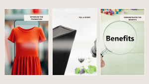
Now that all that research is done, it’s time to move on to the creative stage. This is when your listing images will come alive. A simple yet very effective 3-phase process for creating attention-grabbing images is the following:
Phase 1: Establish the Foundation
Ensure you have a photo shoot of your product. This should at least include shots well-lit from multiple angles.
You can employ the service of a professional photographer or a lightbox setup for the best output. High-quality means sharp images, not blurry, pixelated garbage, but rather sharp, good-resolution, and clear images.
- For example, if you sell a product called a phone case, you should click the product from different lighting and angles. Make sure you use the main image listing for the most appealing view, and the secondary image listing to give details on texture, color options, and in use, for example, on a phone.
Phase 2: Tell a Story
Once you have these basics covered, move to storytelling. Use your images to show how the product fits into your buyer’s life. Lifestyle images are key here, as they enable customers to visualize themselves using the product.
For Amazon FBA sellers, this is paramount because, unlike e-commerce, a store visit is not an option, and your images must tell the entire story.
- Your product is camping gear. Imagine pictures of your product in a real camp setting, such as a tent under the stars, the portable stove in action, or the backpack packed for a weekend trip.
Phase 3: Demonstrates the Benefits
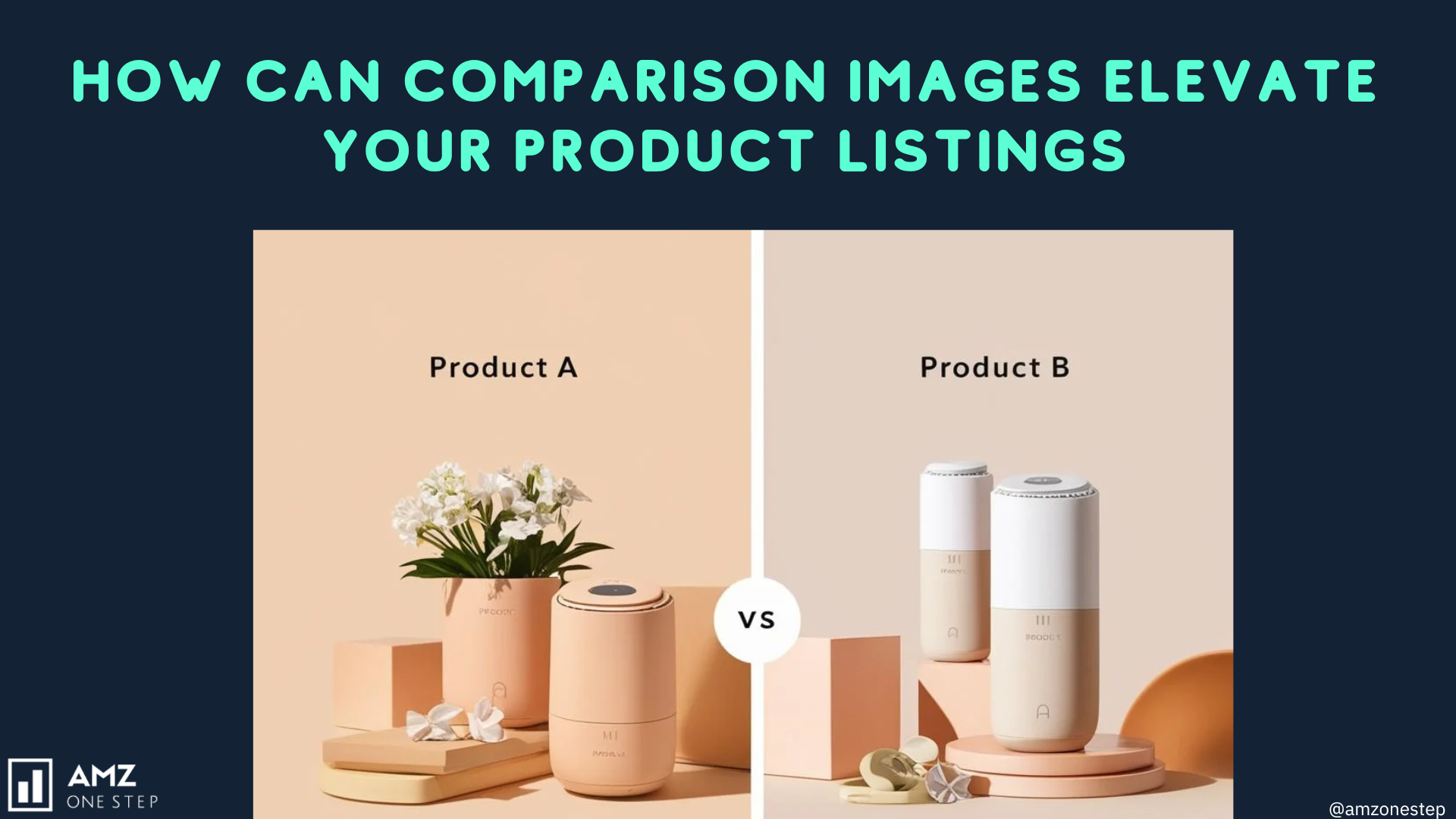
Do not just display the product- explain why your product is the best one. Employ infographic-style images that speak loudly and clearly. It may be a comparison chart, breaking down the features, or a close-up image listing with benefits highlighted.
- Comparison image listing of how many features, how long their battery lasts, or the level of water resistance in their product compared to the competitors.
Action Steps:
- Ensure you have high-quality product shots (from all angles).
- Create lifestyle images to help buyers imagine using your product.
- Use infographics or comparison charts to highlight unique features and benefits.
Read More: How Professional Amazon Product Photography Increases Sales?
How to Use Emotion in Amazon Product Photography
Identify Your Target Audience’s Emotions
Before you start creating images, it is essential to understand the emotions of your target audience. Ask yourself the following questions:
- What problems does your product solve?
- What aspirations do your customers have?
- How do they want to feel when using your product?
Example: Baby Products
If you sell baby products, your audience may seek reassurance, joy, and trust. You could evoke emotions of warmth and love by showing a parent holding their baby while using your product, such as a baby carrier or stroller.
Lifestyle Images can tell the Emotion.
Lifestyle images might especially be highly adept at representing emotion because they depict the product in action situations. Show how your product works for a customer’s everyday life, and you might stir up happiness, satisfaction, or even nostalgia.
Example: Kitchen Gadgets
You might be selling a food processor as a kitchen gadget. You may be just showing a product on a white background, but now imagine an image listing a family cooking together in the kitchen.
The warmth of the kitchen, the smiles of the family, and the color of the ingredients will tell a story of happiness and togetherness. The buyer will effortlessly relate him or herself to that condition by buying the product.
Use Color Psychology
Colors play a very important role in the way we feel about an emotion. Using color appropriately in your listing images can increase the emotional impact of your product photography.
- Warm Colors (Red, Orange, Yellow): Typically create feelings of excitement, warmth, and happiness; perfect for children-related products or those selling social activities.
- Cool Colors: Blue, Green, Purple Although the key takeaway here is that cool colors are generally related to emotions like serenity, trust, and relaxation, they should be used for products that are related to health, wellness, or self-care.
Example: Fitness Equipment
If you’re selling fitness equipment, you would use vibrant colors like bright greens or oranges to bring a feel of energy and motivation to your lifestyle pictures. For instance, taking a picture of someone using your equipment in a very bright and well-lit gym would create a feeling of determination and energy.
Showcase Customer Testimonials and Real Experiences
Add testimonials or reviews to your listing images for potential emotional connections with your buyers. Instead of sending a message that you are a reliable seller, show them real customers using your product. This can build trust and authenticity, in turn drawing more potential customers to your product.
Example: Home Decor
If you have a business offering decoration for homes, then consider gathering a photo collage, which contains reviews from satisfied customers along with pictures of their beautifully decorated space.
So, not only do you talk about your product, but you also have the potential to bring warmth and inspiration to the minds of potential buyers as they imagine what your product could bring to their houses.
Emotional Storytelling Through Images
Storytelling is a very effective tool in marketing, and the teller’s visual stories via product images can get deep emotional responses from their audiences. You can use this to your advantage by developing an effective story for your product that people will relate to yourself.
Example: Travel Gear
If you sell travel-related equipment, then certainly there is the possibility to create various photographs that will speak to an entire story of a journey.
You can capture a person packing their bag, marveling over beautiful landscapes and exotic cultures. Such photos will make others feel adventurous and want to travel with your product.
Facial Expressions and Body Language
The facial expressions and body language of people in your pictures may also connote numerous moods. People naturally find faces attractive, and posing with smiling happy faces can elicit a positive emotional set.
Example: Pet Products
If you are selling pet products, imagine colorful and cute images filled with happy pets with owners. From a funny playing dog with its new toy to an adorable cat resting in a soft bed, a picture like this can help your potential buyers believe the happiness their pets would feel with your product.
Play with angles and composition.
Now and then, the way you capture an image listing can evoke different emotions. This can be developed by changing your angles, perspectives, and compositions, which can really affect how viewers perceive your product.
For example, if the gadget is tech-related, unusual angles can really be effective in emphasizing the sleek design and the modern features of the gadget. A close-up of details or angles that highlight how the product is integrated into a workplace can easily provoke a feeling of innovation and excitement from viewers.
Top Mistakes to Avoid in Amazon Listing Images
Neglecting the Main Image
It’s the very first thing people see when perusing listings; main image listings really can make or break an image listing to entice a click. A really disastrous mistake most sellers make: they may use low-quality images, images that do not meet Amazon FBA requirements or images that are both.
Example:
If you were showcasing a gorgeous blender, instead of a sharp, clean shot of it against a white background, you would probably use a photo taken in your own kitchen that is fuzzy and blurry. This image listing is blurry and distracts the viewer from the product- they’re drawn to the blurred area instead.
Tip: Your primary image listings need to be clear, and focused, and show the merchandise against a white background. This will serve to capture the viewers’ attention and provide an impression of professionalism.
Mixed Quality Images
Another common mistake made by the sellers is that their listing images are of inconsistent quality. They would have professional photos mixed with amateur photos where the customer might not understand what to make of them.
For example, you would have a beautiful principal image listing but low-lit or pixelated secondary images. Customers would question whether or not to depend on the product while looking at the high-quality images mixed with low-quality ones.
Tip: Maintain a uniform look for all your images in Amazon FBA. Invest in professional product photography or see that all images remain within the same quality, lighting, and style.
Read More: How Professional Amazon Product Photography Increases Sales?
Not Showing Alternative Product Variation
If you have a product that comes in multiple colors and sizes, you might not present that variation as well. This means potential sales will not be made.
Example:
For example, imagine a seller who sells a hot backpack with five different colors. When the listing has only one color, some customers may perceive it as their single choice to buy that backpack, which might be an actual loss of sales for other variants.
Tip: Include images of all possible colors or styles within the listing images. You can make a collage or have them all separate, shown clearly for each variation.
Text or Graphics Overloading in Images
While the text could be of great assistance in getting information across, too many graphics and text appearing on the image listing is too destructive. It would shift the focus of the product and confuse the customer.
Example:
This listing for a phone case contains multiple text overlays and icons placed within the cover photo. It is disorganized and appears amateur. The potential customer will not be able to focus on the product.
Tip: The text should be minimized and, as can be seen in this example, it should enhance the image listings rather than cover it. Secondary images may use bullet points or infographics where necessary.
No Lifestyle Shots
Lifestyle shots are perfect helpers in visualizing the product and its place in customers’ lives. Many sellers fail to take advantage of this fact and shoot only with product-only shots.
Example:
If you have a camping stove, for instance, a lifestyle picture with the stove used in camping will go to the length of giving context and attraction. A plain picture of the stove fails to deliver its practical usage and benefit.
Tip: Make sure lifestyle images are included in listing images so that buyers can imagine using your product. Lifestyle images are images of the actual usage of the product, wherein functionality and benefits are shown.
Failure to Read and Obey Amazon’s Image listings guidelines
Amazon FBA has its set requirements for an image, and if not upheld, the images are likely to be rejected. Your sales pitches, therefore, get affected.
Example
Images posted with logos, watermarks, or any content against Amazon FBA policies will lead to failure of the listing display to the customers. This again causes confusion on their part and results in loss of trust.
Tip: Know Amazon’s image listing specifications, including size, format, and content. This way, when uploading images into Amazon FBA, you will be in compliance and those images appear the proper way.
Lean on Low-Quality Stock Photos
Using stock photos has its benefits; on the other hand, relying entirely on them isn’t a good thing at all. Low-quality or ‘one-size-fits-all’ images fail to show what makes your product special.
Example:
If you sell handmade jewelry but have a generic stock photo of a necklace, buyers might feel they’re not getting an authentic product. This can lead to distrust and lost sales.
Tip: Invest in original product photography capturing the unique qualities of your product. Authentic images build trust and credibility with potential buyers.
Not Highlighting Key Features
Customers need to know why to choose your product above others. If your images do not show the features of your product, you miss selling points.
Example
For instance, in a vacuum cleaner, when you do not feature the special aspect of your device-the presence of a HEPA filter or detachable hose-for the buyer’s perusal to compare with other products for sale, you are missing a good selling point.
Tip: Images from listings, infographics, or close-up images might help to focus attention on important features. These may be the most impactful ways to convey benefits for the product.
Not Testing Different Images
You think an image listing is great, but that doesn’t necessarily translate into good performance. Sellers often miss the value of testing different images to see which convert better.
Example:
You may think a certain lifestyle image listing is going to resonate with your customers, but it’s going to probably end up clicking less. And you will never know which image listings actually work for your audience unless you test.
Tip: Use A/B testing to compare different listing images and see which ones drive more engagement or conversion. Then utilize Amazon’s tools to execute these tests efficiently.
Not Sensitive To The Wrong Image ListingsOrder
The arrangement of your images might be what will determine the perception of your product by the customers. If it falls by the wayside, you may lose the chance to effectively promote your product.
Example
Suppose your hero image listing is awesome, but the next one is a poor-quality shot; the customer might carry away a wrong impression. The first few shots of the product should depict the most attractive features of your product so that it grabs the interest of any prospective buyer.
Tip: Strategically place your images. Your main picture should lead the load, then your best lifestyle image, and following with other product details or features that would bring to attention. This way can ensure that people retain their interest through the following products.
Read More: How to Optimize Your Amazon Product’s Main Image?
How to Test and Validate Your Amazon Product Images
Testing your listing images will help you understand which images are best performing in front of your target audience. This way, your CTR and conversions will be higher.
Knowing what works and what doesn’t, you’d be able to fine-tune your approach, get rid of under-performers’ images, and focus on the images that actually drive sales.
A/B Testing
A/B testing, or split testing, refers to the comparison of two versions of an image listingsto see which one works best. This method can help identify which images are going to attract attention for your shoppers to click through to your product page.
Example
For instance, let’s say you’re selling a kitchen knife set. Then, you would have two different variations of your main images: one picture with the knives placed neatly on a cutting board and the other image listings depicting the knives in action, chopping up some vegetables.
A/B Test Setup
Image listingsA: Knives on a cutting board (static image)
Image listingsB: Knives in use (dynamic image)
You can use Amazon’s Manage Your Experiments tool, if you have seller-central access, which allows brand-registered sellers to use it or else you can create an A/B test. Now compare the click-through rates and conversion rates for each image listing over a period.
A week later, you feel that Image listingsB-the knives in action-had a higher CTR of 15% compared to Image listingsA’s 10%. It probably means customers respond well to images where the product is in action.
Surveys and Customer Feedback
Collecting inputs from the users themselves may help you to understand the actual view of people towards your listing images. You can make use of a survey or ask your customers to comment on your listing.
Example
If it is resistance bands, a fitness product, that you are selling, you will send a very brief survey to all previous buyers asking them what they think of the product images. You could include questions such as:
- Did the images have any impact on your decision to buy? Yes/No/Not Applicable If yes, please provide your comments. Which aspects do you think need improvement in the product images?
Results Analysis:
If a couple of customers complain that the images don’t convey a sense of application regarding the usage of resistance bands, then possibly it is the lifestyle images or instructional graphics that have to be improved.
Utilization of Heatmaps and Analytics Tools
A heat map is a visual tool that shows exactly where users click, scroll, or spend more time on a webpage. You can include heat map analytics to identify where the most attention-grabbing and interactive images are located.
Example:
Assume you are selling a smartwatch and, consequently, have a product listing for it. Using heatmap software, you monitor how users will be interacting with your listing. You realize that they’re more interested in clicking on images showing different variations in color choices than on the main image.
Analysis of Results
With this data, now you know what to do: More images of different variations of your smartwatch since they interest potential buyers.
Conversion Rate Analysis
One of the simplest ways you can validate your product images on Amazon FBA are by the conversion rates. You track how those changes in the image listing will affect the sales following your changes of the images.
Example:
You were using one static image listing for your cream, and before you went ahead and added lifestyle images that include the cream being applied, you tracked the conversion rates as shown below:
- Before Change: 3% conversion with the static image.
- After Change: 5% conversion rate on lifestyle images
This increasing conversion rate only shows that your new images have better connected with your target audience, and they are buying more often.
Competitor Analysis
Look at listing images of your competitors who are at the top level. They can give you insight into what brings in money in your niche. Check patterns on their successful images and replicate those in your listings for success.
Example:
If you sell eco-friendly cleaning supplies, for instance, check the company who tops your category on Amazon. Often they are full of a green background and pictures of happy families using these cleaning products in a clean, shiny home setting.
Results Analysis:
You can make your Amazon product photography stronger and more likely to attract more customers by adding, for example, something like a bright green background and lifestyle shot that highlights the environmental friendliness of your product.
How to Include Instructional Elements in Amazon Listing Images
Why Instructional Elements Matter
Adding instructional elements to your listing images can significantly elevate the customer experience. The more clearly a buyer can understand how to use a product, the more likely they are to make the purchase.
Also, good instructional images can minimize common concerns or misunderstandings about a product, which could be the difference between the sale being made or not.
Read More: 5 Valuable Results You Can Expect From Amazon Product Testing Campaigns
Tips for Creating Instructional Elements in Listing Images
Step-by-Step Instructions
Add instructional sections by developing step-by-step instructions or guides. Step-by-step instructions work particularly well for putting together products or items that have multiple usage options.
Example: If you are selling a kitchen gadget that is complicated, you can have an image listing of the product being assembled or used step by step. For example, a spiralizer could be illustrated using a sequence of images that illustrate the following:
- Step 1: Place the vegetable on the spiralizer
- Step 2: Use the crank to get spirals
- Step 3: Serve the newly prepared spirals
Such an illustration guide will explain ideas to people and at the same time attract people to imagine how easy it is to use your product.
Use Infographics
Infographics are a fantastic way of expressing several messages in one picture. They can better depict product features, technical specifications, or usage scenarios.
Example: You are advertising a fitness tracker and with an infographic, you can highlight the following features:
- Heart rate monitor
- Step counter
- Sleep monitoring
The infographic can also communicate how to use the tracker correctly by indicating its right wear or how to pair it from a mobile phone. When the content is presented this way, there is a better chance that customers may be engaged and converted.
Highlight Features by Callouts
Another way to add educational attributes to your listing photos is through callouts. Callouts are those little text boxes or arrows pointing to specific features of your product that explain what it offers the buyer in simple language.
Example: For a great backpack, you might have a photo of the bag with arrows pointing to features like:
- Water-resistant material
- Several organizing compartments
- Comfortable padded shoulder straps
This can help a customer, in the shortest time possible, get an idea of the benefits the product will bring for him to increase his chances of buying it.
Illustration of Usage Scenario
Show images where different usage scenarios are illustrated, giving the prospect knowledge of your product and its versatility and functionality.
Example: If you’re selling a multi-cooker, put images illustrating the product in different settings such as:
- Cooking rice
- Steaming vegetables
- Making soups
Attach a short description of what is happening and how easy it will be to create the recipe with each photo. Education aside, it makes the customers curious to create the dish at home.
Before and After Comparisons
Before-and-after photos can work very well for the type of products that solve specific problems. They provide conclusive visual proof of what has been achieved with a product.
Example: If it is a stain remover, then there is a before-and-after photo of the garment. The “before” picture may display a tough stain, while the “after” picture has the fabric clean and pristine. Pair this with a short caption that goes like this: “Apply directly to the stain, wait for 5 minutes, then rinse for best results.” This does not only display efficacy but also shows the customer users how to use it right.
Lifestyle Images with Context
Lifestyle images are images that show your product in use. By doing so, you will help the customer envision it in their life. Adding context is an excellent way to give the consumer implicit instructions.
For instance, if you are selling a portable blender, depict a picture of someone holding it in the kitchen, at the gym, and fruits and vegetables surrounding the person. Add such an image listing’s caption as follows: “Blend your favorite smoothies on-the-go,” which illustrates not only how the product works but also shows why it is convenient.
The Role of Texture and Detail in Amazon Product Images
Why Texture and Detail Matter
Improving Product Perception
Texture is how a product feels, or its surface quality-a smooth texture for instance, versus a rough one. Or, it is shiny or matte. Detail is the little details that will distinguish your product. Both help the would-be buyer perceive product quality and functionality-or lack thereof- and what to expect.
For example, the sale of a wooden kitchen cutting board with a picture of its grain pattern and finish will lead to your product depicting being a handicraft, robust, and robust.
This amount of high resolution in terms of attention-grabbing details makes customers really eager to have the product, hence leading to an increase in the conversion rate.
Building Trust with Customers
Shopping online will not allow customers the feel of things that occur in a real store. Closeups of textured fabrics and other descriptiveness should help to fill in that void.
For example, showing some closeup of the weave of a fabric or the finish on some piece of metal could give buyers confidence in the quality.
If you are selling an expensive leather wallet, you will include a close-up shot of the description which shows the grain of the leather, stitching, and its sheen to assure buyers that it is worth their money. High details give customers confidence and credibility in the item, and they are most likely to buy it.
Competitive Differentiation
In areas where many competitors are offering the same products from the same sellers, details and textures make a difference. Because they offer an opportunity to distinguish the product from others and present it in a better way.
For example, when selling a case for a cell phone, unveiling the complex patterns of the design or texture of the grip and perfection in cutouts for the buttons and ports can make yours different.
Compare two listings. Both are listing the same type of phone case but in different ways. The first one uses a generic, low-detail image.
In contrast, the second listing boasts of the unique textured pattern and how the case actually feels in the hand when used. Shoppers are probably going to choose the clearer picture in some way.
Showcase Texture and Detail: Good Practices
Use High Res Images
Using a very high-resolution image listing is very important in texture and detail capture. Make sure that your camera settings are set to take very clear and crisp images that show all the subtle aspects of your product.
Example:
If your business revolves around skincare products, then getting a close-up shot of your texture product—cream or lotion—can very efficiently say about its richness. Showing the consistency and how it spreads can help those customers envision how the application would feel.
Use Multiples Angles
Multiple views on the product can help to project its texture and details. It gives the customers an image listing of a three-dimensional presentation of the product which explains its physical characteristics.
Example
While you are selling shoes, photograph the shoe from the front, sides, and back. Also, close-up shots of the texture of the material used. You can highlight stitching, the grip of the soles, or any unique embellishments.
Use Contextual Images
Use images that reflect how your product will be used in the buyer’s life. One great way of representing a product so that it feels and looks real is through the use of contextual images. Contextual images represent a chance through which potential buyers can see how the product fits in their lives, hence its features.
If you sell cookware, there must be some pictures that reflect its usage, like how it would be used to sauté vegetables. It not only shows the details of the cookware but also gives the buyer a realistic image of how they can use it.
Use Zoom Features to the Fullest
Many Amazon FBA shoppers expect that they can zoom in on product photos to see close-up details. Make sure your images are optimized so that enlargements by potential buyers clearly show the texture of the finish without a degradation in quality.
Example:
If your product is jewelry, for example, providing zoomable image listings that will allow the buyer to take a closer look at the intricacies of a pendant’s design or the clarity of a gemstone can really help instill buying confidence.
Utilize Infographics
Infographic-type images are great at showing texture and detail besides your main key features and benefits. Use arrows or labels to point out specific attributes of your product.
How About This:
If it is the sale of a backpack, create an infographic directing peoples’ attention to the material used (e.g., water-resistant fabric), the details of stitching, and organizational compartments. It provides the buyer with both visual and textual information that could further help the buyer decide.
Start transforming your images today with AMZ One Step.

Hi there! I’m the content marketing and branding specialist for AMZ One Step. I work hard to create engaging and informative content that helps our readers learn more about Amazon selling and how to make the most of their businesses. I love spending time with my family and exploring literary works when I’m not writing or working on projects.


