So you’re thinking about doing your own product photography on Amazon? Well, that’s not a bad idea.
Product photography for Amazon is one thing that can either take you to the next level or can throw you out of the competition.
I am sure you know the value of photography for e-commerce and especially on Amazon selling, so I will not write much about it.
At the same time, I expect you to be aware of the different types of images that you need for great photography.
Know these 8 Mistakes Every Photographer Do While Clicking Products For Amazon- You better avoid it!

Limiting yourself to same angles
As a seller, you should keep in mind that buyers won’t be able to touch or handle your product. They would certainly avoid making a purchase if the product is not ‘well defined’. In order to eliminate their questions or uncertainty, you should take photographs of all the necessary angles that you think can make an impact.
You know your product better than anyone. Before thinking from the buyers’ perspective, think on your own as what angles will reflect my product better and will increase the chances of conversions.
As much as taking shots from the side, back, and bottom are important, you should also include close up shots because people love to see the textures and every small detail of the product.
This is how you can illustrate a closeup shot for your product on Amazon.
Over-complementing the product with Colorful Backgrounds
The main image of your product has to be on a white background since it’s an Amazon policy. We all know it!
But, it doesn’t mean that you will keep the rest of the images on colorful backgrounds. Though I am a hard critic of colorful backgrounds for the product images, you should use it if it is really complementing the product.
In short, the background should speak and compliment your product at the same time otherwise, it will lose its impact. The below picture has perfectly demonstrated colors that are complementing the product at the same time.
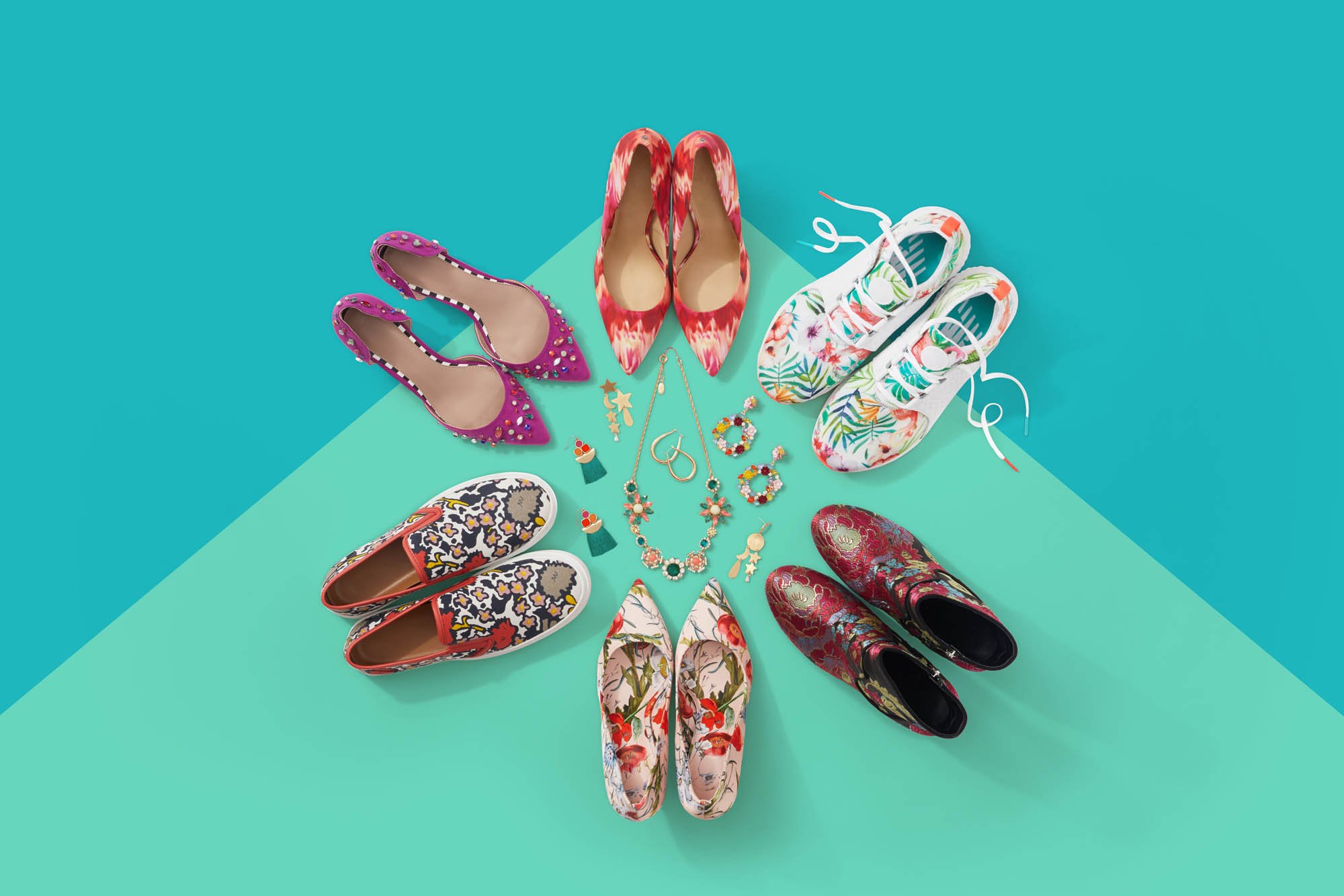 It all comes down to your personal preferences and what works best for your product. Of course, these types of shots will require a bit more hard work, but it is going to worth your time.
Using Cheesy Graphics
Remember, the things that you consider tiny are the ones that matter the most. Using awkward fonts, poor graphics, and obnoxious colors will reflect a poor impression of your brand that will eventually hurt your conversions.
Keep that in mind, small things matter!
If you use cheesy graphics on your product images, it will give you the worst turnaround than the area 51.
 Amazon is not the place for these kinds of images. It will make your brand look fake and trustworthy, while at the same time, it will make you lose potential clicks and sales.
If you know the basics of photography and designing, you would know that the font, typography, and colors really make a huge impact on the images.
The image shown is the perfect example of the worst image.
It’s like you’re selling the idea without engaging the customer. This formula no longer works in the eCommerce world.
Too much visual noise
You don’t get the word ‘visual noise’, right? But what if I tell you that it’s the most important mistake sellers do while taking photographs for their products?
Believe it or not, too much visual noise can adversely affect your photography.
This happens mostly due to non-professional cameras, un-trained photographers, and improper lighting conditions that create a recipe for disaster. Here is the perfect illustration of too much visual noise.
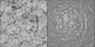 When unprofessional and untrained photography takes a zoom shot, it creates the noise that hurts the picture and you at the same time.
This is very much due to a high ISO – ISO is an ability of the camera that delivers clean images based on the surrounding lighting.
Not Staging the product properly
It’s all about creating the need for the product by giving it a realistic look through visuals. For example, if you’re selling Napkins, you should be shooting it with a bunch of flowers or dishes. Or if you’re selling something that people wear, it’s a great idea to shot a model wearing it.
Staging the product properly can add more context and relevancy to your product as your customer would be able to see the way your product will look at them.
Since buyers aren’t good at imagining, and as I said they can’t touch the product, you should focus on capturing it in a way that could give them a clear idea about what to expect.
However, you should keep in mind that whatever object you’re added in the shot should be totally relevant, otherwise, it will reduce the customer’s attention from the pain product.
Not Taking shots without a tripod
Well, this is the basis of product photography. You need still images, and for that; you need a tripod.
A tripod helps you to handle the camera steady while allowing you to adjust the angles easily. While your hands are free, you can reposition different angles according to your product.
Ignoring the need for Retouching your images
As a photographer, your primary goal should always be to take shots that are as pristine and clear as possible. The need for retouching is always there especially when you’re taking many shots. You have to make sure that there aren’t any wrinkles or dust particles on a product as that will count as a negative point otherwise.
This is basically done in the editing phase where you need to edit out the irrelevant things from the images.
Not Conveying a brand story
This is where you need to use the magic wand.
Images do tell a lot about a brand. And as you may have heard ‘they are your first impression’, which is totally right. In order to create a brand story through your shots, you need to start focusing on emotions more than the necessity because it sells.
It’s hard to swallow, but emotions are a great way to earn customer’s trust and loyalty. Especially, when you’re competing on the tough grounds with thousands of brands trying to win over you, you need to come with ideal images that could define your brand better than anyone.
At AMZ One Step, we create images that could distinguish you from your competitors and can make you stand out in the toughest niches. We bet, our portfolio is enough to convince you.
Customers are always picturing themselves using that item and they don’t prefer seeing the same style images again and again – the lesson is, you need to come up with something unique that could define your product and your brand flawlessly.
Is it a good image or a bad image?
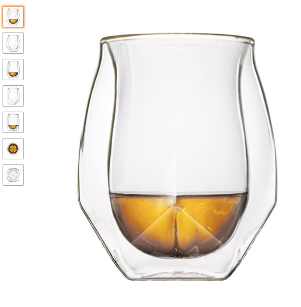
Uploading these types of product images on Amazon is like ruining your business out of your own hands. Though the structure of the glass is unique and flawless that leaves no question on the capability of the product itself, the way it has been portrayed is downsizing the brand.
So how does a good image looks like that defines a flawless brand story?
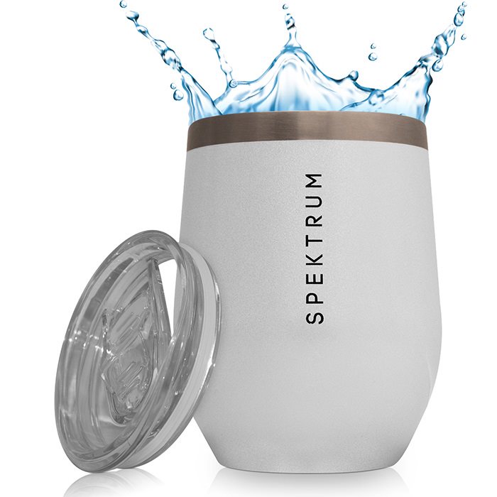
This is what we created for our client; though it’s the main image, we can’t really add emotions in it, but we tried our best to make it presentable and relatable at the same time. What do you think about this picture?
Back to the point; emotions! The foremost way to engage your target market is by adding emotions in your photographs that can persuade them to make a purchase. Well, the image below has the emotions incorporated!

Key Takeaways
Amazon Product Photography is all about capturing the images that can drive clicks and sales. To be very honest, Bad images are often one of the biggest reasons for the low performance of any Amazon business.
The better the image, the better it illustrates, the more it can sell.
With bad images, you’re most likely to lose clicks and sales that will prevent you from getting good organic rankings on Amazon.
So what good images really are for Amazon? The simple answer to this question is ‘anything that can make an impact while convincing a customer in making a purchase is good photography’.
Here are few takeaways of this blogs post
- As an e=commerce seller, you should know that buyers won’t be able to touch or handle the product. Therefore; the need for taking shots from different angles is immense to bring clarity in the image.
- Avoid over complementing your images with colors. You should use a colorful theme only if it is really complementing the product otherwise, it is wiser to keep it on the white background.
- Using Cheesy graphics is indeed a great way of ruining your brand image on your own.
- When taking shots, focus on visual noise. Too much visual noise will remove away the charm of your product. You need to adjust the ISO setting to take perfect shots
- Stage your products properly and in accordance with the necessity. This is where you should be trying your best to illustrate the need or the necessity of the product.
- Always use a tripod for product photography
- After taking the shots, you should spend a little time in the retouching of your images. Try to remove the curls or dust if they’re captured.
- Every image of your listing should convey a brand story. And that is not earned by creating the necessity but rather by emotions which attracts the customer’s loyalty.
If you don’t plan to outsource your product photography, you need to follow this guide to create flawless images that can earn you good clicks and conversions – and something that can give you a competitive edge over your competitors.

Hi there! I’m the content marketing and branding specialist for AMZ One Step. I work hard to create engaging and informative content that helps our readers learn more about Amazon selling and how to make the most of their businesses. I love spending time with my family and exploring literary works when I’m not writing or working on projects.

