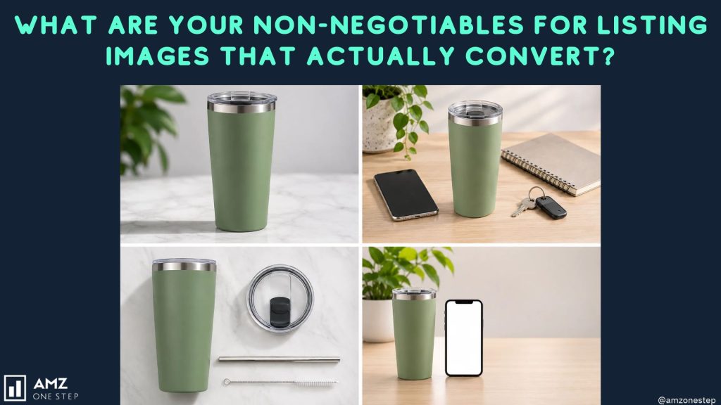

A shopper scrolling Amazon search results on a phone gives your listing about as much attention as a billboard gets from a passing car. They see the main image, the price, the star rating, and maybe the first few words of the title. If the image doesn’t earn the click, your bullets and backend keywords never get read.
That’s why most Amazon listing optimization work that moves sales starts with the image stack, not the copy. Below are the nine rules we hold every set of Amazon listing images to before it goes live. None of them are about making images prettier. Each one exists because skipping it costs clicks or conversions.
1. The main image is built for the search grid
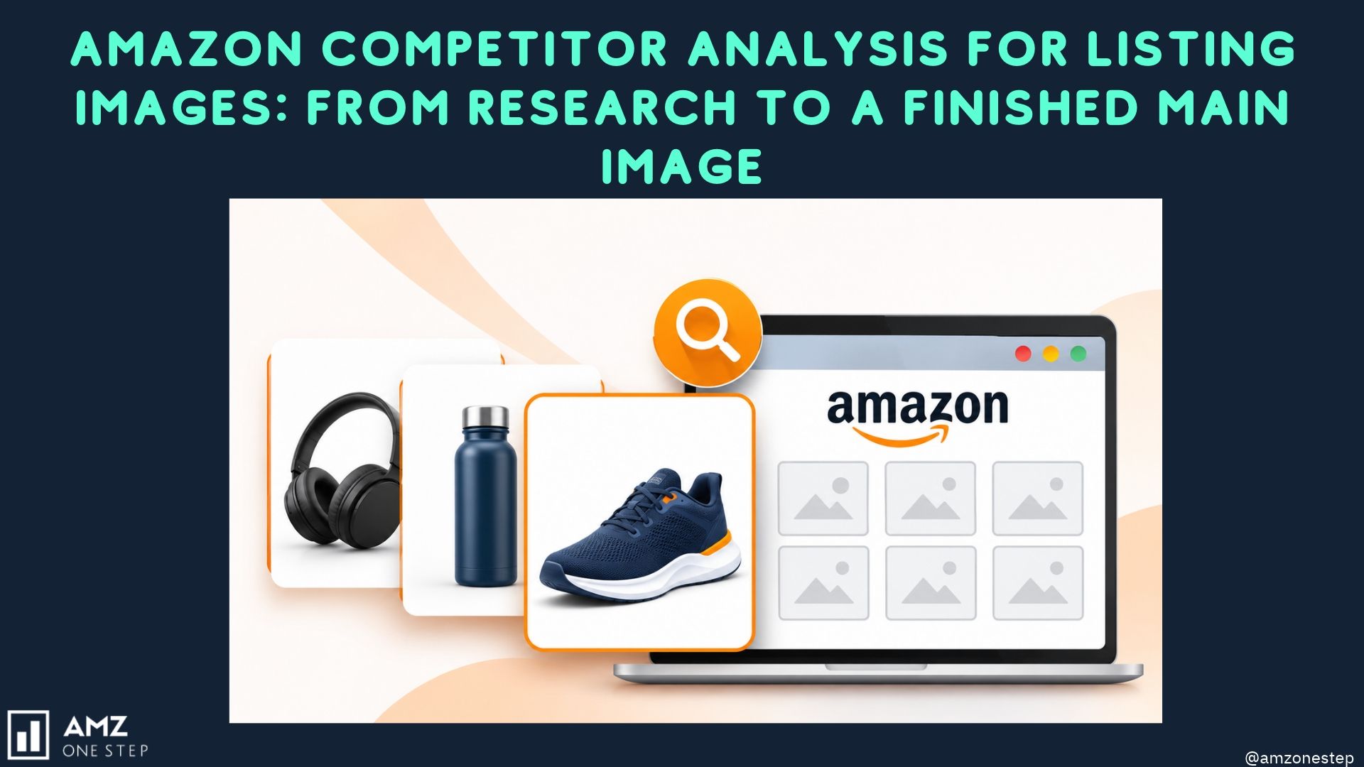
Your main image competes in a grid of thumbnails, so judge it at thumbnail size, next to the listings it actually sits beside. A main image that looks great full-screen can disappear in the grid.
The Amazon basics are fixed: a pure white background (RGB 255, 255, 255), the product filling about 85% of the frame, and no added text, badges, or props that don’t ship in the box. Within those rules you still have real choices. Camera angle, how many units you show, whether the packaging appears, and how much of the frame the product occupies all change click-through rate.
Before you approve a main image, put it in a screenshot of page one for your top keyword. If you can’t spot it in two seconds, rework it.
2. Image two answers “why this one?”
Once someone clicks, the second image is usually the first thing they see after the main shot. Use it for your strongest buying reason, stated plainly.
Keep it to three or four short benefit callouts. A wall of feature text gets skipped. Lead with the outcome the buyer cares about (“Stays cold for 24 hours”) rather than the spec that produces it (“Double-wall vacuum insulation”). The spec can sit underneath as proof.
3. Scale is shown, not stated
Wrong-size expectations drive a large share of returns and one-star reviews. Dimensions in a bullet point are easy to miss. A hand holding the product, a ruler line with measurements, or the item next to a familiar object makes size obvious in a glance.
If reviews on your listing or on competitor listings mention “smaller than I expected” or “bigger than it looks,” treat a scale image as mandatory.
4. Lifestyle images show your actual buyer
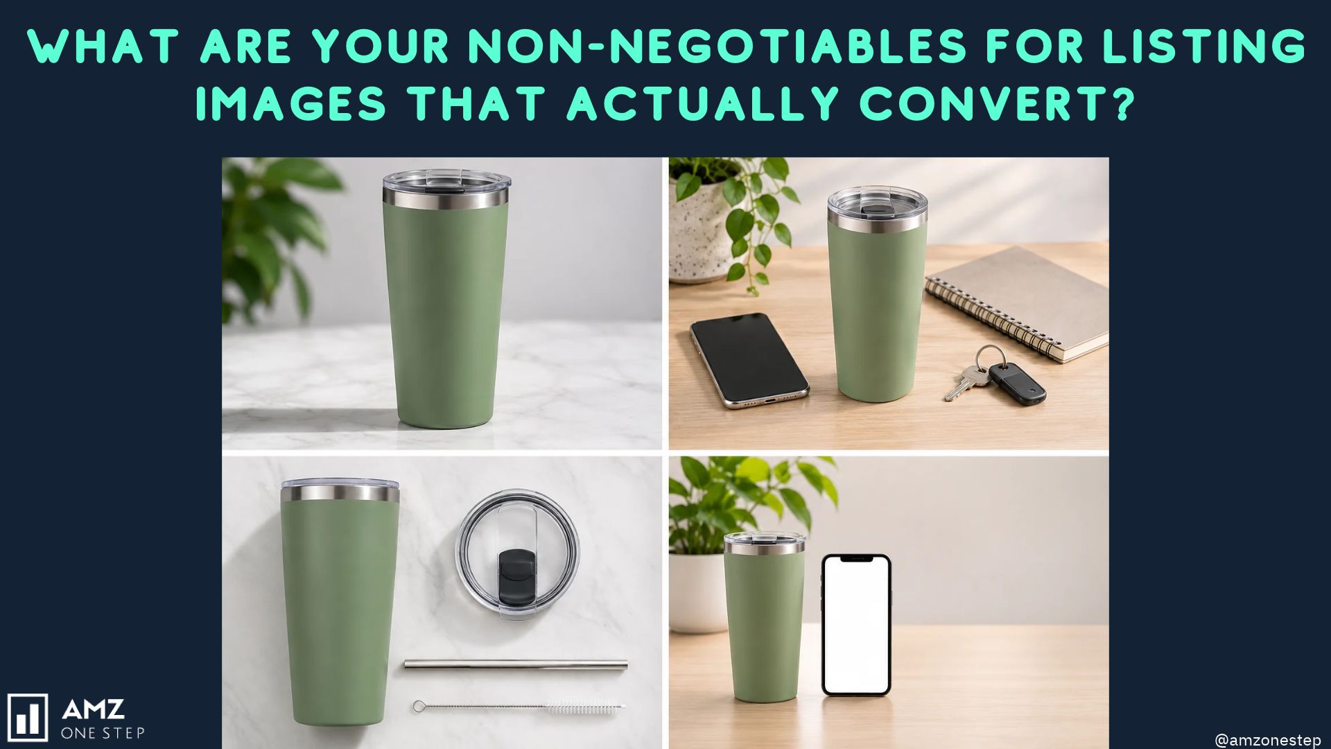
A lifestyle image works when the shopper sees themselves in it. Generic stock-style scenes rarely do that. A camping mug photographed in a corporate kitchen sends the wrong signal, even if the photo is well lit.
Pick the setting from who buys the product and where they use it. Your search term report and your reviews tell you this. Show the product in use, mid-task, rather than posed on a table.
5. Objections from reviews get answered visually
Read the three-star and one-star reviews on your top competitors. The same complaints come up again and again: the lid leaks, the strap feels cheap, it doesn’t fit a specific model. Each repeated complaint is a question your images should answer before the buyer has to ask.
A close-up of the seal, a material callout, or a compatibility chart can turn a competitor’s weakness into your reason to buy. This is also the image most sellers skip, which makes it one of the easier ways to stand out.
6. What’s in the box is clear
Buyers want to know exactly what arrives. Lay out every component, accessory, and insert in one flat image with short labels. For bundles and multi-packs this matters even more, because the main image can’t carry text to explain the count.
If you sell several variations, a comparison image showing the differences side by side cuts down on wrong-variant purchases.
7. Every image passes the phone test
Most Amazon traffic comes from the mobile app, where your infographic shrinks to a few inches wide. Text that reads fine on a desktop monitor turns into noise on a phone.
Practical checks before you upload:
- Upload at 2,000 px on the longest side so zoom works (Amazon needs at least 1,000 px).
- Keep callout text large enough to read on a phone without zooming.
- Use strong contrast between text and background.
- Limit each image to one message.
Open the draft images on your own phone, at actual size, before you approve them.
8. The stack and A+ content look like one brand
When image two uses one font, image four uses another, and the A+ modules use a third color palette, the listing looks assembled from parts. Shoppers read that as a smaller, less trustworthy seller.
Set a brand kit once: colors, fonts, logo placement, and icon style. Apply it to every image and every A+ module. Consistency also makes the listing faster to update later.
9. Decisions get tested, not argued
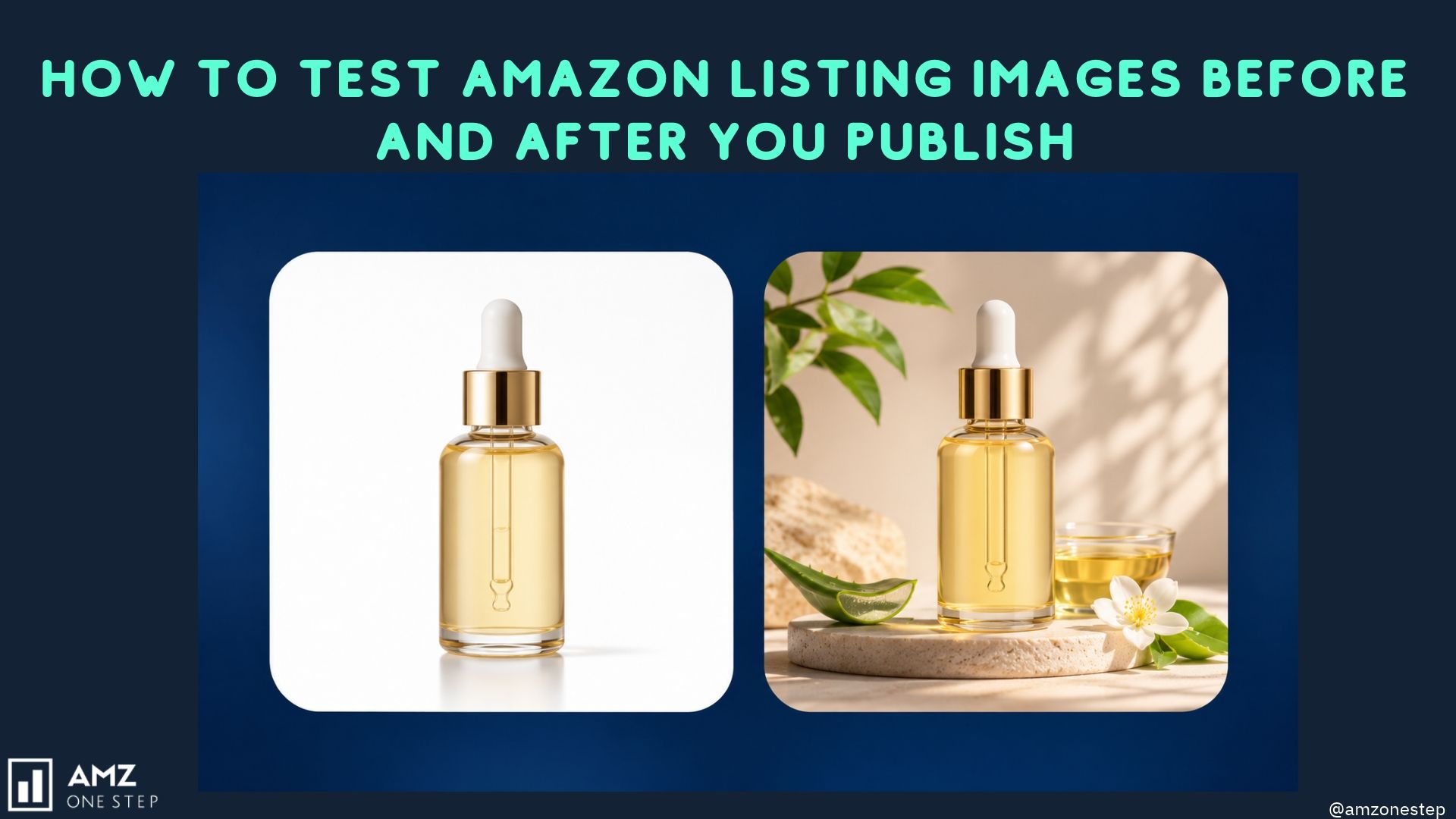
Teams can debate main image options for weeks. A split test settles it with your own traffic. If you’re brand registered, Amazon’s Manage Your Experiments lets you test main images and A+ content against each other on live traffic, as long as the ASIN gets enough visits to reach a result.
Test one variable at a time, starting with the main image, since it affects click-through on every search. Keep the winner, then test the next idea.
A quick pre-upload checklist
| Check | Pass condition |
|---|---|
| Main image | Pure white background, product fills ~85%, stands out on a page-one screenshot |
| Image two | One clear buying reason, 3–4 callouts max |
| Scale | Size is obvious without reading a bullet |
| Lifestyle | Setting matches the real buyer and use case |
| Objections | Top review complaints are answered visually |
| In the box | Every component shown and labeled |
| Mobile | Text readable on a phone at actual size, 2,000 px uploads |
| Brand | Same fonts, colors, and icons across images and A+ |
| Testing | Main image test planned or running |
How listingoptimization.ai builds these rules into every listing
Working through this checklist by hand takes research, design time, and a lot of back-and-forth with a designer. listingoptimization.ai, built by the team at AMZ One Step, handles most of it inside one workflow:
- Market intelligence first. It analyzes competitors, your category, and reviews before generating anything, so objection-answering images (rule 5) come from real complaints.
- Three main image concepts per ASIN. You get options to compare instead of one guess (rule 1).
- SERP simulation and shelf comparison. See your main image in a simulated search grid next to competitors before it goes live.
- Infographics, lifestyle scenes, and A+ modules generated as one set, with your brand kit applied to every output (rule 8).
- Built-in A/B testing and an AI edit copilot for revisions (rule 9).
- Eight marketplace translations and optional direct upload to Seller Central.
Your first listing is free, and no credit card is needed to start. Generate your first listing on listingoptimization.ai and check it against the nine rules above.
Frequently Asked Questions
Quick answers to the most common questions about refreshing Amazon listing images.
What size should Amazon listing images be?
Amazon requires at least 1,000 px on the longest side for zoom. Uploading at 2,000 px gives sharper zoom and room to crop.
Can the Amazon main image have text or graphics?
No. The main image needs a pure white background with only the product and what ships with it. Save text and callouts for the secondary images.
How many images should an Amazon listing have?
Use every image slot available in your category. Each slot is a chance to answer a buying question, and empty slots leave those questions open.
How do I know which main image converts better?
Run a split test through Manage Your Experiments if you’re brand registered. Compare click-through and conversion over the full test period rather than judging from early days.

Kamaljit Singh is the Founder and CEO of AMZ One Step and a former Amazon seller. Kamaljit has been featured in multiple Amazon podcasts, YouTube channels. He has been organizing meetups all around Canada and the US. Kamaljit has over 350,000 views on his Quora answers regarding FBA. Kamaljit also founded AMZ Meetup where he organizes conferences for Amazon sellers.